
Ecommerce user experience is the sum of every step a shopper takes on your store, from the first page to the order confirmation. We tested six WooCommerce fixes and counted what changed on screen. Most of them are built-in settings that take minutes to check.
We tested on WordPress 7.1.3 and WooCommerce 11.2 with the default Twenty Twenty-Five theme in October 2026. We changed settings, ran two DevDiggers plugins in their Pro builds, created test orders and measured button sizes at a phone width of 390 pixels. The statistics come from Baymard Institute, Google and the W3C.
This guide explains what eCommerce UX means and why it affects sales. It then walks through the six fixes with the real screens and the settings behind them. A short list of best practices to check next closes the guide.
What Is Ecommerce User Experience?
Ecommerce user experience is how easy and trustworthy it feels to find a product, pay for it and track the order. It covers search, product pages, the cart, checkout, emails and the order status page. Ecommerce UX is the same idea, and eCommerce usability is the narrower question of whether people can finish each task.
A simple check helps here. Ask a friend to buy one item from your store while you stay quiet. Note every pause.
eCommerce UX design is the work of removing those pauses. Each step should have one obvious next action, and a shopper should never wonder what to do next.
A purchase has five moments: finding a product, judging it, paying, waiting and asking for help. Each moment can fail on its own.
Design and usability are the parts shoppers notice first. Speed, clear prices and a short checkout matter just as much. A store can look polished and still lose a sale at one confusing step.
On WooCommerce the theme and the store settings share the work. The theme controls layout and tap targets, while settings control guest checkout, shipping display and form fields. Every fix below sits in one of those two places.
Why Does Ecommerce User Experience Matter?
Ecommerce user experience matters because most shoppers who start a checkout never finish it. Baymard Institute reports a 70.22% average documented cart abandonment rate, calculated from 50 studies. Shoppers who leave tell researchers that cost, forced accounts and long forms pushed them out.
Baymard lists the top reasons in its cart abandonment research, last updated September 2025. Extra costs were the biggest at 40%. The site wanting an account came in at 18%, and a long or complicated checkout at 17%.
Baymard also estimates that the average large eCommerce site can gain a 35.26% higher conversion rate from better checkout design. Our guide to increasing ecommerce conversions tests eight such fixes, from showing shipping costs in the cart to cutting checkout fields.
That figure is its own estimate for checkout design and not a promise for your store. The map below shows six of the reasons and where this guide has a tested fix. Delivery speed and trust have no fix here because they depend on your carrier and your policies.
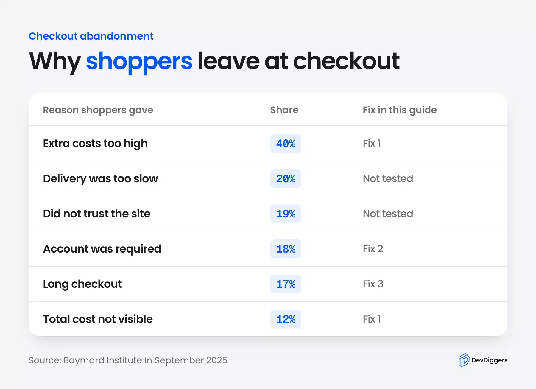
Not every lost visit is a failure. Baymard’s list of reasons leaves out shoppers who were just browsing. It puts that group at 42% of US shoppers.
The reasons above come from people who meant to buy.
Speed belongs in the same conversation. Google’s case study with Deloitte found that a 0.1 second faster mobile site raised retail conversion rates by 8.4%, as stated in Milliseconds Make Millions.
The study covered 37 brands. Treat it as a direction and not a guarantee.
What WooCommerce Already Does Well
A fresh WooCommerce 11.2 store handles several eCommerce UX basics before you change anything. We checked each default on our test store before we touched a single setting. That baseline shows which of the six fixes you can skip on your own store.
Our test store had three products, a $6 flat rate for United States orders and Cash on delivery as its only payment method.
Guest checkout was on, and the checkout page said “You are currently checking out as a guest.” The cart showed a flat rate shipping line and an estimated total. Address line 2 sat behind an “Add apartment, suite, etc.” link, and the “Use same address for billing” box was already ticked.
The checkout preselected our one payment method. Phone was optional and Company was hidden. Those defaults make the checkout a better starting point than most custom forms.
The confirmation page also did its basic job. A guest order showed the order number, date, total, email and payment method, followed by the order details and both addresses. Customers with an account get a My account area with Orders, Downloads, Addresses and Account details.
The gaps were elsewhere. Out of stock products ended in a dead end, the order status page was plain text and some mobile links were small. The six fixes below cover the settings that decide the defaults and those gaps.
6 Ecommerce UX Fixes We Tested on WooCommerce
These six eCommerce UX fixes cover the cost, account, form, phone, out of stock and order status steps of a WooCommerce purchase. They are ordered by priority. The first three match the checkout reasons in Baymard’s research that a store owner can change in settings, at 40%, 18% and 17%.
The fourth is a standard that applies to every phone visitor. The last two fill dead ends that Baymard does not measure.
We ranked those by reach. Both run our own plugins in their Pro builds. Each fix names the exact setting and what we saw.
1. Show the Shipping Cost in the Cart
Baymard puts extra costs at 40% of abandoned checkouts and a hidden order total at 12%. That makes this the first fix.
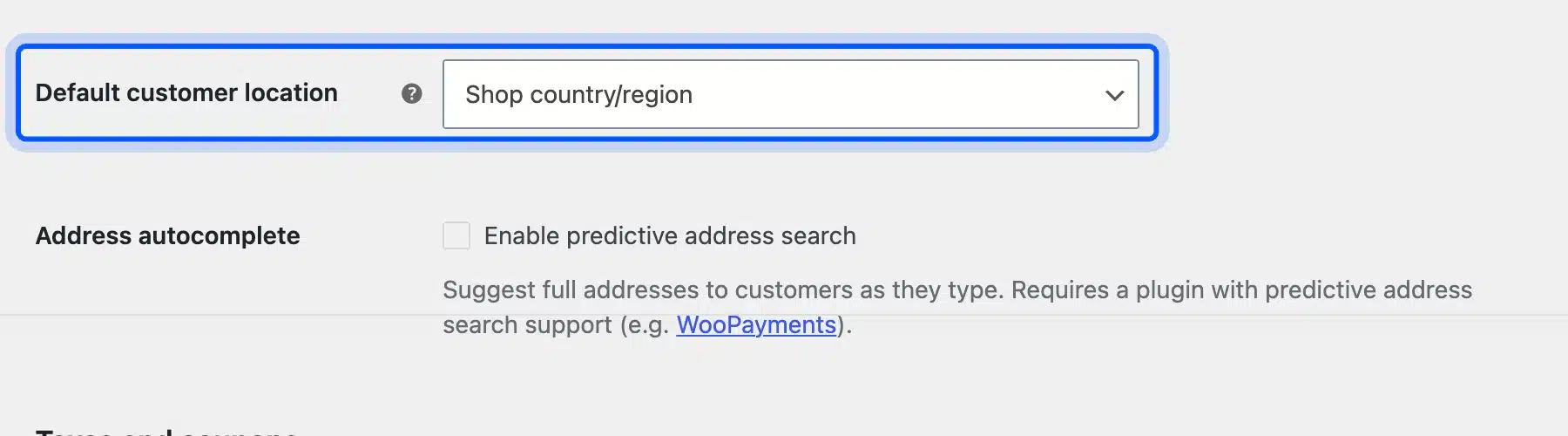
Whether the cart shows shipping depends on one setting. Open WooCommerce > Settings > General and look at Default customer location.
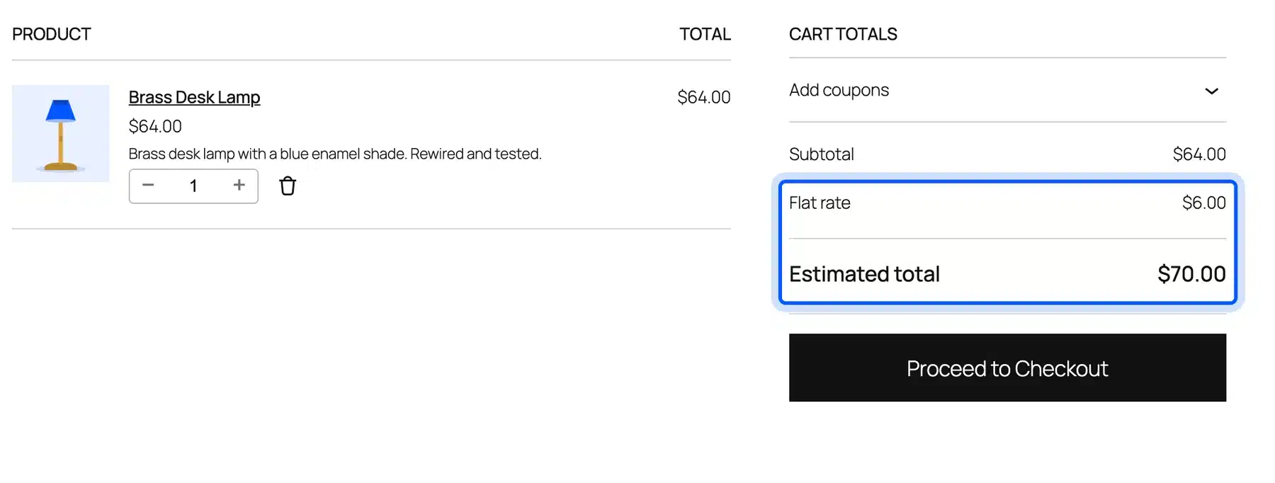
With “Shop country/region” selected, our cart listed “Flat rate $6.00” and an “Estimated total” of $70.00. The shopper knew the full price before the checkout button. The setting only changes what they see before they enter an address, and the checkout still asked them to confirm the shipping option.
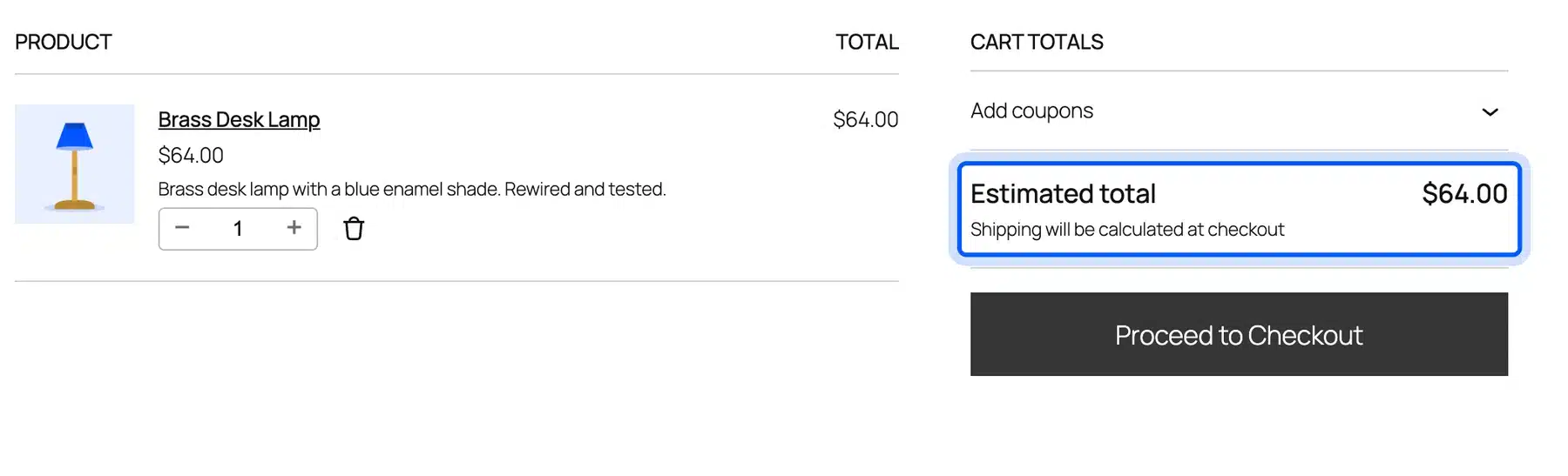
With “No location by default”, the same cart showed an estimated total of $64.00 and the line “Shipping will be calculated at checkout.” The $6.00 only appeared on the next page. That gap is the surprise Baymard’s shoppers described.
2. Keep Guest Checkout On and Offer an Account After the Order
Baymard found that 18% of US shoppers left because the site wanted them to create an account.
That is the second largest reason a store can fix in settings. WooCommerce handles this in Settings > Accounts & Privacy. The first checkbox is “Enable guest checkout (recommended)”, and it was on in our store.
The “Enable log-in during checkout” option below it was off.
We switched it off to see the damage. A logged-out visitor then reached the checkout and saw only a login prompt.
The page read “You must be logged in to checkout. Click here to log in.” Nothing else on it let a guest continue.
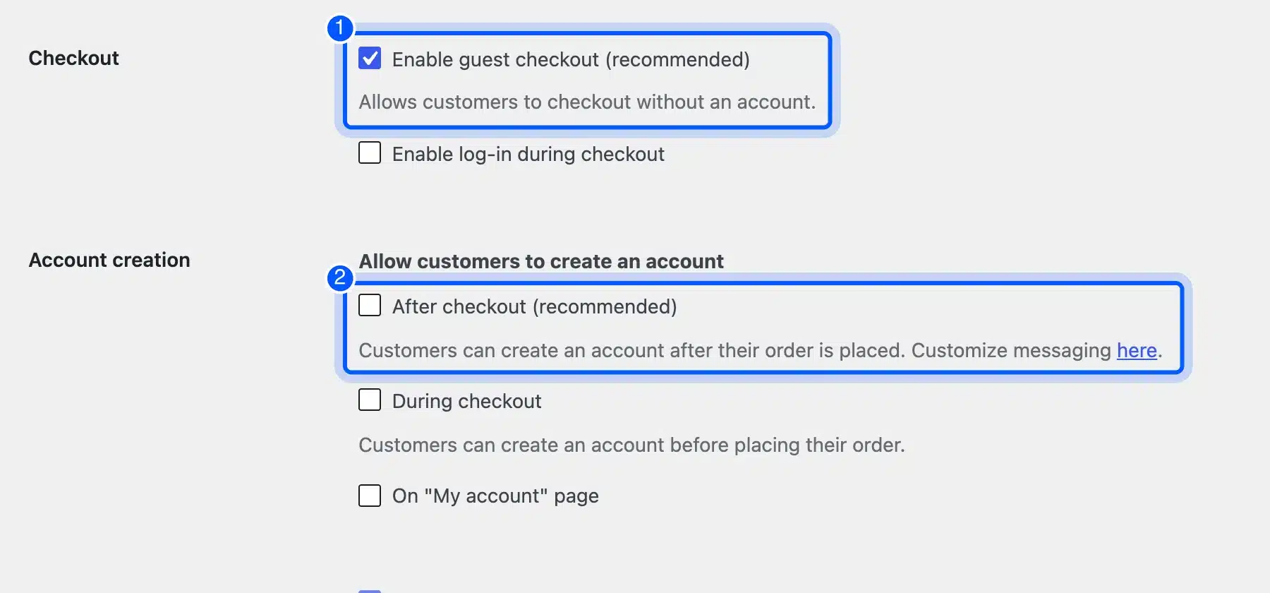
Accounts still help repeat buyers. Offer one after the sale.
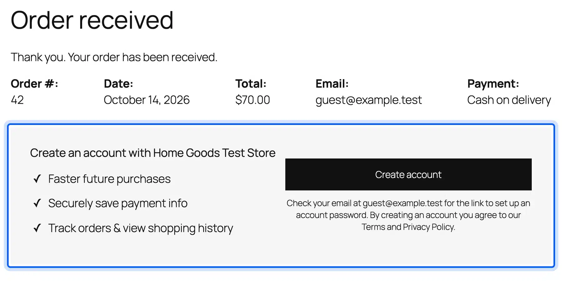
Tick “After checkout (recommended)” under Allow customers to create an account. The order received page then showed a “Create an account” panel with three benefits and a Create account button.
3. Trim the Checkout Form
Baymard reports that 17% of shoppers blamed a long or complicated checkout.
This is the third fix because it ranks just below forced accounts. Our default form showed nine fields: email, country, first name, last name, address, city, state, ZIP code and phone. Phone was the only optional one.
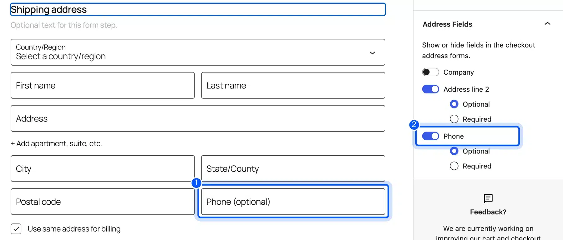
You can drop fields in the block editor. Open the Checkout page, select the Shipping address block and use the Address Fields toggles in the sidebar. Company, Address line 2 and Phone each have a switch.
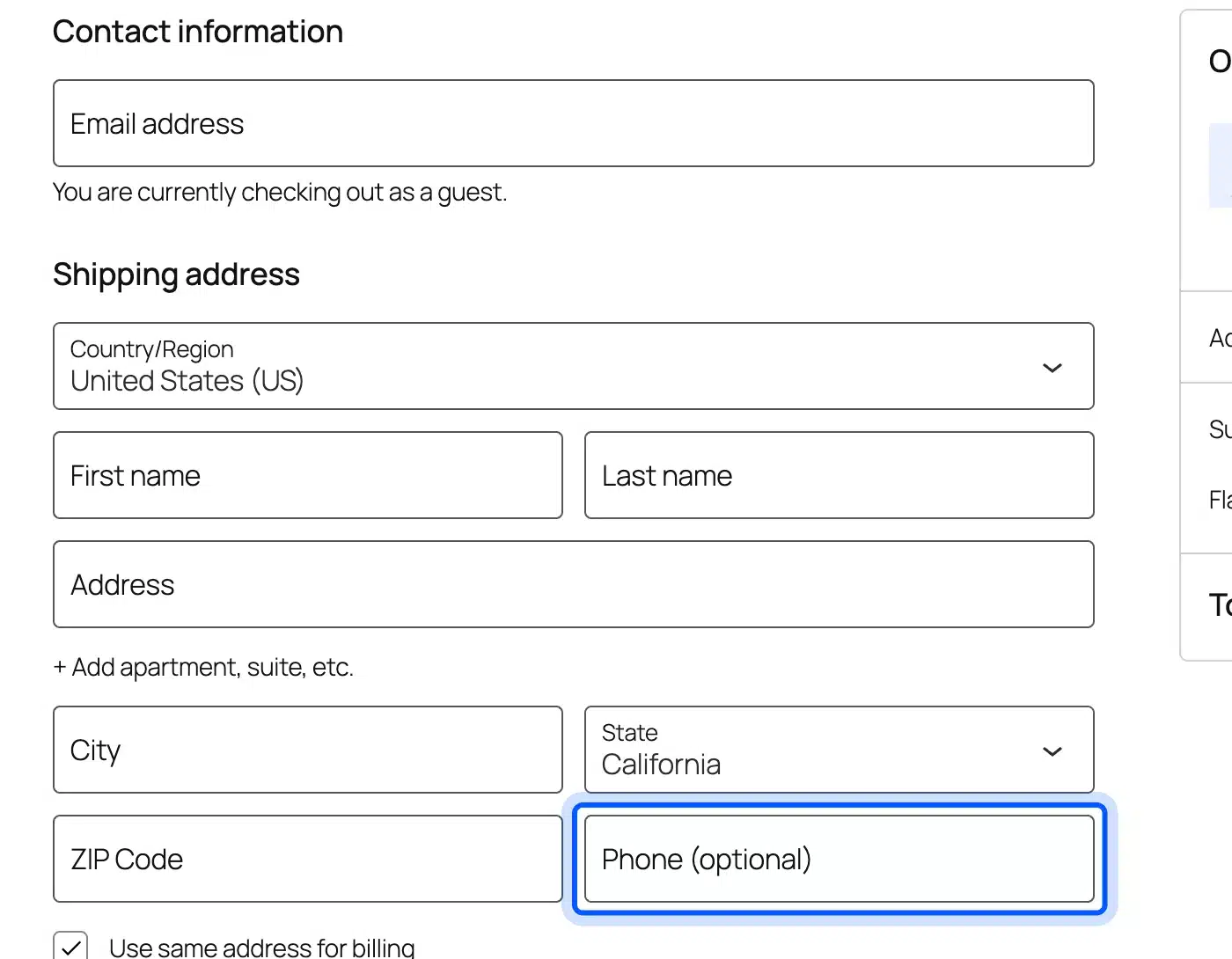
We switched Phone off and pressed Save. The save panel said “There is 1 site change waiting to be saved” and “This change will affect your whole site.” After saving, the live checkout showed eight fields.
Address line 2 stayed collapsed behind its link. That keeps the form short on a phone.
Keep Phone on if your couriers need it. Our guide to add custom fields to WooCommerce checkout covers the opposite job.
The General settings also list “Address autocomplete”. It needs a plugin with predictive address search such as WooPayments.
4. Check Tap Targets on Mobile
Phone shoppers need buttons they can hit without zooming.
This ranks fourth because the rule covers every phone visit. Baymard gives no abandonment share for it.
The W3C sets 24 by 24 CSS pixels as the minimum target size at Level AA in WCAG 2.2 success criterion 2.5.8. It lists exceptions and the full page is worth reading before you judge a link.
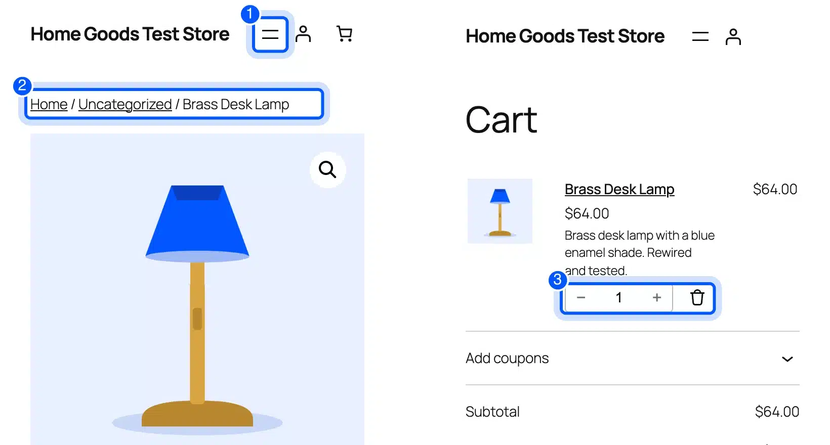
We measured our test pages at 390 pixels wide. The main buttons were large. Add to cart was 151 by 55 pixels and Place Order was 330 by 55.
The small targets were secondary. On the checkout the checkbox and radio inputs measured 20 by 20 pixels.
The Open menu button was exactly 24 by 24. Breadcrumb links were 19 pixels tall and footer links were 23 pixels tall.
In the cart the plus and minus buttons were 30 by 27 and the remove icon was 24 by 24. Your theme decides these sizes. Check yours with your browser’s inspector.
A full accessibility audit for a WooCommerce store also covers keyboard use, zoom and checkout forms.
Run the same check on your checkout page too. Phone users fill in that form with a thumb. Our list of the fastest WooCommerce themes is a place to compare themes.
5. Add a Back in Stock Waitlist to Out-of-Stock Products
An out of stock product page on a default store shows two words and nothing to do.
This ranks fifth because it hits only shoppers who land on a sold-out item. Our vase page said “Out of stock” with no button, form or related message. In the shop grid its button read “Read more” and not “Add to cart.”
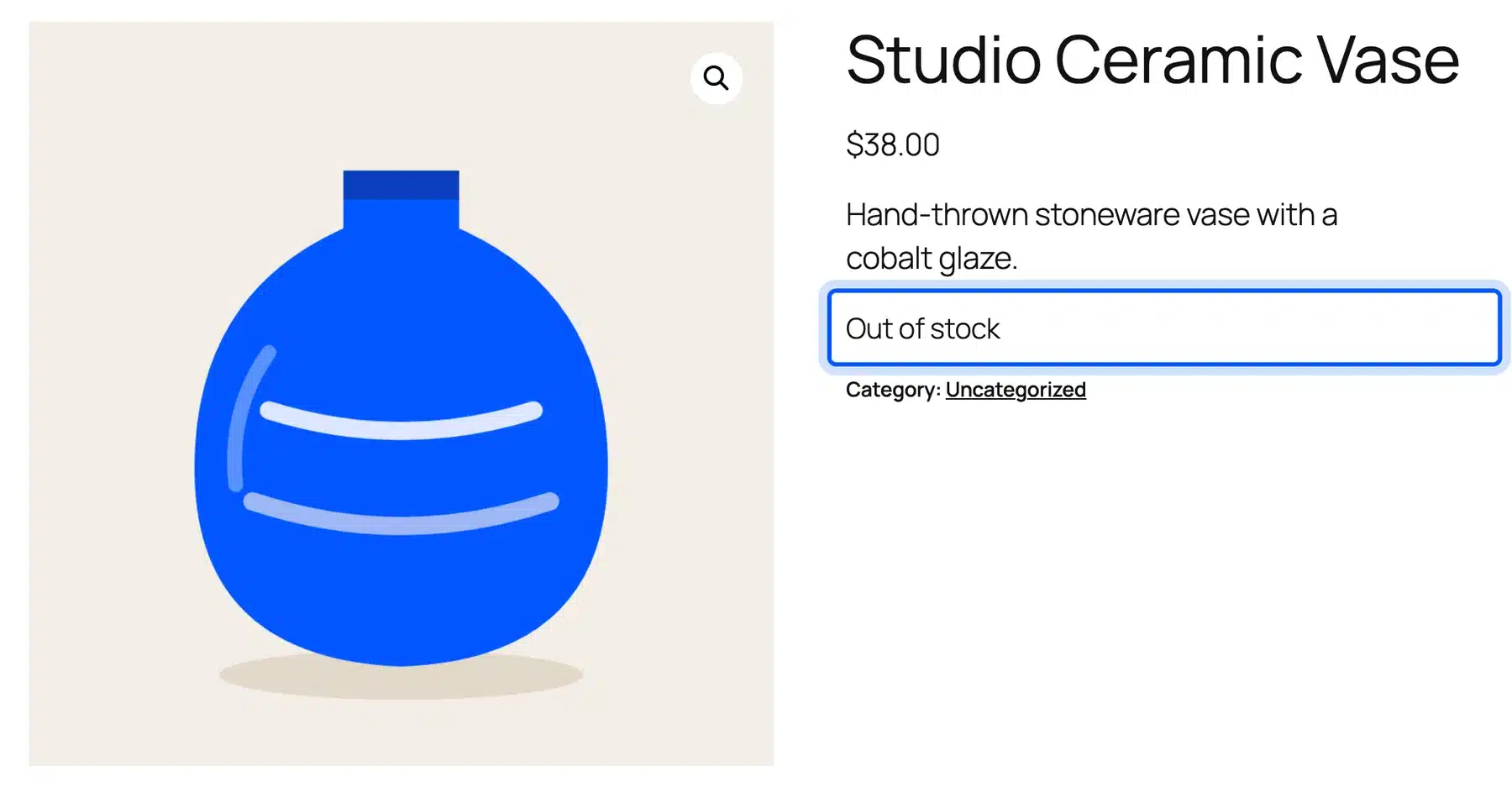
WooCommerce has one built-in answer. Under Settings > Products > Inventory the option “Hide out of stock items from the catalog” removed the vase from our shop page. The product URL still opened and still said “Out of stock.”
Links and search results can land on the same dead end.
WooCommerce Waitlist is our plugin for this gap. It adds a join button and an email field to the page. We ran the Pro build, version 1.4.0, on our test store with WooCommerce 11.2.
- Install the plugin. Go to Plugins > Add Plugin > Upload Plugin, choose the zip file and click Activate. Add your license key under DevDiggers Plugins > Waiting List > Configuration > License.
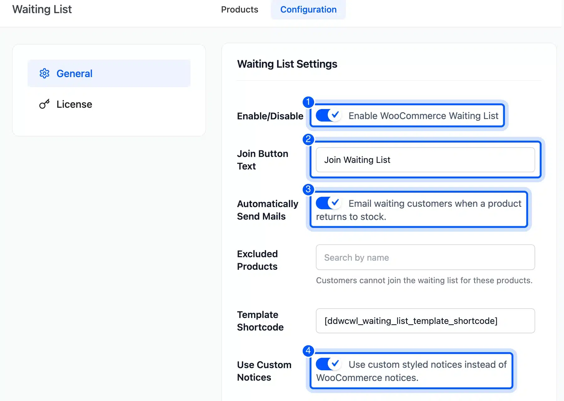
- Open DevDiggers Plugins > Waiting List > Configuration > General. Tick Enable WooCommerce Waiting List. Keep Join Button Text as Join Waiting List or write your own. Tick Automatically Send Mails and Use Custom Notices. Click Save Changes.
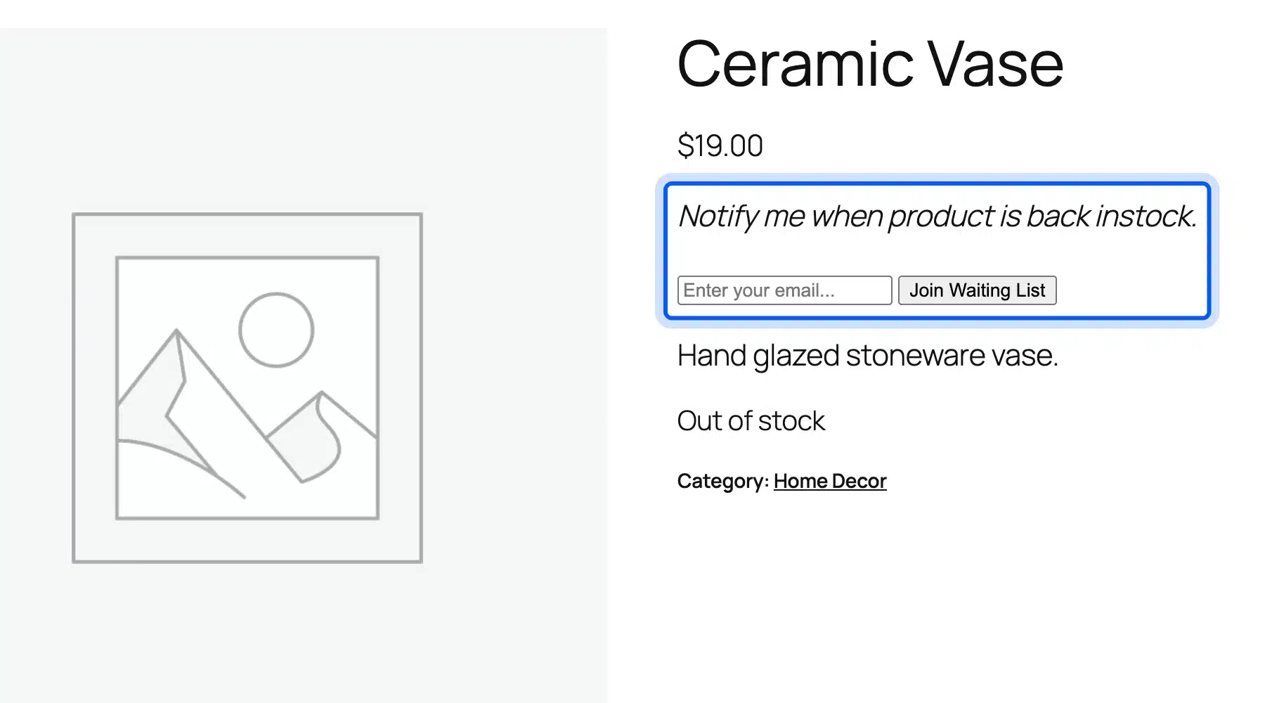
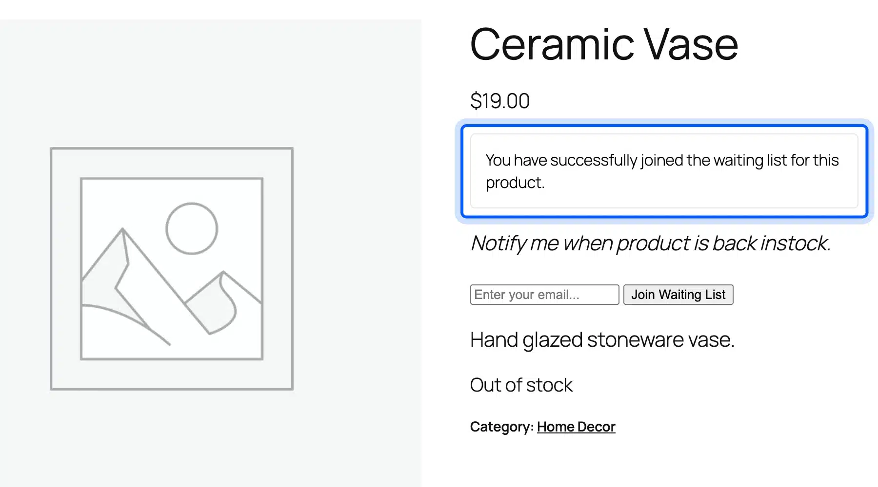
- Open an out of stock product as a visitor. The page now shows “Notify me when product is back instock.” an email field and the join button.
- Enter an email address and click Join Waiting List. With Use Custom Notices on, the page showed “You have successfully joined the waiting list for this product.”
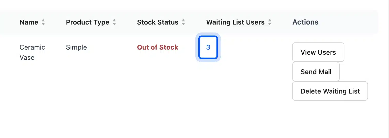
- Open DevDiggers Plugins > Waiting List > Products. The table lists each product with people waiting. Ceramic Vase showed Out of Stock and 3 waiting users. View Users, Send Mail and Delete Waiting List sit beside it.
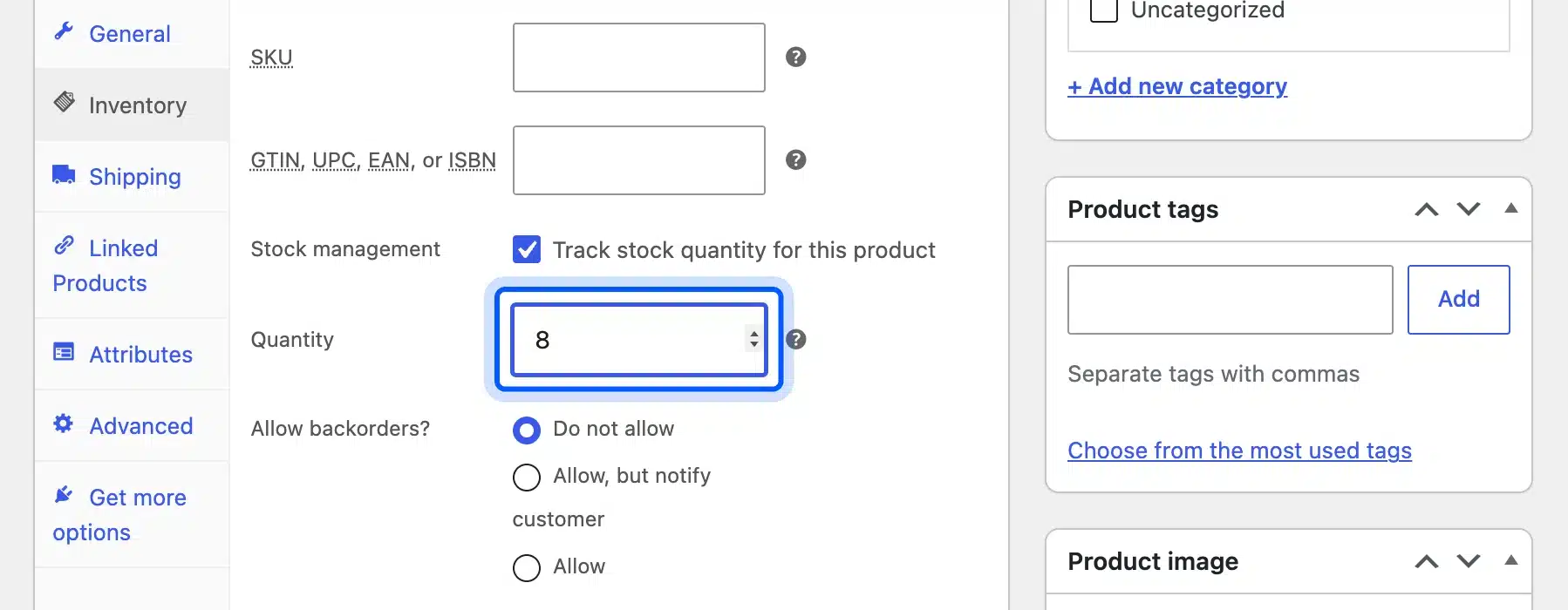
- Restock the product. Open it and go to Product data > Inventory. Type a Quantity of 8 and click Update.
Saving the product sent three emails, one for each waiting address. The subject read “Waiting List Notification” with our store name in front. The body said “Ceramic Vase is in stock now” and linked to the product page.
Two limits showed up in the test. A block theme page showed no message after a join until we ticked Use Custom Notices.
A stock change made through code and not the product editor sent no email. Use the product editor when you restock.
Licenses start at $29 as of October 2026 on the product page. Our roundup of the best WooCommerce waitlist plugins compares other options.
6. Show Customers Where Their Order Is with a Progress Bar
After payment, shoppers want to know what happens next.
This ranks last because the sale is already made. It builds trust for the next order.
The default view order page in My account gave one sentence. It read “Order #41 was placed on October 14, 2026 and is currently Processing.”
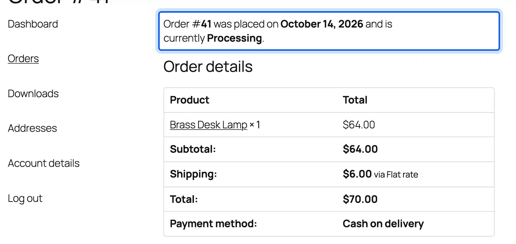
That sentence gives no sense of the steps ahead. WooCommerce Order Progress Bar shows the stages as a bar on the order received and view order pages. We ran the Pro build, version 1.1.0, on our test store.
- Install and activate the plugin as in fix 5. Add your license key under DevDiggers Plugins > Order Progress Bar > Configuration > License.
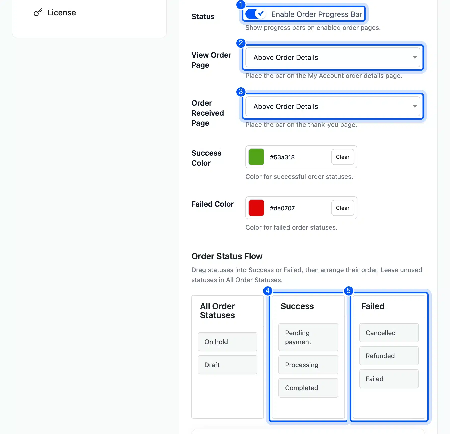
- Open DevDiggers Plugins > Order Progress Bar. Under Display tick Enable Order Progress Bar. Set View Order Page and Order Received Page to Above Order Details. The Success Color and Failed Color came as #53a318 and #de0707.
- Build the flow under Order Status Flow. Drag Pending payment, Processing and Completed into Success. Drag the canceled, refunded and failed statuses into Failed. We left On hold and Draft in All Order Statuses. Click Save Changes.
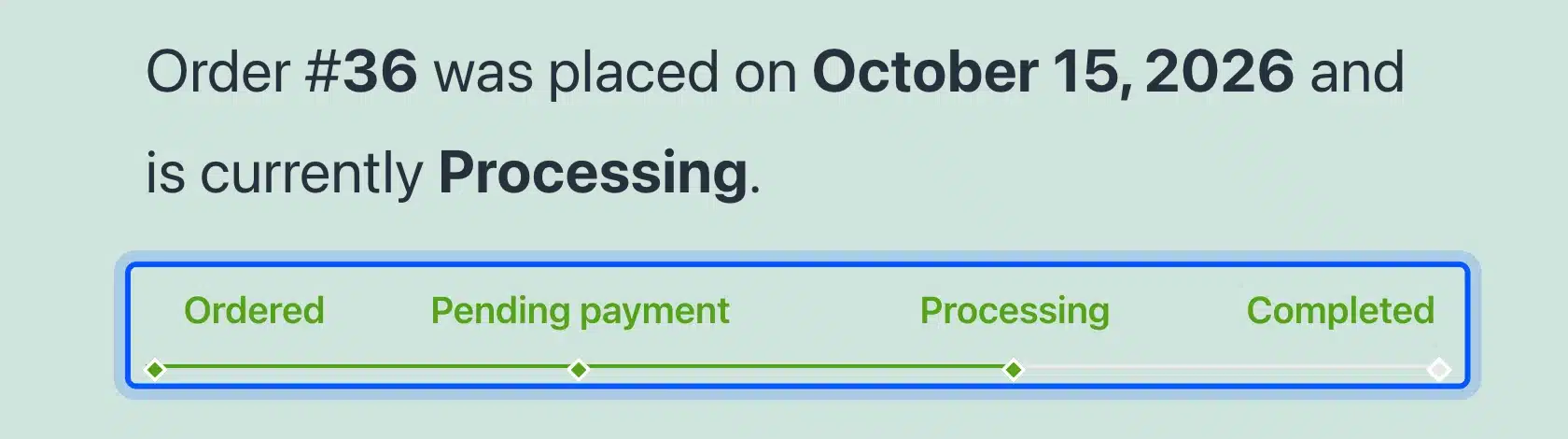
- Open My account > Orders and view an order. Our order in Processing showed a bar with four steps: Ordered, Pending payment, Processing and Completed. The first three were green and Completed was still empty.
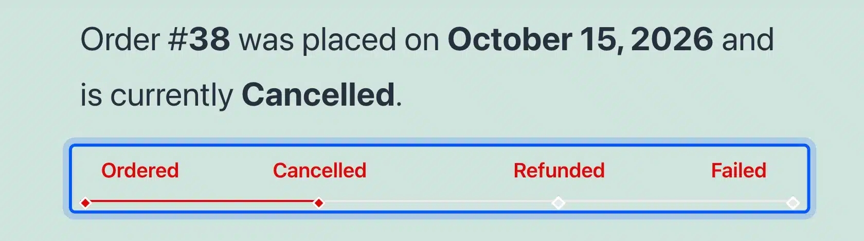
- View a canceled order. The bar turned red. It listed Ordered and then the canceled, refunded and failed steps. Only the first two steps were marked.
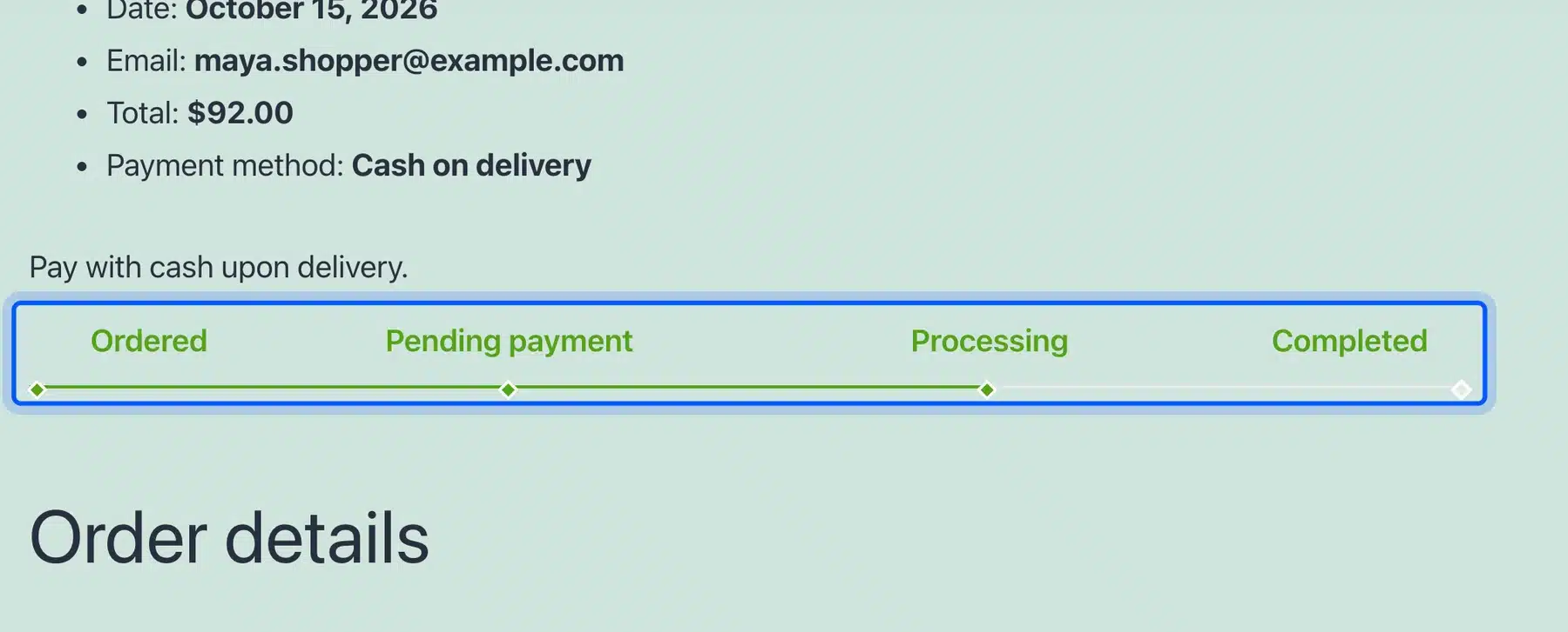
- Check the thank-you page. The same bar sat between the payment note and the Order details heading.
One limit showed up. We ran this plugin on Twenty Twenty-One, a classic theme. On Twenty Twenty-Five, a block theme, the bar did not appear on either page in our test.
Try it on a staging copy of your own theme first.
Licenses start at $29 as of October 2026 on the product page. Our list of the best WooCommerce order tracking plugins covers other ways to answer where is my order.
Ecommerce UX Best Practices to Check Next
These eCommerce UX best practices sit beyond our six tests but come from the same research. Speed, payment choice, returns and trust each show up in Baymard’s reasons. The list below works as a to-do for your own store after the six fixes.
- Page speed: Google wants Largest Contentful Paint within 2.5 seconds at the 75th percentile, according to web.dev. It also wants Interaction to Next Paint at 200 milliseconds or less. Our guide to speed up a WooCommerce website starts the work.
- Search: Our default theme showed no search field on the shop or product pages. We typed “cermic vase” and “brass lmap” into the store search, and both returned “No products were found matching your selection.”
- Payment options: Baymard lists too few payment methods at 9% and a declined card at 10%.
- Returns policy: An unsatisfactory returns policy cost 13% of shoppers in Baymard’s list.
- Trust: Not trusting the site with card details was 19%. Show clear policies and secure payment badges.
- Delivery: A delivery time that was too slow cost 20%. State the speed before checkout.
Search deserves a closer look because shoppers who know the product name expect it to work. Add a search field to your header and test two or three common typos. A page that says only “No products were found” gives shoppers nothing to try next.
Change one item at a time and note the date. Compare abandoned carts before and after so you know which change worked. Our guide to editing the WooCommerce shop page helps with the browsing steps.
Conclusion
Ecommerce user experience on WooCommerce comes down to a few settings, one theme check and two plugins. Work in the order of the evidence. Show shipping in the cart first because extra costs top Baymard’s list of reasons.
Keep guest checkout on and trim the form next. Then measure tap targets on a real phone. Add a waitlist and an order progress bar once the checkout is sound.
The first four fixes take minutes and cost nothing. Test each change on your own store before you launch it.
Frequently Asked Questions (FAQs)
Q1. How do I improve eCommerce user experience on a WooCommerce store?
Start with the biggest checkout reasons. Show shipping in the cart, keep guest checkout on and remove optional fields. Then check tap targets, give out of stock products a waitlist and add an order progress bar.
Q2. Does WooCommerce allow guest checkout by default?
Yes. On our WooCommerce 11.2 test store the checkout said “You are currently checking out as a guest.” The setting is Enable guest checkout under Settings > Accounts & Privacy.
Q3. Does hiding out of stock products help eCommerce UX?
It removes the dead end from the shop page. On our store the product URL still opened and still said “Out of stock.” A waitlist plugin gives shoppers an email box to join instead.
Q4. How big should mobile buttons be?
WCAG 2.2 sets a 24 by 24 CSS pixel minimum for targets at Level AA, with exceptions. Our main buttons were 55 pixels tall. Check small links such as breadcrumbs and footer menus.
Q5. Which Core Web Vitals should an online store pass?
Google lists three at the 75th percentile of page loads. Largest Contentful Paint should be 2.5 seconds or less. Interaction to Next Paint should be 200 milliseconds or less and Cumulative Layout Shift 0.1 or less.
Q6. What is the average cart abandonment rate?
Baymard reports 70.22% as the average documented rate, based on 50 studies and updated in September 2025. Your own rate may differ. Measure it before and after each change.