How to Convert a Container to a Column in WordPress

You can convert a container to a column in WordPress in under five minutes, but the steps depend entirely on which editor you’re using. That’s the part most guides skip, and it’s why people end up following the wrong instructions.
Most tutorials assume you’re using Gutenberg. If you’re on Elementor, the picture is different. Elementor made its Flexbox Container the default in 2023, replacing the old sections-and-columns model. So what “container” and “column” mean depends on your setup.
This guide covers both. You’ll learn the exact steps for Gutenberg’s Columns block, the right approach for Elementor in 2025 to 2026, and the common mistakes that break layouts after conversion.
What Is the Difference Between a Container and a Column in WordPress?
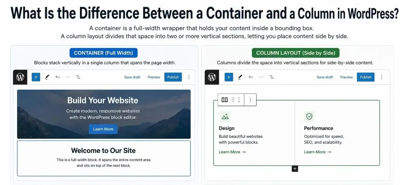
A container is a full-width wrapper that holds your content inside a bounding box. A column layout divides that space into two or more vertical sections, letting you place content side by side.
By default, when you add blocks in the WordPress block editor, each one stacks on top of the next in a single column that spans the page width. That’s container behaviour. If you want text and an image sitting next to each other, you need a column layout.
Worth knowing before you go further: these two terms mean different things depending on your editor.
What Is a Container Block?
In Gutenberg, “container” usually refers to the Group block, a wrapper that holds other blocks. In Elementor, a “container” now refers to the Flexbox Container, which replaced the old Section. The naming gets confusing because Elementor’s Flexbox Container can behave like a column layout depending on how you configure it.
What Is a Column Block?
In Gutenberg, the Columns block is a dedicated block that splits your content into two or more vertical sections. Each section holds its own blocks independently. In Elementor’s older model, “columns” were nested inside Sections. In modern Elementor, that structure is gone, and Flexbox Containers have replaced it.
How to Convert a Container to a Column in WordPress Using Gutenberg
This takes about three minutes on a post you’re already editing. No plugins needed, the Columns block is built into Gutenberg.
Step 1: Back Up Your Site
Before touching any layout, create a backup. If you run WooCommerce, follow our guide on how to back up your WooCommerce database first. One step, five minutes, saves a lot of pain.
Step 2: Edit the Post or Page in the Block Editor
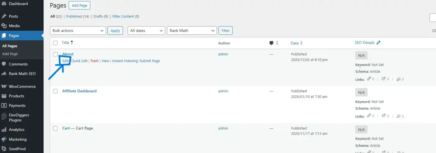
Go to Pages or Posts in your WordPress dashboard. Click Edit on the page you want to update. If it’s a new page, click Add Page.
Step 3: Click the + Button and Search for “Columns”
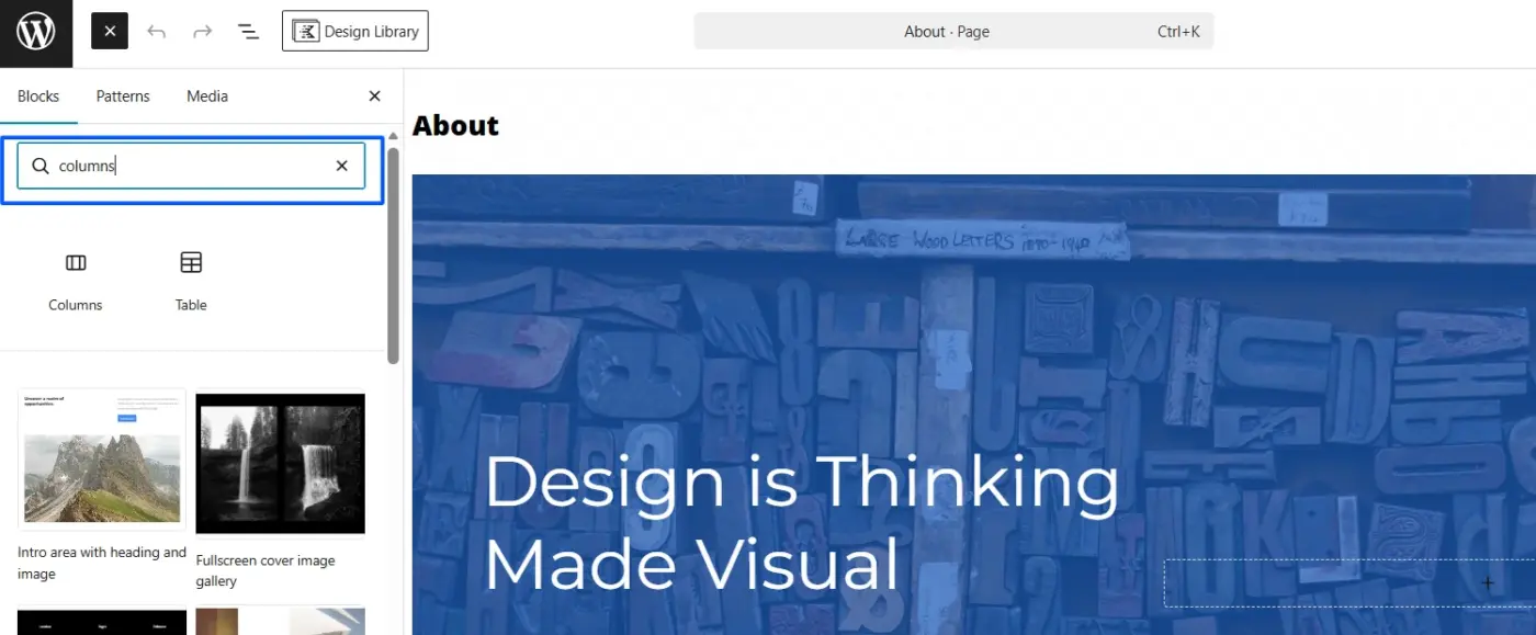
In the editor, click the + block inserter icon, either in the toolbar at the top or the one that appears between blocks. Type “Columns” in the search field and select the Columns block from the results.
Step 4: Choose Your Column Layout
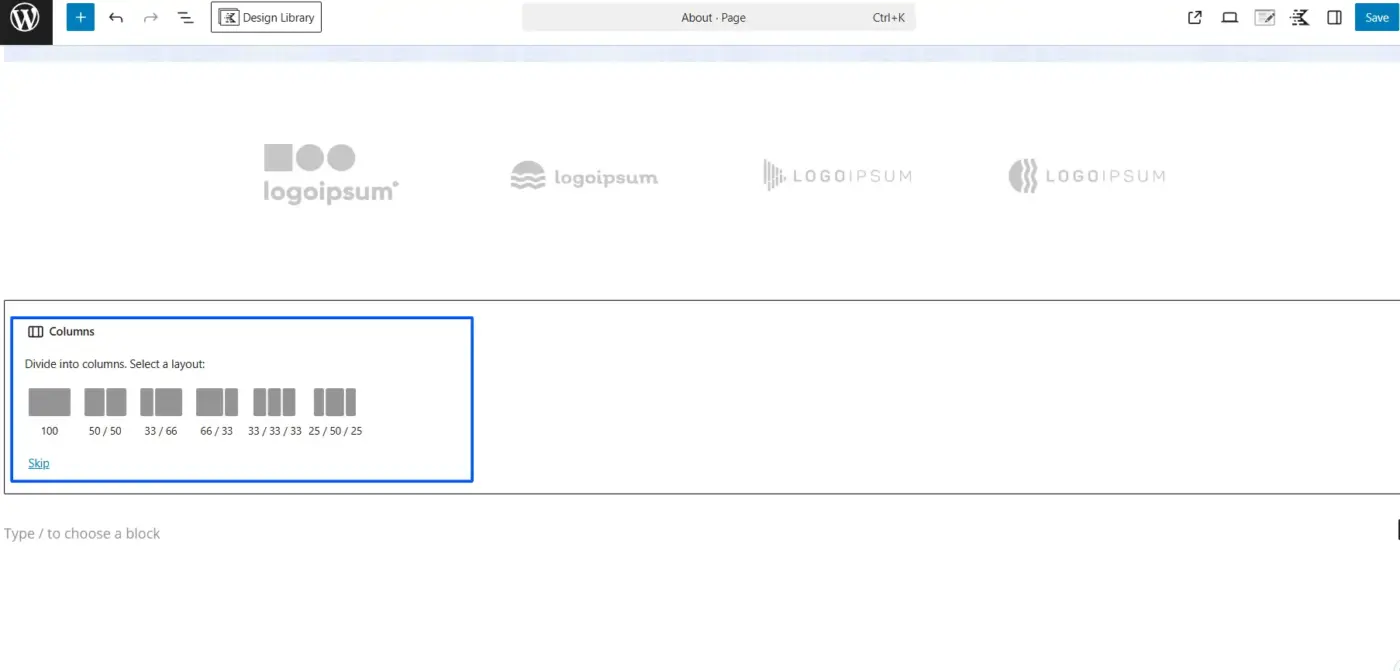
Gutenberg shows you preset layouts: 50/50 (two equal columns), 33/33/33 (three equal columns), 70/30, and more. Click the one that fits your content. You can adjust individual column widths later by clicking into a column and dragging the resize handle.
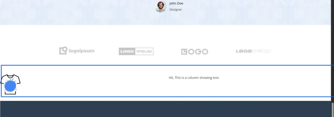
Step 5: Add Your Content Blocks Inside Each Column

Click inside the left column and add a block: a Paragraph, Image, Heading, or anything else. Then click inside the right column and do the same. Each column holds its own blocks independently. If you have existing content you want to move into the columns, cut the block (Ctrl/Cmd + X), click inside the target column, and paste.
Step 6: Check Layout in Preview
Hit Preview to check how the layout looks before publishing.
Step 7: Save and Publish
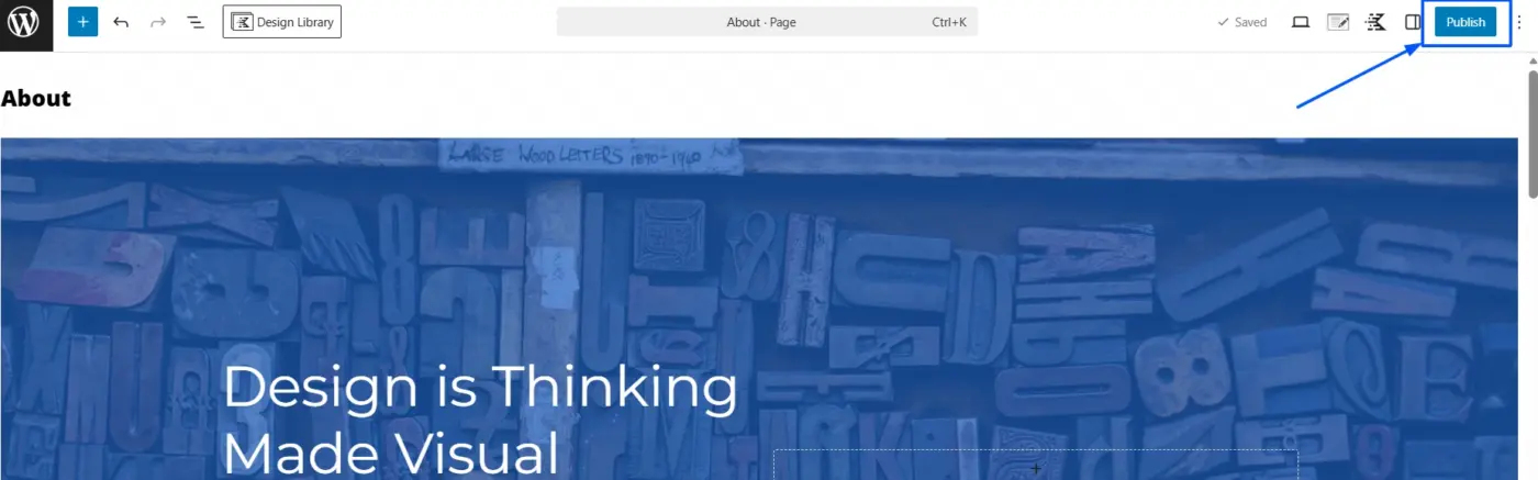
Click Save if you’re still working, or Publish when you’re ready to go live.
Technical note worth knowing: Gutenberg’s Columns block stacks at exactly 782px viewport width. This is hardcoded in WordPress core’s block stylesheet via a CSS media query. If you need a custom breakpoint, you’ll need to add CSS. Most themes handle this fine at 782px, but if you’re testing on a tablet and seeing unexpected stacking, that number is why.
How to Convert a Container to a Column in Elementor
This section exists because Elementor changed the rules in 2023, and most guides haven’t caught up yet.
When Elementor 3.6 launched, it introduced Flexbox Containers and made them the default for new installs. The old Section → Column → Widget structure was deprecated and will eventually be removed. So if you installed Elementor recently and clicked “Add New Container,” that Flexbox Container is now the main layout unit, not a column in the traditional sense.
This matters because you have two different situations to handle.
Situation A: You Want the Old Sections and Columns Back
If you’re on a site built before 2023, or you specifically want the classic Section → Column structure, you can switch back in Elementor’s settings.
- Go to your WordPress dashboard and click Elementor → Settings.
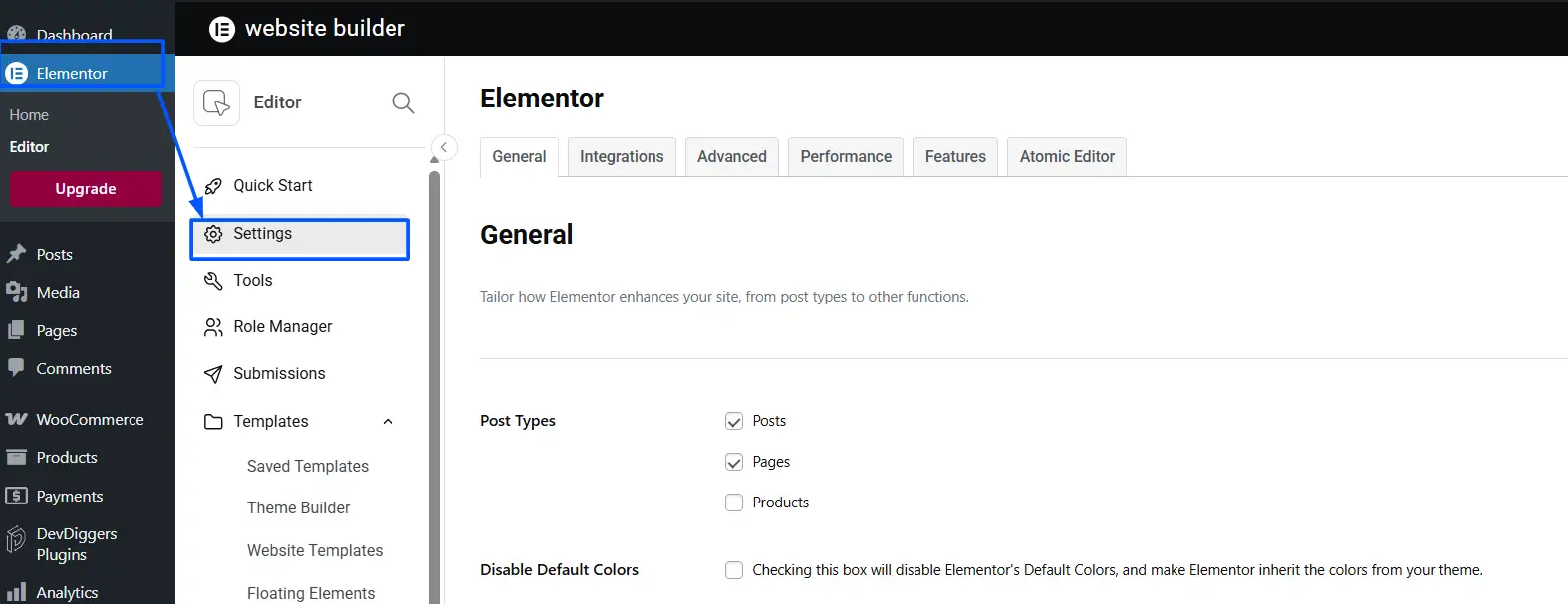
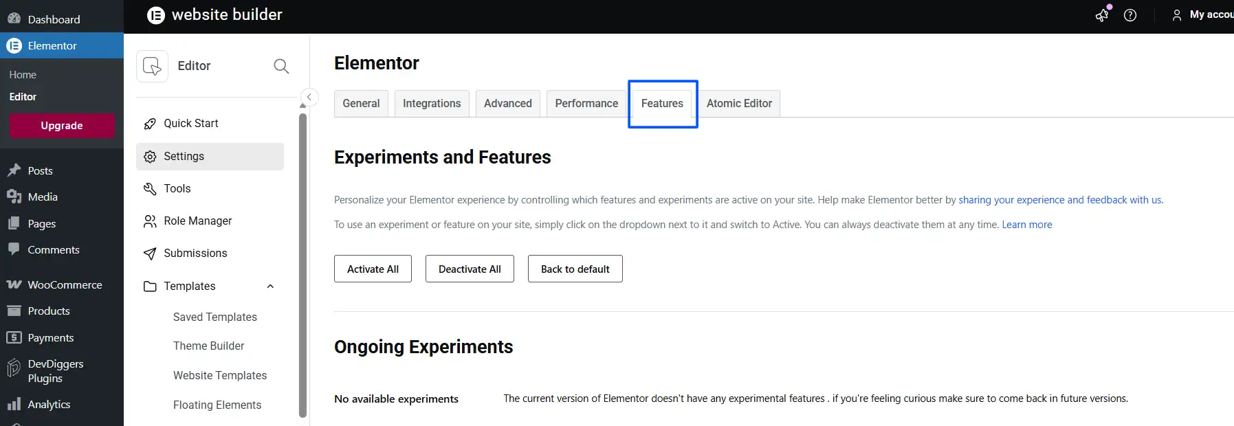
- Click the Features tab.
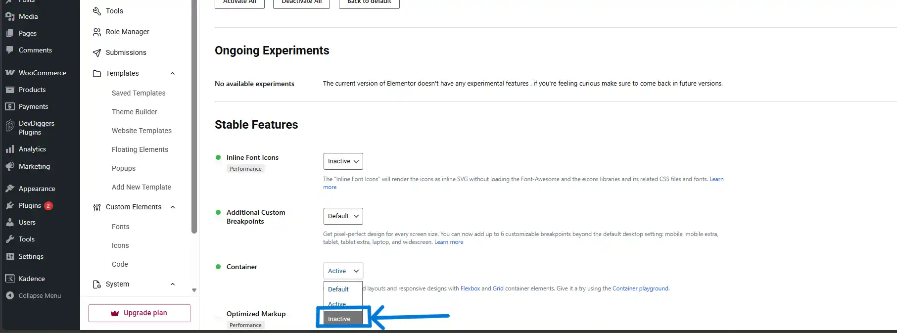
- Scroll to Container and set the dropdown to Inactive.
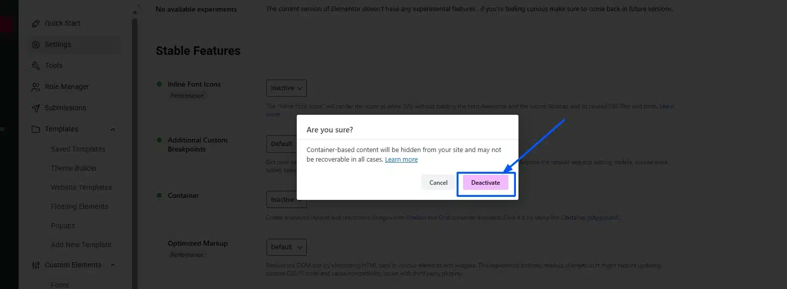
- Click Deactivate on the confirmation message.
- Click Save Changes.
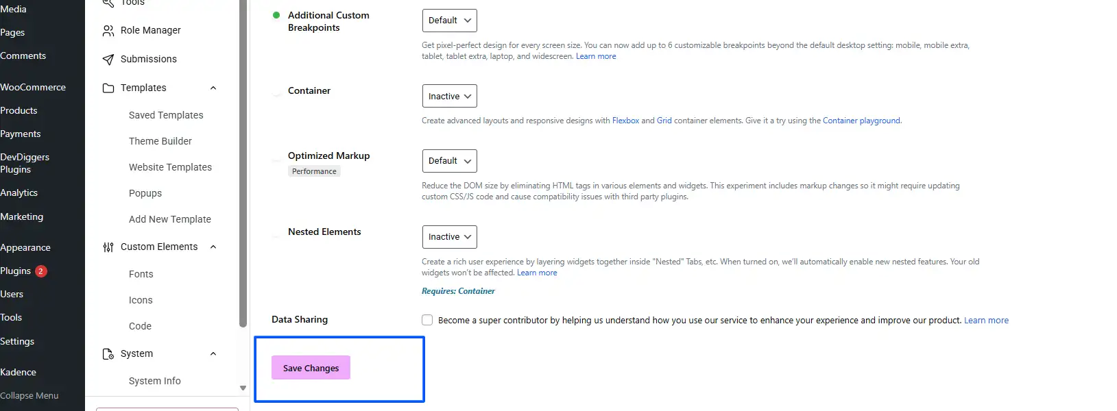
After deactivating, you can click Add New Section and choose a column structure (one, two, three columns, etc.) just like the old model.
Important: Do not do this on a site already built with Flexbox Containers. Switching back breaks existing layouts because the underlying HTML structure changes. Only use this approach on fresh builds or sites that have never used Flexbox Containers.
Situation B: You Want Multi-Column Layouts Inside Flexbox Containers
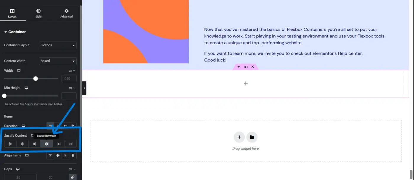
This is what most Elementor users actually need, and it’s simpler than switching back to the old model.
Inside a Flexbox Container, click the direction control in the left panel and set it to Row. Now, any widgets or nested containers you add inside it will sit side by side, left to right. That’s your column layout. You control width using the Width setting on each child element, or by setting the container to Justify Content → Space Between.
If you need a two-column layout, add one container, set it to Row direction, then drag two nested containers inside it. Set each nested container to 50% width. Done.
This approach performs better than the old sections/columns model. According to Elementor’s own documentation, Flexbox Containers produce significantly less DOM output, meaning faster page loads. Going back to old columns is going backwards for new projects.
If you’re using Elementor and also need to optimise your WooCommerce shop page layout, see our guide on editing the WooCommerce shop page for how page builder layouts interact with WooCommerce templates.
Which Method Should You Use?
Here’s a quick breakdown to help you decide.
| Method | Best For | Watch Out For |
|---|---|---|
| Gutenberg Columns block | New WordPress sites, blogs, content-heavy pages, no page builder | Limited responsive control, stacks at 782px only |
| Elementor Flexbox Container (Row) | Modern Elementor sites, complex layouts, and better performance | Steeper learning curve than Gutenberg |
| Elementor legacy sections/columns | Sites built before 2023 on the old Elementor structure | Deprecated, avoid for new builds |
| CSS custom columns | Developers who want full control | Requires coding, not for beginners |
For beginners: Use Gutenberg. The Columns block handles 90% of layout needs without any configuration. It’s already installed, it’s stable, and it works with every modern WordPress theme.
For intermediate users on Elementor: Stay in Flexbox Containers. Learn the direction, justification, and alignment controls. It’s a short learning curve, and the results are far better than the old column model.
If you’re building a new WordPress site from scratch and are not sure which setup suits your business, our WordPress development services team can help you choose the right stack from the start.
Common Mistakes When Converting Containers to Columns in WordPress
Most conversions go fine. A few specific mistakes break things, and they come up often enough to be worth calling out.
- Mistake 1: Adding content to the Columns block wrapper instead of inside a column. This is the most common Gutenberg error. When you first add the Columns block, it shows an outer wrapper and inner column areas. If you click and type directly in the outer area, your content doesn’t go into a column, it sits outside them. Always click inside the specific column section before adding a block.
- Mistake 2: Not checking mobile stacking after conversion. Column layouts look great on desktop. On mobile, they often stack in an order that doesn’t make sense, image below text when you wanted it above, for example. Always preview your page on a phone-sized screen before publishing. The Gutenberg editor has a mobile preview button in the top toolbar.
- Mistake 3: Nesting too many Column blocks inside each other. Two or three levels of nested columns are fine. Beyond that, you get into performance territory. According to research on Gutenberg’s layout structure, every extra wrapper element adds rendering overhead. If you find yourself nesting four or five levels deep, the design probably needs a simpler approach.
- Mistake 4 (Elementor): Switching off Flexbox Containers on a live site. This is the one we see most often in support tickets. Someone installs Elementor, builds a few pages using Flexbox Containers, then reads an old tutorial that says to deactivate the feature. The existing pages break immediately because the underlying markup changes. The Elementor conversion from sections to Flexbox is one-directional, you can migrate sections to containers, but switching back after building with containers isn’t clean. If your site is already live and using Flexbox Containers, leave them on and learn the Row direction approach from the previous section.
- Mistake 5: Using columns on pages where they hurt, not help. Columns improve layouts where content naturally lives side by side: features lists, image-text pairs, pricing comparisons. They don’t work well on focused landing pages, checkout pages, or single-product WooCommerce pages where you want one clear reading path. Not every page needs columns.
Tips for a Smooth Conversion
- Test on a staging site first: If you’re converting a key page, homepage, a WooCommerce product page, or a landing page, do it on a staging environment before touching your live site. Most hosts provide one-click staging.
- Optimise images inside columns: Two columns side by side mean images are smaller on screen. Upload correctly sized images rather than letting the browser scale them down. Unoptimised images inside column blocks are a common source of slowdowns. See our guide on WordPress image optimisation for the full process.
- Use consistent column widths: Mixing 40/60, 50/50, and 33/33/33 columns on the same page creates a fragmented look. Pick one or two column ratios and stick to them throughout.
- Check font size and line length: A narrow column can make your font size feel too large, or your line length too short for comfortable reading. Aim for 60 to 75 characters per line in body text. Adjust font size or column widths if lines feel cramped.
Final Thoughts
Converting a container to a column in WordPress is simple once you know which editor you’re working with. In Gutenberg, add the Columns block, choose a layout, and drop your content in.
In Elementor, either set a Flexbox Container to Row direction for a modern column layout, or switch back to legacy sections if you need the old model on a pre-2023 site. Always check mobile stacking, avoid nesting too deep, and back up before making layout changes on a live page.
The mistake most people make isn’t the conversion itself; it’s following a guide written for a different editor, or an older version of Elementor, and wondering why the steps don’t match what they’re seeing.
If you want help with more complex WordPress layout work, our WordPress development services team handles custom page structures, theme customisation, and WooCommerce setup.
Frequently Asked Questions (FAQs)
Q1. Can I convert an existing block to a Column block in Gutenberg without losing my content?
Not directly, the Columns block is a container you add around new content, not a transform you apply to an existing block. The practical approach is to add a Columns block, then cut and paste your existing blocks into the individual column areas. It takes about thirty seconds per block.
Q2. Does converting to columns affect my site’s SEO?
No. Google reads content, not layout structure. Column layouts do not hurt or help rankings on their own. What matters for SEO is page speed, so avoid nesting too many column layers, and optimise any images you place inside columns.
Q3. What happens if I switch Elementor from Flexbox Containers back to sections and columns on a live site?
Existing pages built with Flexbox Containers will break. The HTML structure changes when you switch, and Elementor cannot automatically reformat what it has already generated. Only switch back to legacy sections on a fresh or staging site, not one where Flexbox Containers are already in use.
Q4. Can I set different column widths in Gutenberg?
Yes. Click inside the Columns block to select the outer wrapper, then click on an individual column. In the right sidebar, you’ll see a Width percentage field. Set it to any value, for example, 30% for a narrow sidebar and leave the adjacent column to fill the remaining space automatically.
Q5. What is the difference between the Gutenberg Columns block and the Group block?
The Columns block splits content into vertical side-by-side sections. The Group block wraps content in a container without splitting it, it’s more like a styled section. If you want two things sitting next to each other, use Columns. If you want to apply a background colour or padding to a group of stacked blocks, use Group.
Ekta Lamba
Ekta Lamba is a tech writer at DevDiggers focused on making WordPress and WooCommerce straightforward for non-developers. She covers plugin errors, platform updates, and WordPress basics, written so readers can follow along without a second tab open to translate the jargon.
Join thousands of readers getting smarter every week.
Leave a Reply