What is a Product Listing Page in Ecommerce?


Have you ever landed on an online store, clicked on a category like “Women’s Dresses” or “Gaming Laptops” and been immediately presented with a grid of products to browse? That page is known as a Product Listing Page (or PLP), and it is one of the most important yet overlooked aspects of eCommerce design.
Okay, so why does that matter? It’s simple: a poorly designed PLP can leave users frustrated, decrease your conversion rates, and negatively impact your SEO rankings. On the contrary, a well-optimized PLP can guide shoppers seamlessly from a browsing user to a paying customer, improving both your revenue and the customer experience.
In this article, we will understand what is a product listing page in eCommerce, why they are important, and detail the essential features that lead to high performance, and include some proven design best practices to create PLPs that convert like crazy.
Additionally, we’ll share some real-world examples from tier one brands so you can emulate their strategies in your store.
What is a Product Listing Page in Ecommerce?
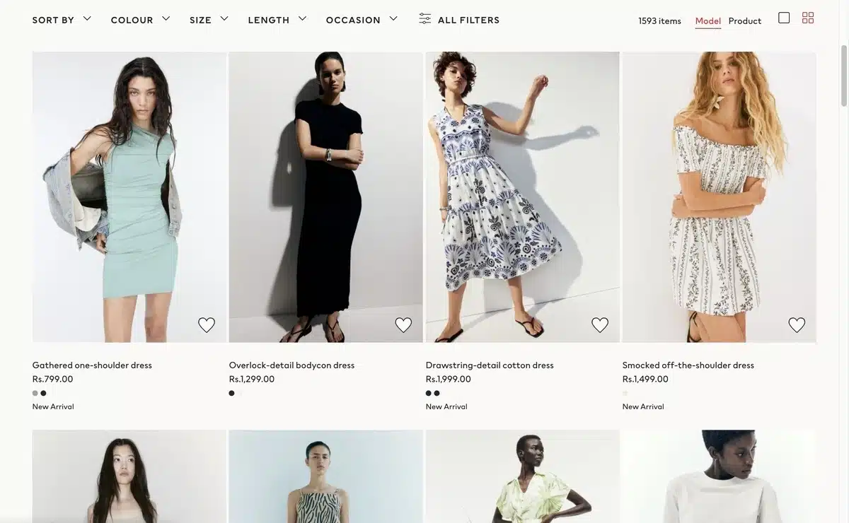
In the world of eCommerce, a price listing page PLP is a page that showcases a list of products within a category, search results or curated products. The best way to think of a PLP is to consider it a digital window into your store where the user can discover products being offered.
Normally, a PLP page will present:
- Product thumbnails with images
- Title and price information
- Sorting and filtering capabilities (by price, color, size, etc.)
- Calls to action such as “Add to Cart” or “Quick View”
The PLP acts as a point between browsing and buying — allowing users to quickly peruse a list of merchandise, skim features, and determine what they would like to explore further or put in their cart.
Example: If you search for “wireless earbuds” on Amazon, the resulting page showing the thousands of options of models of earbuds, displayed with price, ratings, and filter options, is a classic example of a PLP.
Why Are Product Listing Pages Important?
A Product Listing Page (PLP) is much more than a collection of products for sale. It is arguably one of the most important pages in your eCommerce funnel.
In fact, according to research by the Baymard Institute, it is well documented that over 70% of users turn to PLPs to help them decide whether to continue exploring a product or exit the site completely. A well-designed PLP can make or break a customer journey.
1. Enhances User Experience & Navigation
A PLP provides structure to your online store and serves as a map. It allows you to display your products in an organized layout along with filters and sorting options, thus supporting your shoppers by enabling them to:
- Have rapid access to relevant products without endless scrolling
- Compare multiple products simultaneously
- Narrow down options by price, brand, color, or size
Providing a seamless experience will limit frustration for the shopper and increase the likelihood that they will convert.
2. Increases Conversions and Revenue
When shoppers can locate products more quickly, it often increases sales conversion rates. A related study by the Nielsen Norman Group found that intuitive product listings can increase conversion rates by up to 30%.
Why? Because finding products and navigating is easier for shopping, allowing them to feel more in control of their browsing and thus more confident to buy.
3. Increases SEO and Organic Growth
When PLPs are properly optimized, they can drive targeted traffic from search engines to your store based on high-traffic category keywords (think “men’s running shoes” or “wireless headphones”).
So, when optimizing your PLPs, you also need to pay attention to titles, meta tags, and structured data to improve your chances of appearing in Google’s rich snippet results.
4. Reaffirms Brand Identity
A clean and consistent PLP, with quality photos and visually recognizable brand images, builds trust. You never get a second chance to make a first impression: a confusingly designed PLP makes your store appear untrustworthy, whereas an aesthetically appealing PLP makes you look more professional and trustworthy.
5. Aids in Purchase Decisions
PLPs generally contain micro-information like star ratings, badges (“Best Seller,” “New Arrival”), or stock levels that give shoppers an indication of when they should purchase something. These micro-cues allow shoppers to move quickly and confidently towards the right purchase decision without having to click into every product page.
Key Takeaway: A PLP is more than just pretty; it is a page that should help shoppers towards the right decision while offering SEO benefits and added revenue opportunities. If this page fails, the entire funnel suffers.
Key Elements of a High-Performing Product Listing Page
An ideal Product Listing Page in the eCommerce landscape is more than just a listing of products – it’s about creating an easy and smooth browsing experience that helps users get to the products they are looking for.
Below are 15 fundamental attributes every eCommerce PLP should present to create a better user experience and conversions.
- Clear and Informative Page Heading: The first thing users should see is the page title to clarify exactly what they’re browsing. A title like “Men’s Running Shoes” is much better than simply saying, “Shoes.” This clarity also increases understanding for the user and relevance for search engines.
- Clear Navigation Breadcrumbs: Breadcrumbs can guide shoppers to what they’re looking for and help them understand their location within your site’s hierarchy. Something like Home > Men’s Fashion > Shoes clarifies the hierarchy so the shopper can backtrack without using the backspace on the browser.
- High-Quality Product Photos: Images are extremely important in online shopping. PLPs must have consistent, high-resolution images that clearly represent the product. The thumbnail images of the product should be consistent in size to ensure the PLP displays as a proper grid.
- Short Product Titles: Product names should be short, but informative, where the most relevant attributes are highlighted, like brand, model, or feature, without cluttering with unnecessary technical jargon.
- Clear Pricing Information: Pricing should be displayed and easy to read. If there are discounts or promotions, this should be next to the price so the shopper can make an informed decision without having to search or think too hard.
- Visible Ratings and Reviews: Star ratings and the count of each rating type create instant social proof. Having this information right on the PLP allows consumers to assess the credibility of their specific item before continuing to the product detail page.
- Strong Filtering Option: Filters help users filter their results down by size, color, price range, brand, or features. A strong filtering system should be easy to select and visible.
- Sorting Options: Sorting controls allow shoppers to sort products by their preferences. Think “Price: Low to High,” “Newest Arrivals,” or “Best Sellers.” Sorting options will keep their browsing more efficient.
- Quickly Add To Cart or Wishlist: Taking it one step further, allowing users to add items to cart or their wish list directly from the PLP, we can remove unnecessary clicks and help users succeed in their shopping journey quickly.
- Same Product Layout: Having a consistent grid layout with aligned images, titles, buttons, etc., keeps the page appealing and easy to scan.
- Product Availability Indicator: Clearly mark any product as “In Stock” or “Out of Stock”. This avoids frustration and establishes expectations for shoppers before they engage deeply with the product.
- Mobile Responsive Design: More than half of eCommerce traffic comes from mobile devices. When designing PLPs, they must respond to different screen sizes while still being functional and logical.
- Page Load Speeds: Users expect your pages to load in three seconds or less. You can help ensure your PLPs load faster by optimizing the file sizes of images, using caches, and removing unused scripts, which can assist you in creating better PLPs.
- SEO Friendly Content: As users view the PLPs, you are describing the PLP through headings, using alt text for images, and providing structured data, so you are helping search engines with a better understanding of your PLP and ultimately ranking them for relevant keywords or phrases.
- CTA Buttons are easily identifiable: When you use buttons like “Add to Cart”, “Quick View”, or “Compare”, the buttons should distinguish themselves from other things for the user to easily click buttons and take the desired action.
Best Practices for Designing Product Listing Pages (PLPs)
To create a successful Product Listing Page for an eCommerce store, there are many layers of complexity involved when thinking about aesthetics, usability, and performance.
In particular, the most important setup is to ensure that users can look at their leisure, resolve what they want, and make the purchasing decision as quickly as possible.
Here are five best practices that are known to work:
1. Speed and Performance

Page load time is one of the biggest factors in bounce rates and conversions. There are studies that show that 53% of mobile users will abandon a website that takes longer than 3 seconds to load.
If you have an online store or business site, it is worth your while to invest in WordPress speed optimization services to decrease load times and improve performance.
To achieve speeds like what a PLP demands, yes – we can make blue-sky assumptions, so:
- Use compressed, but good-quality images.
- Use lazy loading for product grid images, so that they load when you scroll.
- Reduce JavaScript and CSS bloat to limit render-blocking elements.
- Utilise content delivery networks (CDNs) if you have a global audience.
Fast loading PLPs improve not only user experience, but also help improve SEO rankings because speed is a confirmed ranking factor for Google.
2. Ensure Filters and Navigation are Featured Clearly
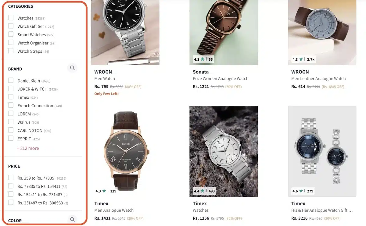
Filters and navigation drive the successful eCommerce experience. Once a customer gets to a PLP, they will want to quickly sort products by price or newest, or best-selling options, while also filtering by things such as color, size, brand, etc.
Some of the best practices for filters include:
- Place filters in a sidebar on the left, or a toolbar across the top, so they are easily accessed.
- Use checkboxes and sliders to provide as intuitive an interaction as possible.
- Allow for filters to update the results without needing to refresh the entire page.
- Provide a prominent “Clear All Filters” button to help users reset their search.
A simple to follow ‘filtering’ system will help to keep users engaged while reducing frustration, especially on mobile devices.
3. Use High-Quality Images with Consistent Size and Scale
Product imagery will be the first thing shoppers notice. When a shopper arrives on a PLP, they should see consistently styled product thumbnails, which should also be of high resolution and clear background. If all images are the same style, the user has an advantage of scanning things faster, and it builds trust around the brand.
Some other best practices for imagery include:
- Offer the ability to zoom or hover over images for more detail.
- Keep the aspect ratio of product images consistently to eliminate distracting spacing.
- Only use lifestyle imagery when it adds context and does not clutter a visual grid.
This uniformity in imagery will create a feeling of professionalism and help elevate the perceived value of the products.
4. Mobile-Friendly Design

With mobile devices driving over 60% of eCommerce traffic, product listing pages (PLPs) must be mobile-optimized from the beginning. Mobile-first means designing for small screens and scaling up for desktop. Not the other way around!
Key mobile considerations include:
- Tappable buttons and spacing should be designed so they’re friendly for a tap.
- If using a filter, stack filters into an accordion or slide-out menu (to minimize real estate).
- The size and contrast of text should be optimized for legibility for smaller displays.
- Critical actions (Add to Cart, Wishlist) should be easily accessible without much scrolling.
A mobile-first PLP will help accessibility and enable users to shop without friction, no matter which device they choose.
5. Surface Key Selling Points and Micro-Information
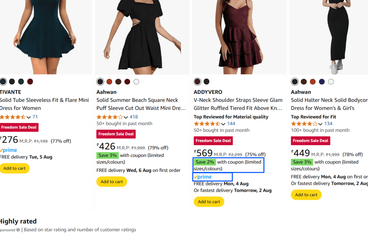
Shoppers shouldn’t have to click into every product to see if it’s right for them. PLPs should efficiently surface as much micro-information as possible, such as star ratings, badges (“New Arrival,” “On Sale”), and short feature blips.
Examples of lending economic value to micro-information include:
- Showing discount percentages.
- Limited stock alerts (for example, “Only 3 left!”).
- Prime badge or free shipping icons to aid quick recognition of benefits.
When you surface these cues up front, you help customers to shop faster and more confidently, and you minimize friction in their shopping journey.
Examples of Great Product Listing Pages
There are many lessons to be learned from leading eCommerce brands that will help you create better product listing pages (PLPs) inside your own store. Every brand below utilizes a different mix of usability, aesthetics, and conversions.
1. Amazon
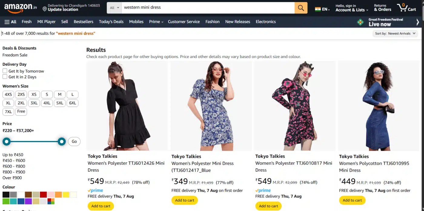
Amazon PLPs can be seen as the gold standard of eCommerce PLPs. Amazon PLPs sacrificed design for functionality and speed of execution. When you search for “wireless earbuds,” the PLP immediately displays hundreds of products, then presents filter options to narrow down the results in the left sidebar, and finally sorting options above the product grid.
What makes Amazon’s micro-information work so well is its micro-information approach. In the product tile, Amazon displays pricing (and discounts are indicated in green), ratings, the number of reviews, and Prime availability.
If the shopper decides to click on any one of the thousands of products, they can make well-informed decisions because Amazon provides the fundamental elements of product discovery in each product tile.
2. Zara
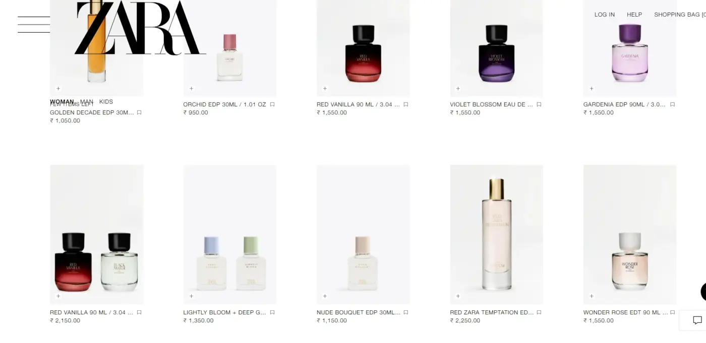
Zara goes the other route: minimalism in design and lifestyle photography. On PLPs, Zara clearly emphasizes large, minimalist product images with minimal text, allowing the image itself to do most of the talking without specifying a colour or size. Instead of including details with listings, Zara provides secondary images of different angles, colourways, or designs by using hover interactions.
Zara’s frameless carousel approach aligns well with its exploratory, fashion-forward brand approach for users looking for a gout of inspiration as opposed to strict detail.
Infinitely scrolling the PLP allows users to continue browsing without an indicator of their previous product next to them, and takes away the clutter of a typical online shopping experience. Browsing – almost like flipping through a fashion magazine.
3. Best Buy
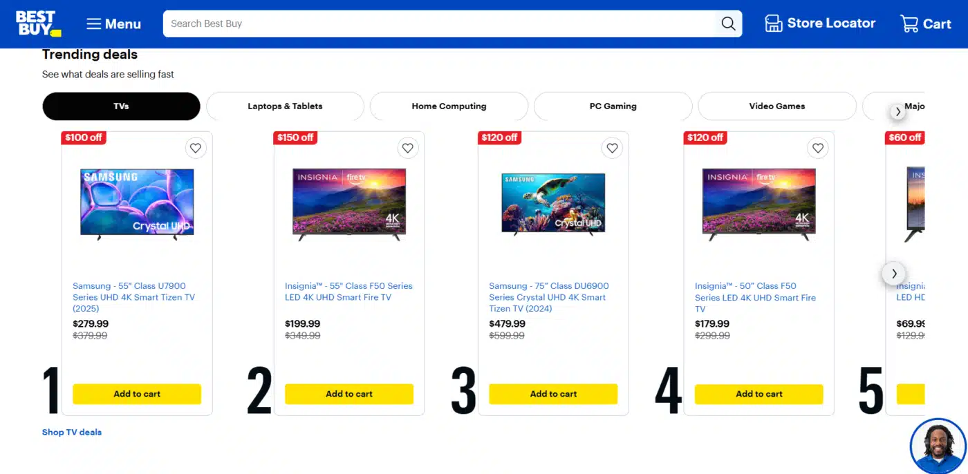
Best Buy’s PLP presents the perfect marriage of presenting credible technical details and usability features that serve the electronics shopper who wants a quick comparison page.
Best Buy’s product listings build credibility in the description section below, showing the key specs such as screen size, resolution, and storage capacity, and possibly saving the user from unnecessary clicks.
The layout elevated the important trust-building features: reviewed ratings, financing options, and stock availability. Best Buy also allowed “Compare” checkboxes down below the product detail, allowing users to pick a few products and generate a side-by-side comparison page to compare products – a powerful feature for the decision-heavy purchase.
4. IKEA
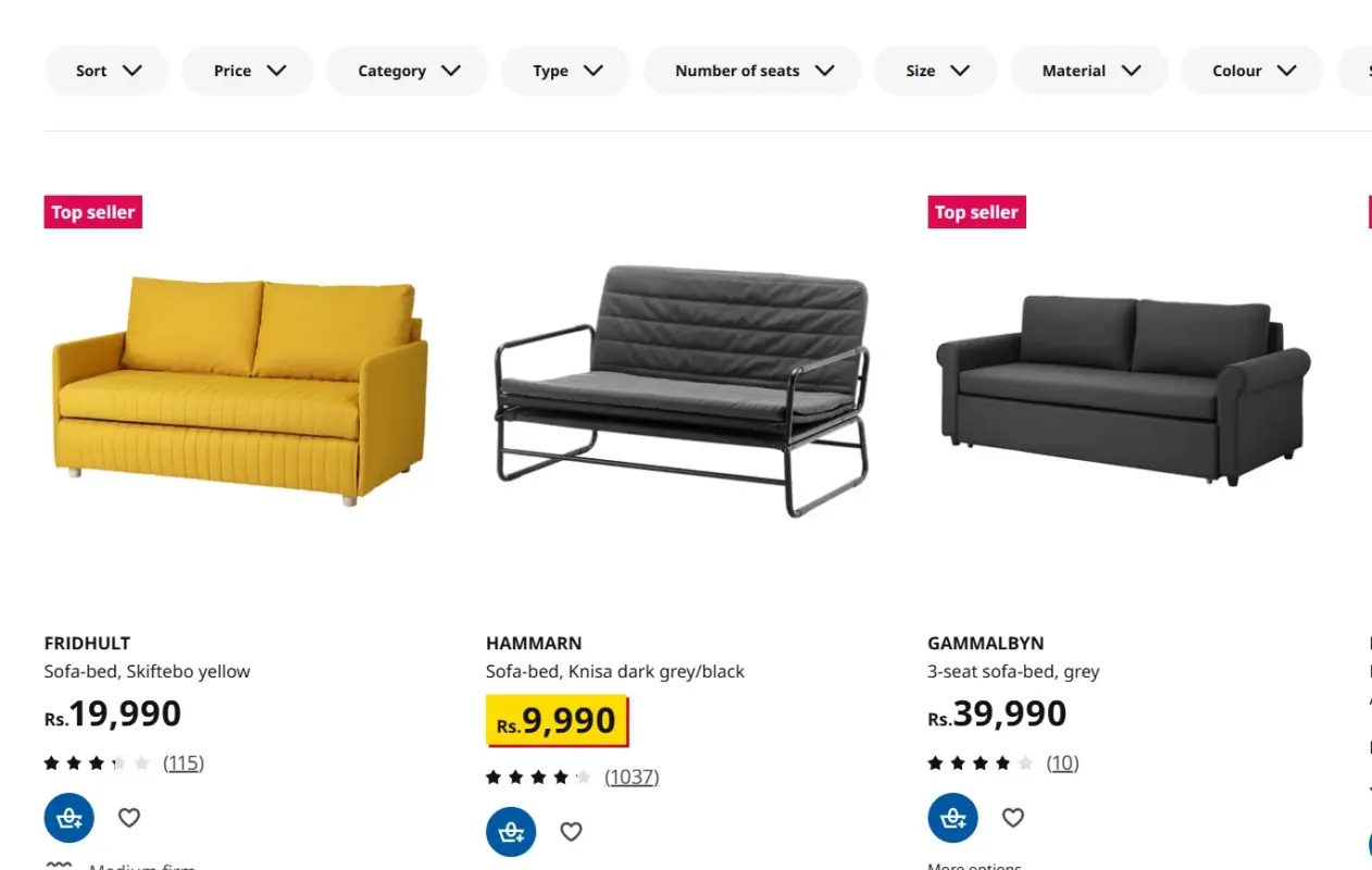
IKEA’s product listing pages (PLPs) consistently exhibit visual coherence and strong brand identity. Every image with a product showcases the brand’s trademark clean backgrounds, which gives the PLP an organized structure and easy-to-scan layout.
Beyond the imagery, IKEA has included clever touches like room inspiration setups – for example, a shopper browsing a chair category could view the chair staged in a full room layout, which encourages ideas for matching products.
IKEA’s PPLP also provides customer customization options (such as product color or size) in line with the listing; thus, customers do not have to click through to a product detail page. This is a small detail, but it lowers friction and reduces the path to checkout, which is especially valuable for high-volume categories like furniture.
Wrapping It Up
A Product Listing Page in eCommerce is not just another view of products; it is the point of transition from browsing to buying. In this guide, we have explored what is a product listing page in eCommerce, why that page is so important for user experience and conversions, what the page must include, and the best practices from some of the biggest brands in eCommerce, such as Amazon, Zara, Best Buy, and IKEA.
When executed right, a PLP’s purpose exceeds merely showing products. A PLP can help customers make the right purchase choice for you, while also establishing credibility and positively impacting SEO rankings. From having a distinct navigational function and filtering options to offering layouts with high-quality images and mobile-first features, the details should be precise.
If you are in the process of optimizing your eCommerce store, begin with how you are presenting your article. In particular, the PLPs. Reflect upon the following points:
- Are they easy to navigate and quick to use?
- Can users gather enough information to make an informed decision without having to click multiple times?
- Do they represent the style of your business and convert users?
Getting your PLP’s design right can have an excellent ROI, because this is typically the point at which customers make their decision to stay, explore, or buy. So get a PLP that will support and enhance your customer’s shopping journey, and ensure they do not forget your brand.
Frequently Asked Questions (FAQs)
Q1. What is a product listing page in eCommerce?
It’s a webpage that displays multiple products within a category or search result to help users browse and compare items quickly.
Q2. What’s the purpose of a PLP?
A PLP helps shoppers find relevant products efficiently and supports better navigation and conversions.
Q3. How is a PLP different from a product detail page?
A PLP shows many products; a product detail page focuses on one product’s features, specs, and buying options.
Q4. Are product listing pages important for SEO?
Yes, well-optimized PLPs can rank for high-intent keywords and attract organic traffic.
Q5. What should a PLP include?
It should feature images, titles, prices, filters, sorting options, and mobile responsiveness.
Ekta Lamba
Ekta Lamba is a tech writer at DevDiggers focused on making WordPress and WooCommerce straightforward for non-developers. She covers plugin errors, platform updates, and WordPress basics, written so readers can follow along without a second tab open to translate the jargon.
Join thousands of readers getting smarter every week.
Leave a Reply