


What should be the width of WordPress pages? Most sites work best with a container width between 1140px and 1200px.
That range covers about 80% of WordPress sites and matches the default in Astra, GeneratePress, and Elementor.
Getting this wrong is common. Widening a container just to “fill the screen” often shrinks product photos and stretches body text edge to edge.
Width is not one setting. It is three separate decisions: your container, your text column, and your image or product grid.
This guide covers the exact pixel ranges by site type, how to set width in Astra, Elementor and Gutenberg, plus the mistakes that quietly wreck a good design.
What Should Be the Width of WordPress Pages: The Quick Answer
For most WordPress sites, the container width should sit between 1140px and 1200px on desktop. This is the range used by default in Astra, GeneratePress, Kadence, and Elementor.
That said, “container width” and “text width” are not the same thing. Your container can hold a 1200px wide layout with columns, sidebars, and images. Your paragraph text should stay closer to 600px-800px. That narrower range is what gets read comfortably.
Quick way to remember: Pick the container width for your whole layout. Then let your theme’s typography settings handle the narrower text column inside it. Most modern themes already do this automatically through Gutenberg’s content width setting, which we will cover shortly.
If you only remember one number from this whole guide, remember 1200px for the container and 750px for body text. That combination works for the vast majority of WordPress sites without any custom CSS.
Why WordPress Page Width Matters?
Width affects readability, professionalism, and how long visitors stay on a page.
Line length matters most. When a line runs too long, the reader’s eyes travel further to find the next one, and that effort adds up fast.
Typography research points to 50-75 characters per line as the comfortable reading range. On screen, that translates to roughly 600px-800px of text width. WordPress.com’s guidance on content width reflects this same range.
A container that is too narrow looks unfinished on a large screen. Neither extreme helps your visitors.
Boxed vs Full-Width: What Is the Real Difference
A boxed layout keeps content inside a container with margins on both sides. A full-width layout stretches content across the entire browser with no margins.
| Aspect | Boxed | Full-Width |
|---|---|---|
| Margins | Visible margins on both sides | No side margins at all |
| Best For | Blogs, business sites, portfolios | Hero sections, landing pages, banners |
| Reading Experience | Comfortable line length, easy to read | Can feel overwhelming for long text |
| Visual Style | Framed, organized, professional | Bold, engaging, edge to edge |
Most well-built pages combine both like a full-width hero section and a boxed container for the text underneath. If you are converting a container to a column in WordPress, decide which parts should stay boxed first.
The Right WordPress Page Width by Site Type
Different site types need different widths. Blogs read best around 1100px-1200px. Business sites can stretch to 1280px. WooCommerce stores need 1280px-1400px for grids, paired with resizing images to match your content width. Portfolios can push past 1400px. See the table below.
| Site Type | Container Width | Text Column Width |
|---|---|---|
| Blog or editorial site | 1100px-1200px | 650px-750px |
| Business or corporate site | 1140px-1280px | 700px-800px |
| WooCommerce store | 1280px-1400px | 700px-800px |
| Portfolio or agency | 1300px-1600px | Varies by layout |
| Landing page | 1000px-1200px | 600px-700px |
How to Set Your Page Width in WordPress: Step-by-Step Guide
The exact steps depend on whether you are using a classic theme, a page builder, or a block theme with Gutenberg’s Full Site Editing.
Method1: Setting width in your theme customizer
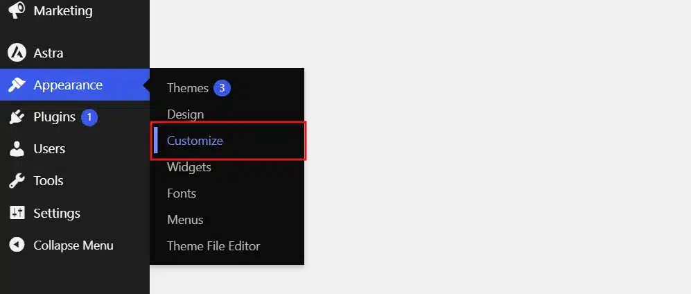
- Go to Appearance → Customize in your WordPress dashboard.
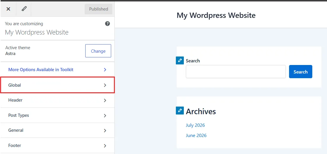
- Look for a section called Global Section.
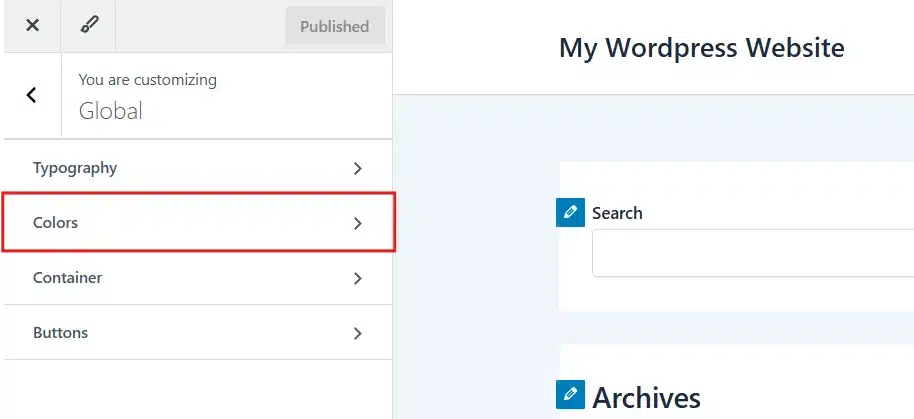
- Inside the Global Section, select the Container Tab.
- Inside the Container Section, Scroll to Container Width and enter your target pixel value.
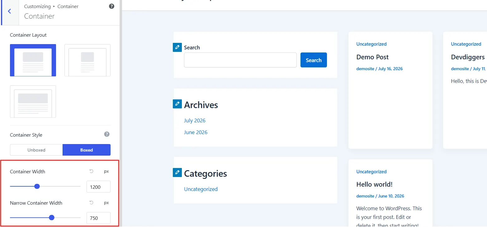
- After setting the target pixel value, publish the changes.
Note: The Block themes (like., Twenty-twenty-four etc.) don’t come with the Customize section. You need to install a Classic Theme like Astra, etc. to enable the option.
Method 2: Setting width in Elementor
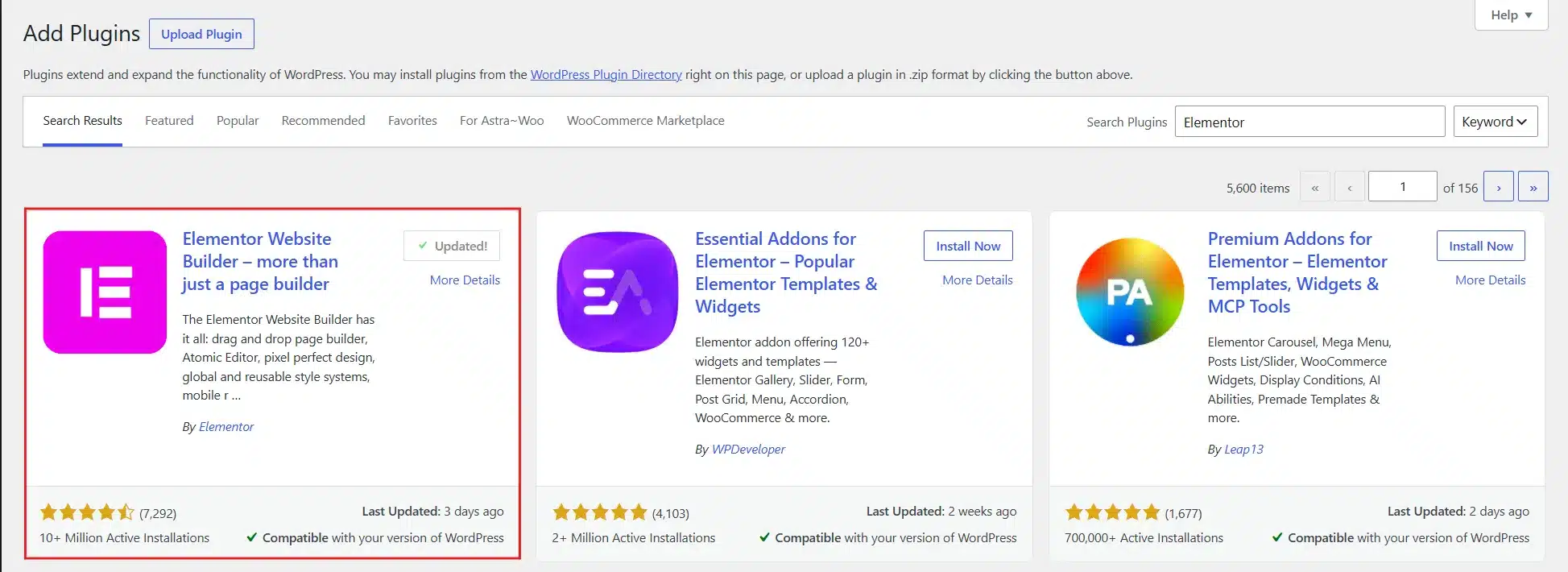
- Install and activate Elementor from the WordPress plugin directory.
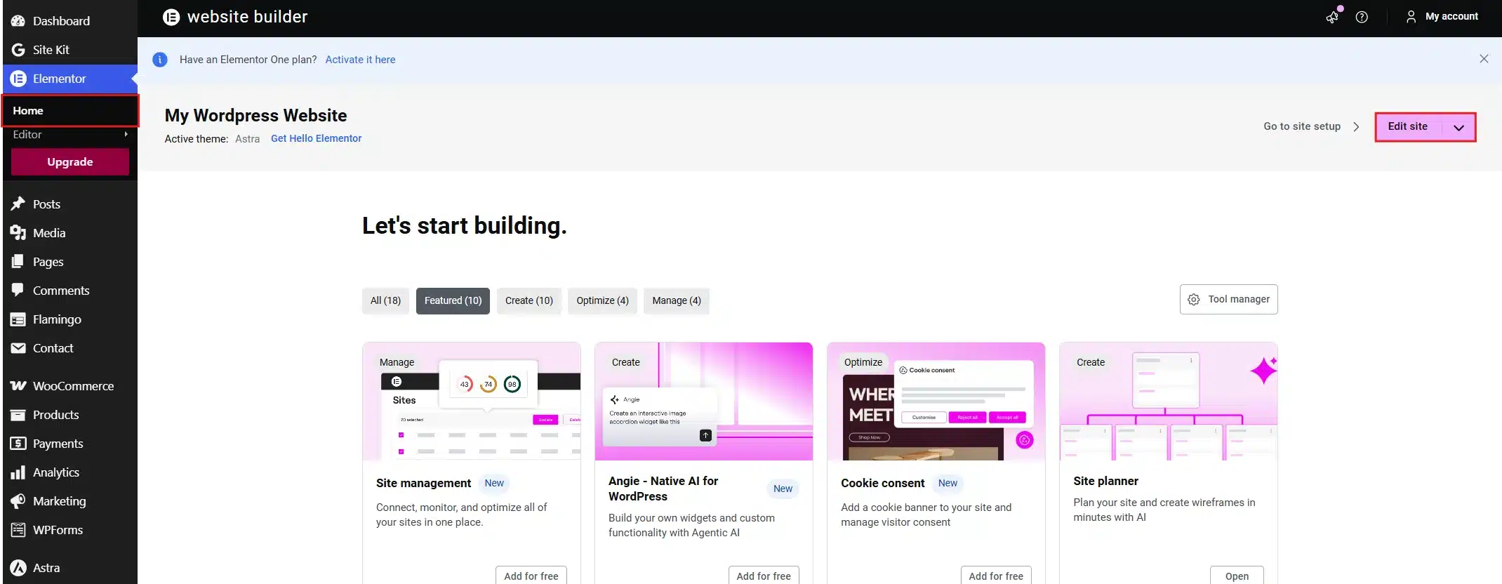
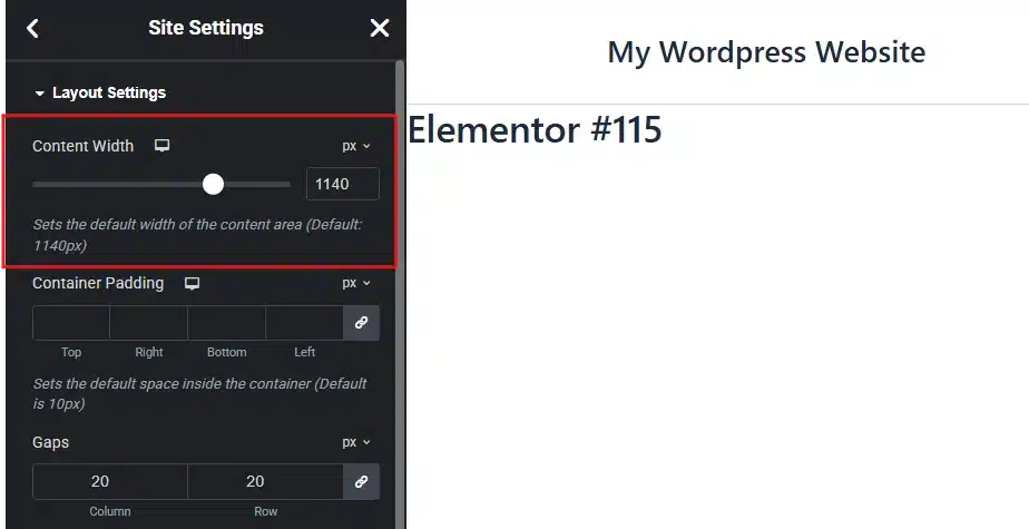
- Go to Elementor → Home → Edit Site to access Layout Options.
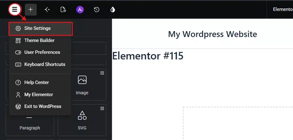
- Now, go to the Elementor icon → Site Settings.
- From the Settings Section, select the Layout tab.
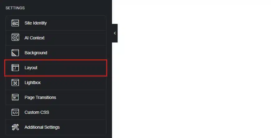
- Open the Content Width field and set your desired pixel value.
- After all, tap on Save Changes.
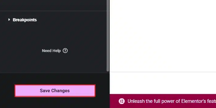
Elementor’s own help documentation confirms that containers can be set to full width directly from this same Layout tab. It is the fastest way to build a hero section without leaving your boxed layout for the rest of the page.
Method3: Setting width with custom CSS
If your theme does not expose a width setting, add this to Appearance, then Customize, then Additional CSS:
.site-container {
  max-width: 1200px;
  margin: 0 auto;
}
Always usemax-width, never a fixed width. A fixed width forces the exact pixel size even on a small phone screen, which causes horizontal scrolling. Max-width simply caps how large the container can grow, and it shrinks naturally on smaller screens.
If you are using a full site editing theme, width is controlled in the theme’s theme.json file rather than the Customizer. WordPress’s own theme developer handbook explains that this layout setting controls the width of the post content and related areas on the page. A typical entry looks like this:
"layout": {
  "contentSize": "750px",
  "wideSize": "1200px"
}
contentSize sets your default paragraph width. wideSize sets the width for blocks you deliberately mark as “wide,” like a large image or a full-bleed section.
Common WordPress Page Width Mistakes to Avoid
Five common mistakes quietly break an otherwise solid WordPress layout, and they usually come from repeated habits, not the “wrong” pixel number.
Stretching past 1600px hurts readability on large screens. Too narrow looks outdated on modern monitors. Skipping padding pushes content to the edge. Using fixed width instead of max-width breaks mobile.
The table below lists each problem next to its fix so you can check your own site in minutes.
| Problem | Solution |
|---|---|
| Container wider than 1600px | Cap it at 1200px to 1400px unless the design calls for full width |
| Container narrower than 1000px | Widen the container and keep only the text column narrow |
| No internal padding | Add 20px to 40px of padding inside the container |
| Fixed width instead of max-width | Replace width with max-width so the layout shrinks on mobile |
| No testing on real devices | Use responsive preview mode and check at least three screen sizes |
Use case Tip: If you run a WooCommerce store, apply these fixes to your product grid template first. Cart and checkout pages usually need width fixes the most.
Conclusion
There is no single correct number for WordPress page width, but there is a reliable starting point. Aim for a 1140px-1200px container for most sites, and narrow your text column to 650px-800px. Widen your container toward 1280px-1400px if you are running a WooCommerce store with product grids.
Set the width using your theme customizer, page builder, or theme.json. Always use max-width rather than a fixed value, and give your container some internal padding so nothing crowds the edges. Test the result on a few different screen sizes before you call it done.
If you would rather have this set up correctly the first time, DevDiggers offers WordPress development services. The team handles layout, width, and responsive design as part of a full build. For a wider look at layout decisions, our WordPress website structure guide covers navigation, hierarchy, and page organization too.
Frequently Asked Questions (FAQs)
Q1. What is a good container width for a WordPress website?
Most WordPress sites work well with a container between 1140px and 1200px on desktop. This matches the default used by popular themes like Astra, GeneratePress, and Kadence, and it holds up across most screen sizes without extra custom CSS.
Q2. Should I use width or max-width in CSS for my WordPress container?
Always use max-width. A fixed width value never shrinks, which causes horizontal scrolling on smaller screens. max-width caps the largest size your container can reach while still shrinking naturally on phones and tablets.
Q3. What is the difference between content width and wide width in Gutenberg?
Content width is the default size for regular blocks like paragraphs and headings, usually 650px to 800px. Wide width is a larger size, often 1000px to 1200px. It is reserved for blocks you specifically mark as wide, such as a large image.
Q4. Does WordPress page width affect SEO?
Page width has no direct SEO ranking factor. It does strongly affect user experience signals like time on page and bounce rate, which search engines factor in indirectly. A width that makes your content hard to read will hurt engagement even if it does not hurt your ranking directly.
Q5. What width should a WooCommerce store use?
WooCommerce stores generally perform better with a wider container, typically 1280px to 1400px. Product grids need that extra room to display images clearly without shrinking titles and prices into cramped, wrapped text.
Q6. Can I use a different width for mobile than desktop?
Yes, and you should. Modern WordPress themes handle this automatically through responsive breakpoints, shrinking your container as the screen gets smaller. You generally do not need to set a separate mobile width manually unless you are writing fully custom CSS.