
The standard website page width today is a content container of about 1200 to 1340 pixels, centered on the screen. Text inside it sits in a narrower column of 620 to 760 pixels so each line stays easy to read.
I checked this in October 2026 in two ways. I read the default widths straight from the code of seven popular WordPress themes. Then I measured what Twenty Twenty-Five rendered at five screen sizes on a WordPress 7.1.3 test site.
This guide gives you the numbers, the reasons behind them and the exact settings to change. It covers block themes, classic themes, page builders and custom CSS, plus the mistakes that make a page look cramped or stretched.
What Is the Standard Website Page Width?
The standard website page width is a container of 1200 to 1340 pixels for the layout and 620 to 760 pixels for body text. All seven WordPress themes I checked use a layout width in that range. Wider screens simply show more empty space on the sides.
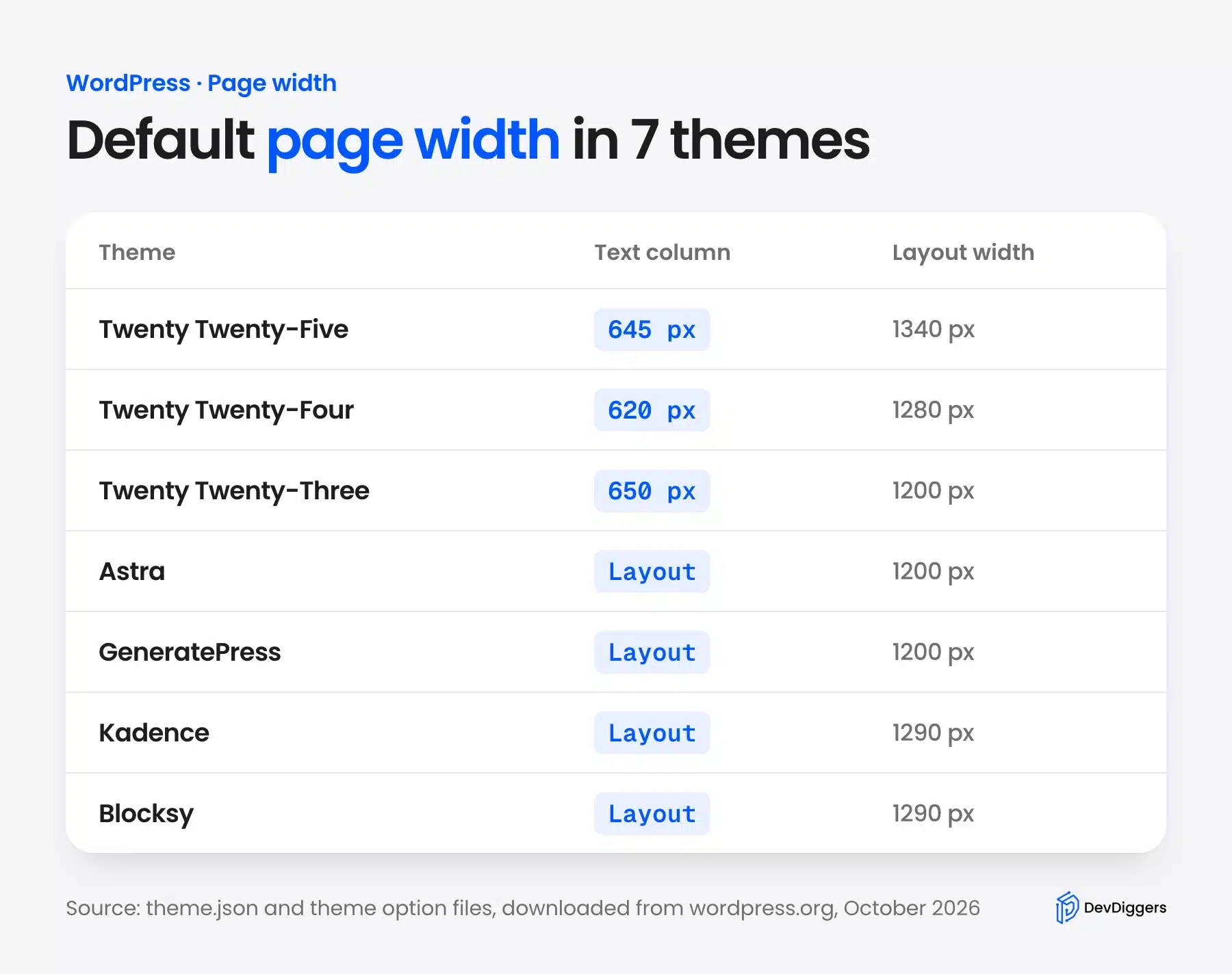
Here is what each theme sets by default, read from the theme files:
| Theme | Text column | Layout width |
|---|---|---|
| Twenty Twenty-Five 1.x | 645 px | 1340 px |
| Twenty Twenty-Four 1.6 | 620 px | 1280 px |
| Twenty Twenty-Three 1.7 | 650 px | 1200 px |
| Astra 4.14 | Set by the layout | 1200 px |
| GeneratePress 3.6 | Set by the layout | 1200 px |
| Kadence 1.5 | Set by the layout | 1290 px |
| Blocksy 2.1 | Set by the layout | 1290 px |
The block themes store these as contentSize and wideSize in theme.json. Astra stores site-content-width, GeneratePress container_width, Kadence content_width and Blocksy maxSiteWidth.
These are only defaults. Every one of them can be changed in the theme settings, as shown later in this guide.
Why the Ideal Website Width Is Narrower Than the Screen
The ideal website width for reading is set by line length rather than screen size. Lines of about 50 to 75 characters are the easiest to read, and a wider column makes the eye lose its place. That is why themes cap the text column even on a 4K monitor.
I measured the text in Twenty Twenty-Five on my test site. At its 645 pixel column and 22 pixel font, each line held about 61 characters, right in the comfortable range.
The W3C readability guidance in WCAG 2.2 asks for blocks of text no wider than 80 characters. A column wider than that fails the guideline for users who need it.
Screen data points the same way. StatCounter’s desktop screen data lists 1920 and 1366 pixels among the most common widths. A 1200 to 1340 pixel container fits both with room for margins.
How WordPress Page Width Works in Block Themes
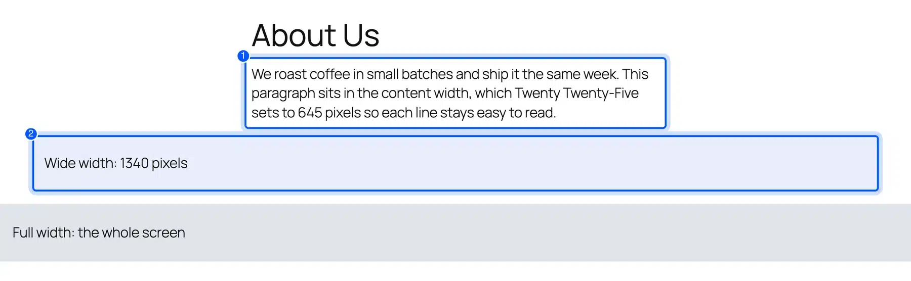
WordPress page width in a block theme has three levels: content width, wide width and full width. Content width holds normal text, wide width is for images and groups set to Wide, and full width spans the whole screen. Each block picks its level from the alignment toolbar.
I placed one block of each kind on a test page and measured them at five screen widths:
| Screen width | Content | Wide | Full |
|---|---|---|---|
| 1920 px | 645 px | 1340 px | 1920 px |
| 1440 px | 645 px | 1340 px | 1440 px |
| 1366 px | 645 px | 1266 px | 1366 px |
| 768 px | 645 px | 691 px | 768 px |
| 390 px | 330 px | 330 px | 390 px |
The pattern is simple. Content and wide widths are maximums. They shrink on smaller screens and never stretch past the setting.
On a 390 pixel phone, every level collapsed to the screen minus the side padding. The font also dropped from 22 to about 18 pixels, because Twenty Twenty-Five uses fluid type.
The theme.json layout reference documents contentSize and wideSize and how blocks use them.
What Happens When the Text Column Gets Wider
To see where the readable limit sits, I widened the Twenty Twenty-Five text column on the test page and counted the characters per line. The font stayed at 22 pixels for every run.
| Content width | Characters per line | Readable? |
|---|---|---|
| 645 px (default) | 61 | Yes |
| 760 px | 73 | Yes, at the upper edge |
| 900 px | 86 | No, past the 80 character limit |
| 1100 px | 105 | No |
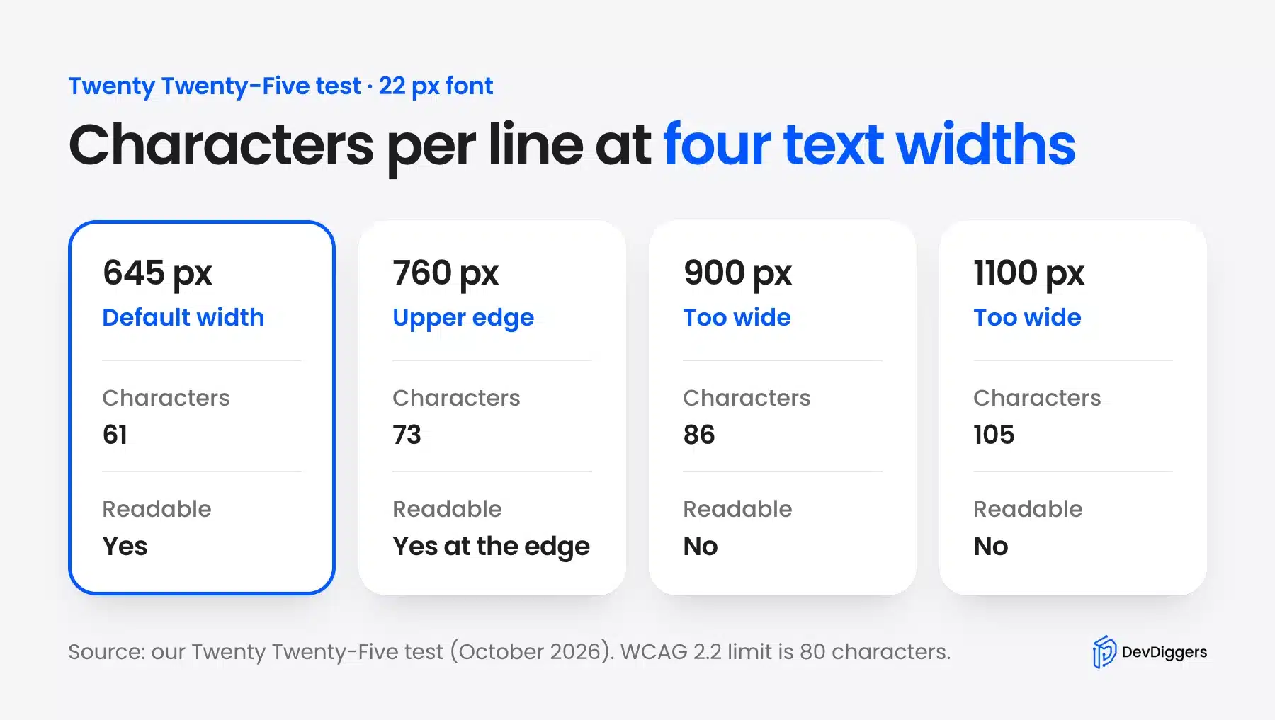
The jump is steep. Each extra 100 pixels added about 9 or 10 characters to every line at this font size.
So a content width of up to about 760 pixels is safe with a 22 pixel font. Smaller fonts fit more characters into the same width. Drop the column a little if your theme uses 16 or 18 pixel body text.
How to Change Page Width in a Block Theme
To change page width in a block theme, open Appearance > Editor > Styles > Layout. Set Content width for text and Wide width for wide blocks and then click Save. The change applies to every page and post that uses the theme’s default layout.
Follow these steps:
- Go to Appearance > Editor.
- Click Styles and then the Layout panel.
- Change Content width and Wide width to the pixel values you want.
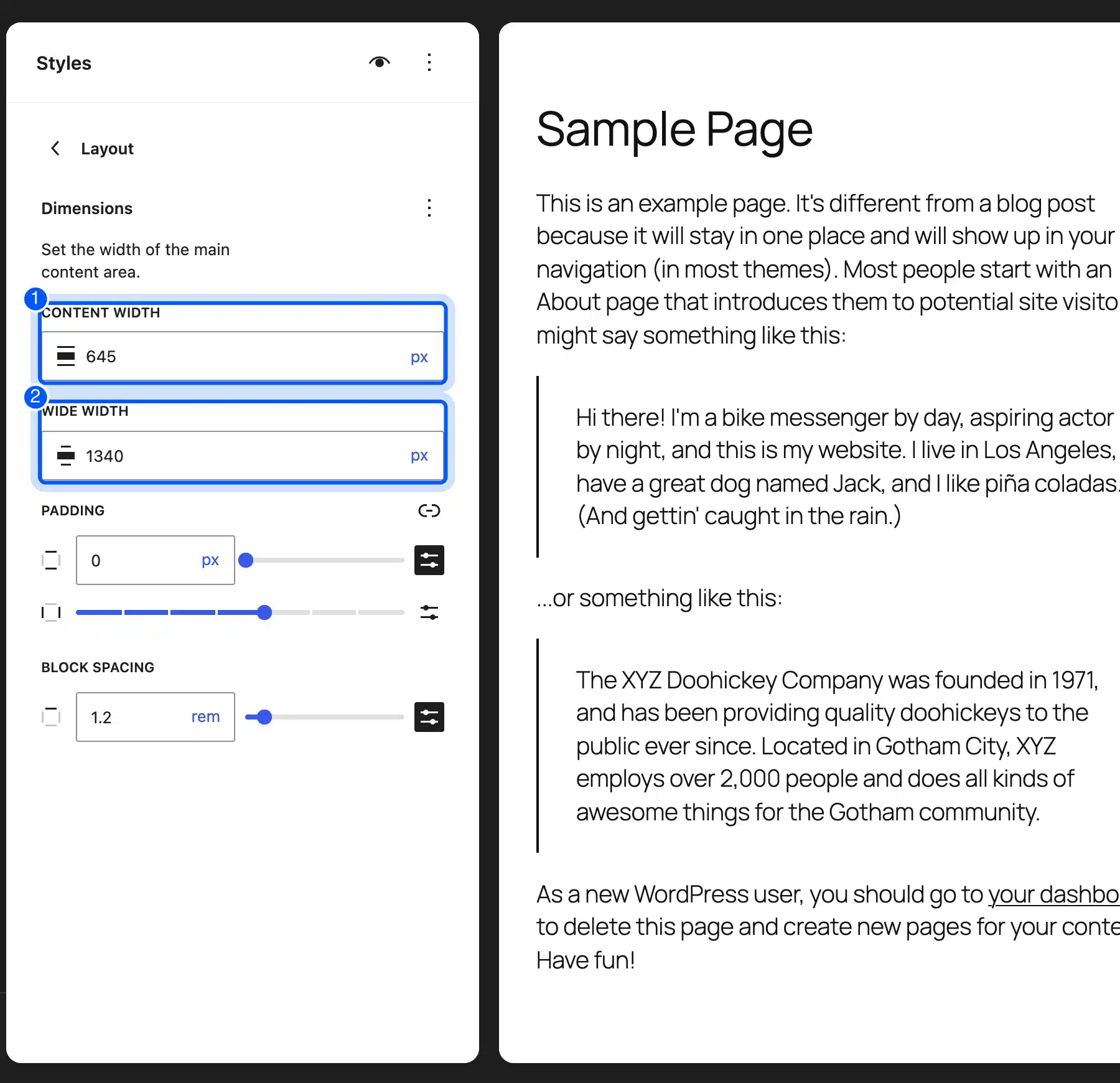
- Check the preview on the right and then click Save.
Change one value at a time and check a long post and a page with images. A content width above 760 pixels makes text lines too long at normal font sizes.
You can also set a width on one group block without touching the whole site. Select the group, open its settings and turn off Inner blocks use content width and then set your own width.
How to Change Page Width in a Classic Theme
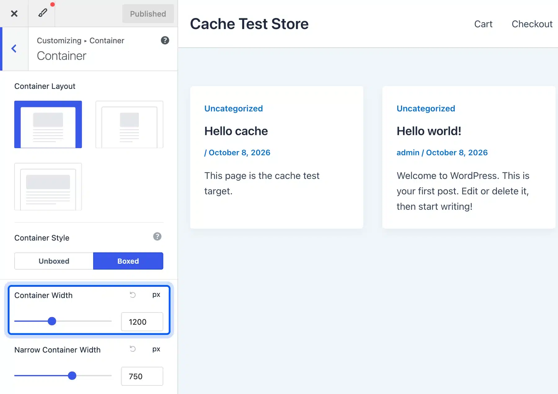
Classic themes set page width in the Customizer or their own options panel. In Astra, GeneratePress, Kadence and Blocksy the setting is called container or content width. Change it there instead of editing theme files. The setting then survives theme updates.
Here is where to find it in each theme:
- Astra: Appearance > Customize > Global > Container > Container Width.
- GeneratePress: Appearance > Customize > Layout > Container > Container Width.
- Kadence: Appearance > Customize > General > Layout > Content Max Width.
- Blocksy: Appearance > Customize > General > Layout > Maximum Site Width.
A sidebar changes the math. In a 1200 pixel container with a 300 pixel sidebar and a 40 pixel gap, the main column is about 860 pixels. That is wider than the readable range at a 16 pixel font. Many themes shrink the sidebar or the font on posts.
Check the real column width in your browser. Right click a paragraph, choose Inspect and read the width shown for the element.
Most of these themes also have a narrow layout option for single posts. Use it for long articles so the text column stays near 700 pixels while pages use the full container.
How to Set Page Width With a Page Builder
Page builders have their own width setting that overrides the theme for pages they build. In Elementor it is Site Settings > Layout > Content Width, which defaults to 1140 pixels. Set it once there and every new section uses it.
Elementor’s default of 1140 pixels is a little narrower than most themes. If your theme uses 1200 pixels, headers and footers from the theme will not line up with Elementor sections. Match the two values to fix it.
Elementor also has a Container type that replaced the older Section and Column blocks. A container set to Boxed uses the site width above, while Full Width ignores it.
Each section or container can also have its own width. Use Boxed for normal content and Full Width for hero banners and colored bands.
The Elementor site settings documentation lists the layout options and their defaults.
How to Set Page Width With Custom CSS
Use custom CSS only when the theme has no width setting. Set max-width on the container and never a fixed width. That way it shrinks on small screens. Add the code under Appearance > Customize > Additional CSS or in a child theme.
Here is a safe pattern for a classic theme:
.site-content,
.entry-content {
	max-width: 1200px;
	margin-left: auto;
	margin-right: auto;
	padding-left: 20px;
	padding-right: 20px;
}

.entry-content p {
	max-width: 72ch;
}
The 72ch value caps paragraphs at about 72 characters at any font size. The class names differ between themes. Inspect the page in your browser first to find the right one.
Test the result at a phone width before you save. The padding rules keep text off the screen edges when the container is narrower than 1200 pixels.
For a block theme, change the values in Styles instead of writing CSS. A CSS override fights the theme’s own layout rules and breaks when the theme updates.
How Big Is a WordPress Page?
People who ask how big is WordPress usually mean one of two things: how wide a page is, or how heavy it is. Width is covered above. The average content size of a WordPress page in bytes depends on images and plugins far more than on WordPress itself.
The HTTP Archive page weight report tracks the median web page at around 2 to 3 MB, and images make up the largest share. Width and weight are linked through images, because a wider layout invites bigger images.
Size images to the layout. In a 645 pixel text column, an image wider than about 1300 pixels adds weight without adding sharpness, even on a high resolution screen.
WordPress helps here on its own. It creates several sizes of each upload and lets the browser pick one that fits the column.
Common Page Width Mistakes to Avoid
Most width problems come from one of five mistakes, and each one is quick to fix. The biggest is setting a text column so wide that lines run past 90 characters. The others are fixed widths, mismatched containers, missing side padding and oversized images.
Watch for these:
- Text too wide: Keep body text near 600 to 760 pixels.
- Fixed width: Use
max-width, becausewidthcauses side scrolling on phones. - Mismatched containers: Match the theme and page builder widths so edges line up.
- No side padding: Leave at least 16 to 20 pixels on each side on mobile.
- Oversized images: Upload images near twice the column width instead of 6000 pixel originals.
Full width hero sections need care too. A headline stretched across a 1920 pixel screen is hard to scan. Keep hero text inside the content or wide width, even when the background runs edge to edge.
A website that changes width from page to page also feels unfinished. Pick one container width and use it everywhere.
How Page Width Affects Speed and Support
Page width changes how much work the browser does and how much data visitors download. Wider layouts often load bigger images and more columns, which adds weight. Keeping one consistent width also makes the site easier to maintain over time.
A wider layout can tempt you to add sidebars and extra blocks. Check the font size before you widen anything, because a bigger font fits fewer characters on each line. Our guide on how to change font size in WordPress shows where to set it.
Theme updates can also reset or change layout defaults. A WordPress care plan usually includes checking pages after updates, which catches a changed container before visitors do.
If you work on a classic theme’s templates, knowing what index.php does in WordPress helps you find where the main container is printed.
Conclusion
The standard website page width is a container of 1200 to 1340 pixels with a text column of about 620 to 760 pixels. That is what all seven themes I checked use, and it keeps lines near the readable 50 to 75 characters.
In a block theme, change it under Styles > Layout. In a classic theme or page builder, use its container width setting and match the two so edges line up.
Use max-width in any custom CSS and size images to the column. Then check a long post on a phone and a wide screen before you call it done.
Frequently Asked Questions (FAQs)
Q1. What is a good container width for a WordPress website?
1200 to 1340 pixels works for most sites. Twenty Twenty-Five uses 1340 pixels, Twenty Twenty-Three 1200 pixels, and Astra and GeneratePress 1200 pixels by default.
Q2. What is the best width for blog post text?
About 620 to 760 pixels, which gives 50 to 75 characters per line at normal font sizes. Twenty Twenty-Five uses 645 pixels, which held about 61 characters per line in my test.
Q3. Should I use width or max-width in CSS?
Use max-width. It lets the container shrink on small screens, while a fixed width forces sideways scrolling on phones.
Q4. What is the difference between content width and wide width?
Content width is the column for normal text and blocks. Wide width is the larger size used by blocks set to Wide alignment, such as images and groups. Full width spans the whole screen.
Q5. Does page width affect SEO?
Not directly. Google cares whether the page works on mobile and loads fast. A sensible width helps both by avoiding sideways scrolling and keeping images at a reasonable size.
Q6. What width should a WooCommerce store use?
Use the same container as the rest of the site, usually 1200 to 1340 pixels. Shop grids with three or four columns fit well in that range, and product descriptions read best in a narrower column.