12 Best WordPress Fonts You Did Not Know You Needed
Choosing the right font for your WordPress site can make or break your website’s appeal. Typography plays a significant role in user experience, enhancing readability, setting the tone, and creating a lasting impression.
In this blog, we will explore the 12 best WordPress fonts you did not know you needed in 2025 and explain why they stand out.
Whether you’re running a blog, an eCommerce site, or a portfolio, the right fonts can elevate your design and align with your branding goals.
Let’s delve into this curated list!
Table of Contents
Why Fonts Matter for WordPress Sites?
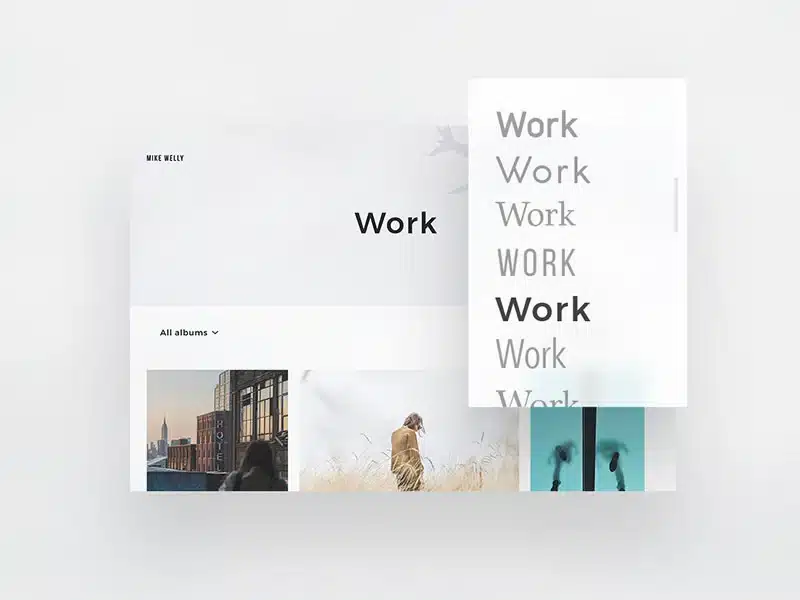
Before diving into the best fonts, it’s essential to understand why typography is so crucial:
- First Impressions: Fonts are often the first thing visitors notice, setting the tone for your content.
- Readability: Clear and well-chosen fonts improve readability, keeping readers engaged.
- SEO Impact: Fast-loading and web-safe fonts can slightly enhance your SEO by improving site performance.
- Brand Identity: Fonts reflect your brand’s personality and values, from playful to professional.
How to Choose the Right WordPress Font
When selecting typefaces, consider the following factors:
- Audience: Understand your intended audience’s needs.
- Objective: Match the typeface to the purpose of your website. For instance, a fashion blog would like beautiful scripts, while a computer blog may prefer clean, modern typefaces.
- Compatibility: Ensure that your typefaces are compatible across different devices and browsers.
- Performance: Web fonts should load quickly to avoid slowing down your site.
12 Best WordPress Fonts You Did Not Know You Needed
| Font Name | Category | Styles Available | Characteristics | Best Use Cases |
|---|---|---|---|---|
| Lora | Serif | Regular, Italic, Bold | Modern, versatile, readable on all devices | Blogs, long-form content, storytelling |
| Work Sans | Sans-Serif | Thin, Regular, Bold, Extra-Bold | Clean, minimalistic, professional | Tech blogs, portfolios, corporate sites |
| Playfair Display | Serif | Regular, Italic, Bold | Sophisticated, high-contrast, elegant | Fashion sites, luxury brands, lifestyle blogs |
| Poppins | Sans-Serif | Light, Regular, Medium, Bold | Geometric, bold, modern | Navigation menus, banners, modern WordPress themes |
| Roboto Slab | Slab-Serif | Regular, Medium, Bold | Clean, contemporary, easy-to-read | Data-heavy websites, professional blogs |
| Quicksand | Sans-Serif | Light, Regular, Bold | Rounded edges, friendly, approachable | Personal blogs, creative projects |
| Raleway | Sans-Serif | Light, Regular, Medium, Bold | Elegant, stylish ligatures, versatile | Creative agencies, portfolio websites |
| Bitter | Serif | Regular, Medium, Bold | Digital-first design, excellent readability | Content-heavy blogs, educational sites |
| Source Sans Pro | Sans-Serif | Regular, Light, Semi-Bold, Bold | Reliable, professional, crisp | Business websites, multilingual projects |
| Nunito | Rounded Sans-Serif | Light, Regular, Bold, Extra-Bold | Balanced, professional, calming | Corporate sites, business presentations |
| Abril Fatface | Display (Serif) | Regular, Bold | Dramatic, bold, eye-catching | Hero sections, creative portfolios, statement designs |
| Oswald | Gothic Sans-Serif | Regular, Light, Semi-Bold, Bold | Strong, impactful, reimagined Gothic style | Tech startups, edgy branding, dynamic layouts |
Detailed Explanation of these 12 Best WordPress Fonts
Fonts are more than just letters on a screen; they tell your brand’s personality and impact your website’s usability.
Below, we explore the 12 best WordPress fonts you did not know you needed, with in-depth details on their characteristics, strengths, and ideal use cases.
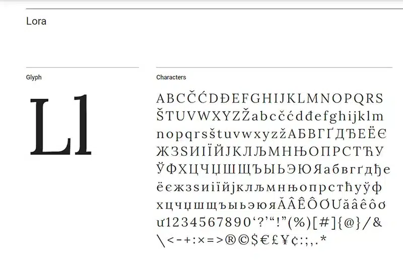
1. Lora
- Category: Serif
- About: The Lora serif has a traditional feel combined with a contemporary touch. It is highly fit for long content reading. Perfect for blogs, storytelling websites, and editorial layouts.
- Features:
- It has elegant strokes with a hint of calligraphy.
- Makes for both body text and header.
- Very readable on screens.
- Best Use Cases: For personal blogs, news, and lifestyle websites that need a professional yet approachable tone.
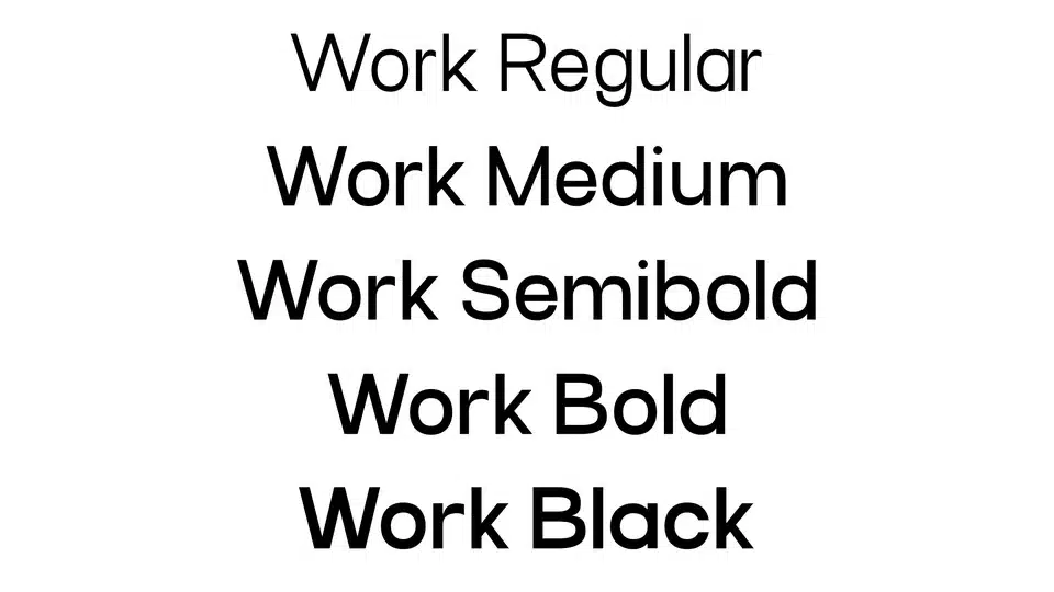
2. Work Sans
- Category: Sans-Serif
- Description: Clean, simple lines: Work Sans draws from the first awkward sans-serif fonts but is tailored for modern applications. This font best suits organizations and companies that resonate with minimalism and efficiency.
- Features:
- Available in nine different weights, ranging from Thin to Black.
- Minimalistic yet versatile.
- Optimized for digital platforms.
- Best Use Cases: Portfolios, tech blogs, and websites of SaaS companies.
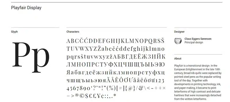
3. Playfair Display
- Category: Serif
- Overview: With its high contrast and elegant curves, Playfair Display brings sophistication and luxury to your site. It’s best for sites that need a touch of class and refinement.
- Features:
- Excellent for large-sized text-like headlines.
- Pairs well with minimalist sans-serif fonts like Open Sans.
- Dramatic and eye-catching.
- Best Use Cases: Fashion blogs, high-end product showcases, and wedding websites.
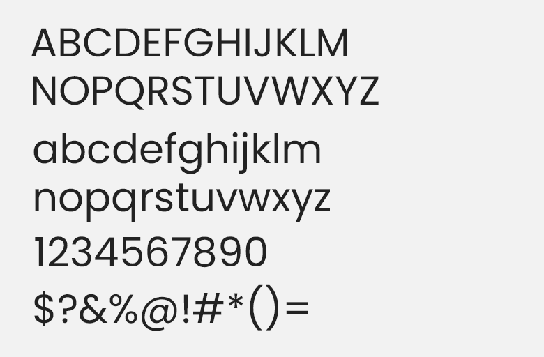
4. Poppins
- Category: Sans-Serif
- Overview: Poppins is a geometric sans-serif font that radiates modernity and boldness. It’s ideal for websites requiring a clean and dynamic feel.
- Features:
- Offers support for multiple languages.
- Bold weights make it suitable for headlines and CTAs.
- Uniform letterforms for a balanced appearance.
- Best Use Cases: Ecommerce sites, banners, and hero sections.
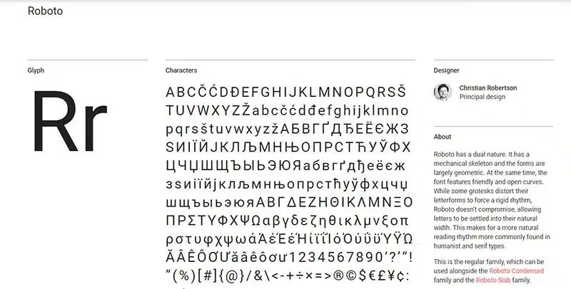
5. Roboto Slab
- Category: Slab-Serif
- Description: One of the favourites of slab-serif cousins, the popular Roboto font, is Roboto Slab. It’s contemporary as well as robust, and it assumes the readability of serif fonts and the simplicity of modern designs.
- Features:
- Sans-serif combination: Roboto and Lato
- Headings to the Body text
- Basic slab-serif design
- Best Use Cases: Analytical and data-driven content on blog sites, professional services, and legal websites.
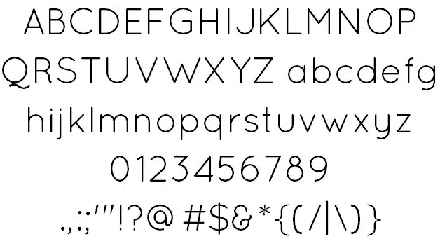
6. Quicksand
- Category: Sans-Serif
- Overview: Known for its rounded edges and approachable look, Quicksand is a friendly, quirky font that’s highly readable. It exudes creativity and fun, making it perfect for informal designs.
- Features:
- Ideal for smaller text sizes.
- Creates a casual and playful vibe.
- Lightweight and soft design.
- Best Use Cases: Creative portfolios, personal blogs, and children-focused websites.
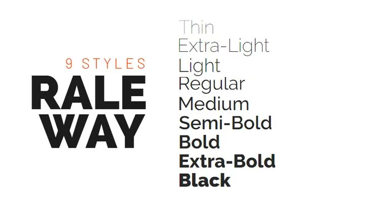
7. Raleway
- Category: Sans-Serif
- Overview: Raleway is a versatile, elegant, and stylish font, suitable both for formal and creative applications. It includes alternate characters and ligatures.
- Features:
- It has several weights that are used for different purposes.
- It is ideal for minimalistic, clean layouts.
- Thin and light design.
- Best Use Cases: Creative agencies, photography portfolios, and startup landing pages.
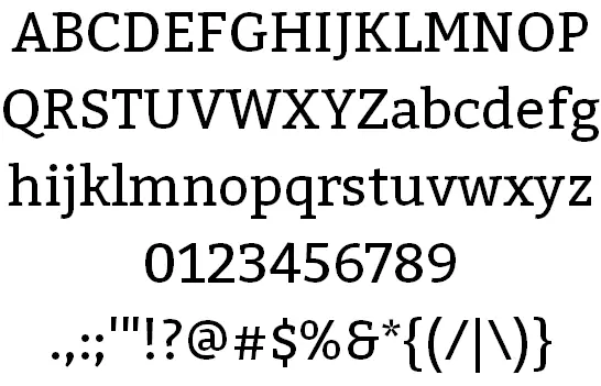
8. Bitter
- Category: Serif
- Bitter is a digital font That provides clear readability without loss of style. It is a strong contender for content-rich websites.
- Features:
- Excellent for long articles
- Combs well with sans-serif
- Clean serif with a modern twist
- Best use cases: Educational platforms, research blogs, and academic websites.
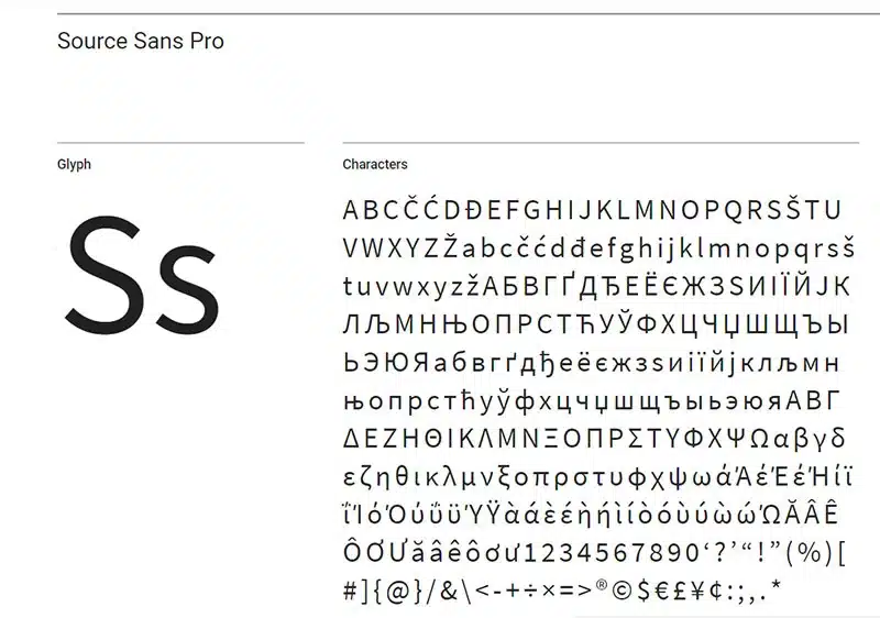
9. Source Sans Pro
- Category: Sans-Serif
- Overview: Adobe’s first open-source font, Source Sans Pro, is reliable, professional, and highly legible. It’s designed for a wide range of applications and supports multiple languages.
- Features:
- Simple yet authoritative design.
- Wide character support for global audiences.
- Highly versatile with multiple weights.
- Best Use Cases: Corporate websites, multilingual blogs, and business portfolios.
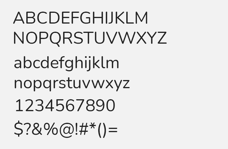
10. Nunito
- Category: Rounded Sans-Serif
- Overview: A rounded sans-serif font with a balanced and friendly look. Nunito is versatile and works for both headings and body text.
- Features:
- Offers a wide range of weights.
- Works beautifully in modern designs.
- Balanced letterforms for a calming aesthetic.
- Best Use Cases: Corporate blogs, presentations, and NGO websites.
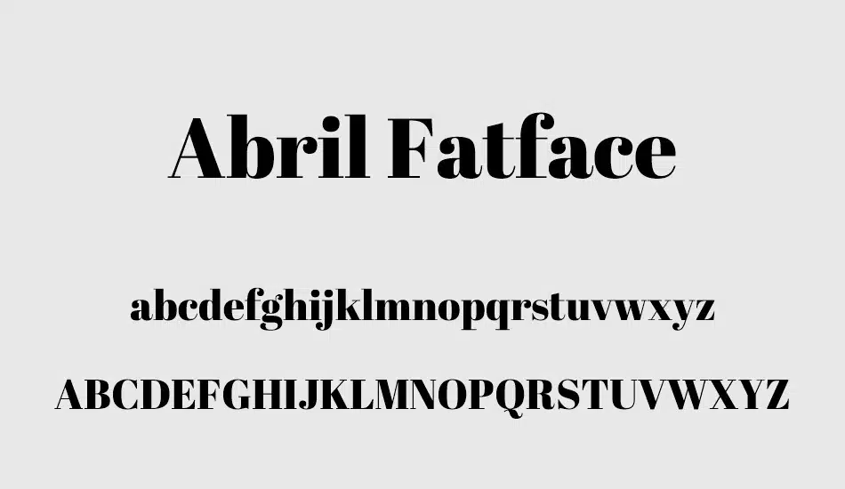
11. Abril Fatface
- Category: Display Serif
- Overview: Abril Fatface is a bold and dramatic serif font that’s designed to grab attention. It’s perfect for impactful headlines and hero sections.
- Features:
- Creates a sense of luxury and authority.
- Best used sparingly for maximum impact.
- High contrast strokes.
- Best Use Cases: Hero sections, magazine-style websites, and creative branding.
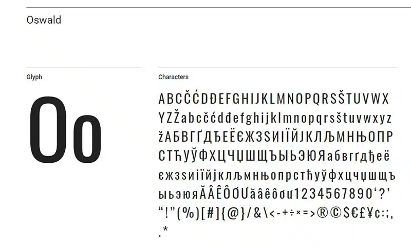
12. Oswald
- Category: Gothic Sans-Serif
- Overview: A reimagined version of classic Gothic fonts, Oswald is strong, impactful, and versatile. It’s ideal for modern and edgy designs.
- Features:
- Condensed letterforms for a bold look.
- It works well for headers and subheadings.
- Strong visual presence.
- Best Use Cases: Tech startups, sports websites, and modern corporate designs.
Final Thoughts
Fonts are not just a design element but are very important in how users interact with and perceive your WordPress website.
Typography, if chosen correctly, can enhance readability, create your brand identity, and improve the overall user experience.
The 12 Best WordPress Fonts You Never Knew You Needed feature a great mix of varied styles – including elegant serif options like Playfair Display and modern sans-serifs like Poppins.
This means that no matter what form your blog, website, or creative portfolio may take, these fonts will provide you with the range and aesthetic you need.
Experiment with a few different font pairings, sizes, and styles, then put together something unique and effective.
Integrate the right fonts in your WordPress site not only to leave an impact but also to maximize functionality and aesthetic appeal of your content.
Make the right choices and see your website come alive as a truly attractive and professional digital space!
FAQs
What is the importance of choosing the right font for a WordPress site?
Fonts impact readability, user experience, and how your brand is perceived. The right font ensures your content is engaging and visually appealing.
Can I use multiple fonts on my WordPress site?
Yes, but using no more than two or three complementary fonts is recommended to maintain a clean and cohesive design.
Are these fonts free to use?
Most of the fonts listed, like Lora, Poppins, and Roboto Slab, are free on platforms like Google Fonts. Always check the licensing details before use.
How do I add these fonts to my WordPress site?
You can add fonts using a WordPress plugin like Google Fonts Typography or by embedding them manually via the Google Fonts API.
What font pairings work well for websites?
Pair serif fonts like Playfair Display with sans-serif fonts like Poppins or Roboto for a balanced and professional look.

