
Picking the best WordPress fonts does not need fifty tabs and a headache. It comes down to a short list of fonts that read well, load fast, and match your brand.
This guide covers 12 fonts that hold up on a real WordPress site, not just in a font preview. Each one gets a quick look at what it is best for, how many sites already use it, and how many weights you get.
That last detail matters. A font with only two weights limits what you can do with headings, emphasis, and hierarchy.
By the end, you will have a short, confident shortlist instead of another browser tab full of maybes.
Why the Right Font Matters for a WordPress Site
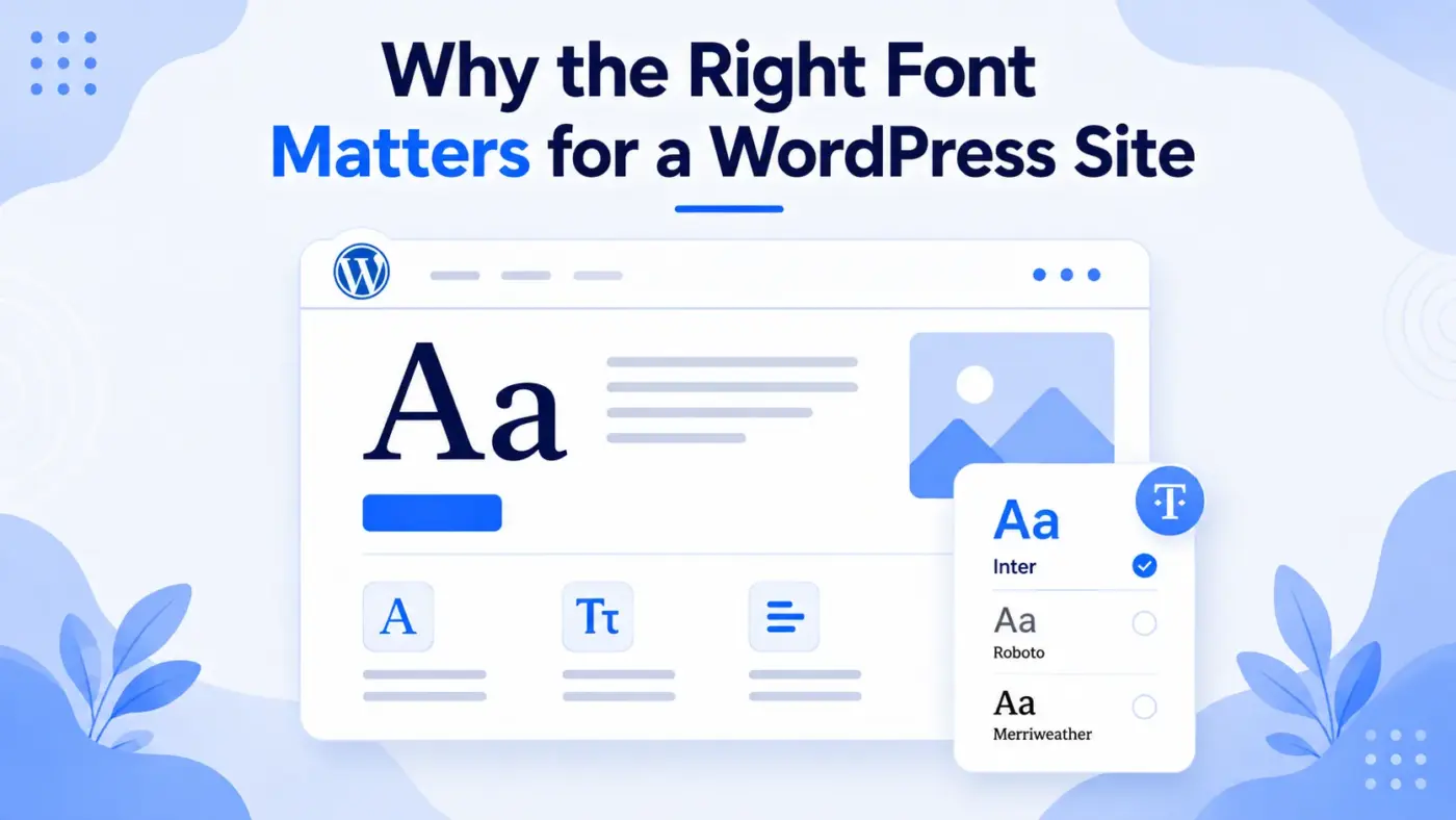
Font choice is not just decoration. It changes how long people stay on a page and how much they trust what they read.
UX research from Nielsen Norman Group estimates that typography drives around 55% of a website’s first impression, formed in less than 50 milliseconds. That split-second judgment happens before anyone reads a single word of your content.
A clean, well-loaded font also helps your Core Web Vitals scores, since Google treats page experience as a ranking signal. A heavy, poorly loaded font can undo good writing before a reader gets past the headline.
Pick well once, and the font disappears into the reading. That is the whole goal.
12 Best WordPress Fonts: Detailed Overview
Here’s the detailed overview of all the best fonts for your Website:
1. Inter
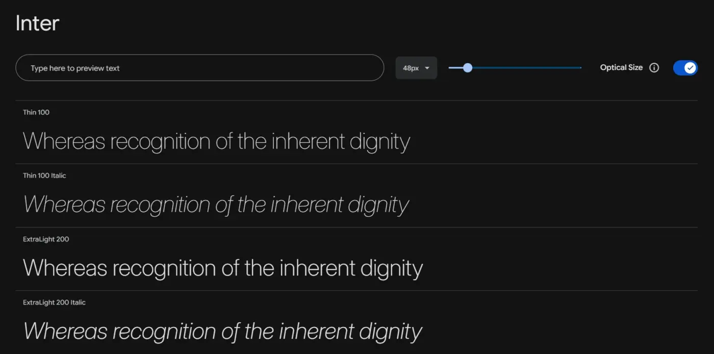
Inter is a sans-serif built specifically for screens, with a tall x-height and open letterforms that stay crisp even at small sizes. Designed originally for a major design tool’s own interface, it has become the default body font for countless SaaS products and modern WordPress sites. It is a variable font, so one file covers every weight from thin to black.
- Used in: 414 billion Google Fonts views per year, up 57% year-over-year
- Font Styles: Variable, Thin to Black, with italics
Best For
Body text and UI copy that needs to stay readable at small sizes.
2. Roboto
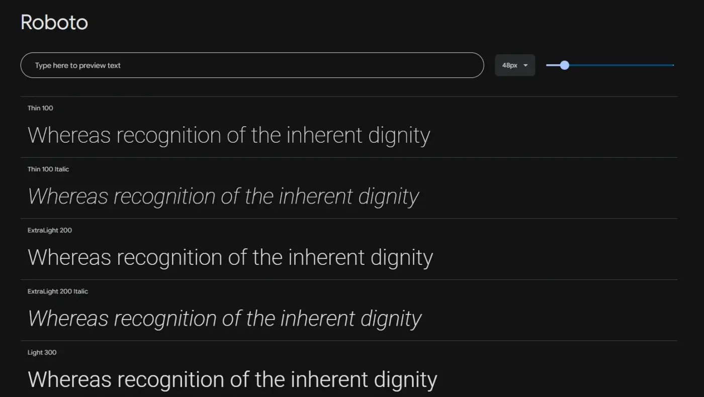
Roboto is Google’s own sans-serif and the single most-used web font today. It reads as clean and neutral rather than flashy, which makes it a safe pick for almost any WordPress site. It moved to a variable format and the Open Font License, so one file now covers every weight the old static version needed separately.
- Used in: About 10% of all web pages
- Font Styles: 9 weights, Thin to Black, each with italics
Best For
A dependable, neutral body font for almost any kind of WordPress site.
3. Open Sans
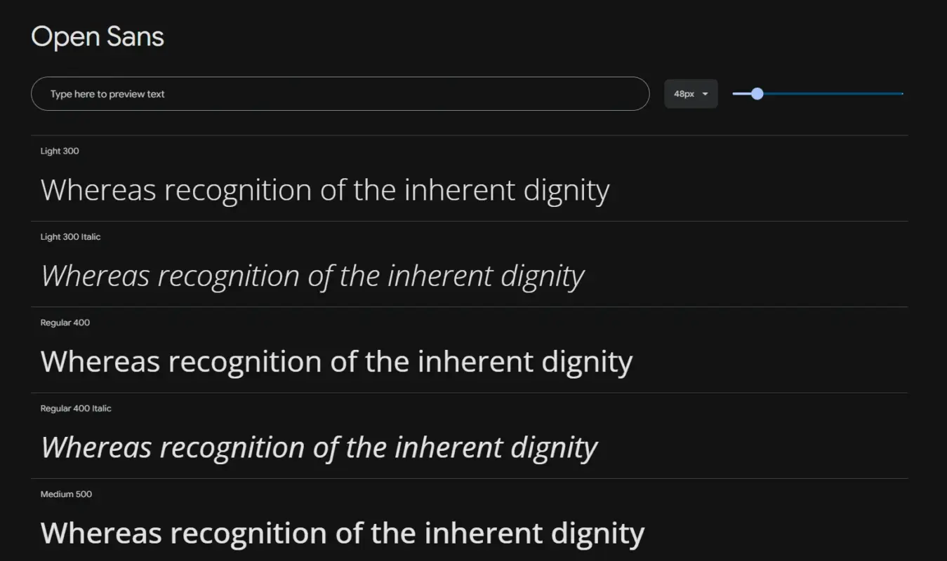
Open Sans is the quiet workhorse of Google Fonts, a humanist sans that stays legible at nearly any size without pulling focus from the content. It sits around third place among the most-used web fonts, despite an old myth that puts its usage far higher than reality. It supports a wide range of languages, which helps on multilingual WordPress sites.
- Used in: About 5% of all web pages
- Font Styles: Multiple weights, Light to Bold, with italics
Best For
A neutral, high-legibility body font that never competes with your content.
4. Poppins
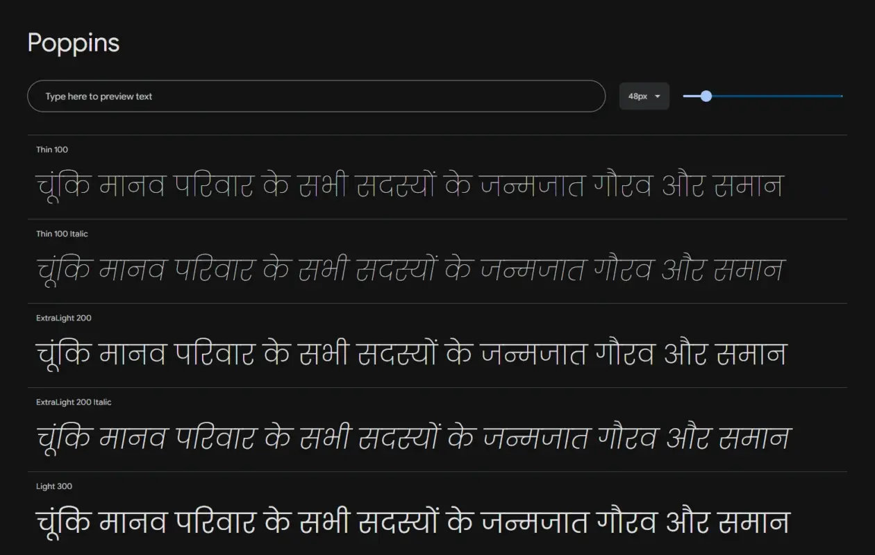
Poppins is a geometric sans with clean, near-circular letterforms that give headings a modern, confident feel. It has been the trendy pick for years and now sits as the second most-used web font. It also supports the Devanagari script, which makes it a strong option for multilingual and Hindi-language sites.
- Used in: Around 5.8% to 6% of all web pages
- Font Styles: 9 weights, Thin to Black, each with italics
Best For
Bold, modern headings, though its wide letters get tiring in long body text.
5. Montserrat
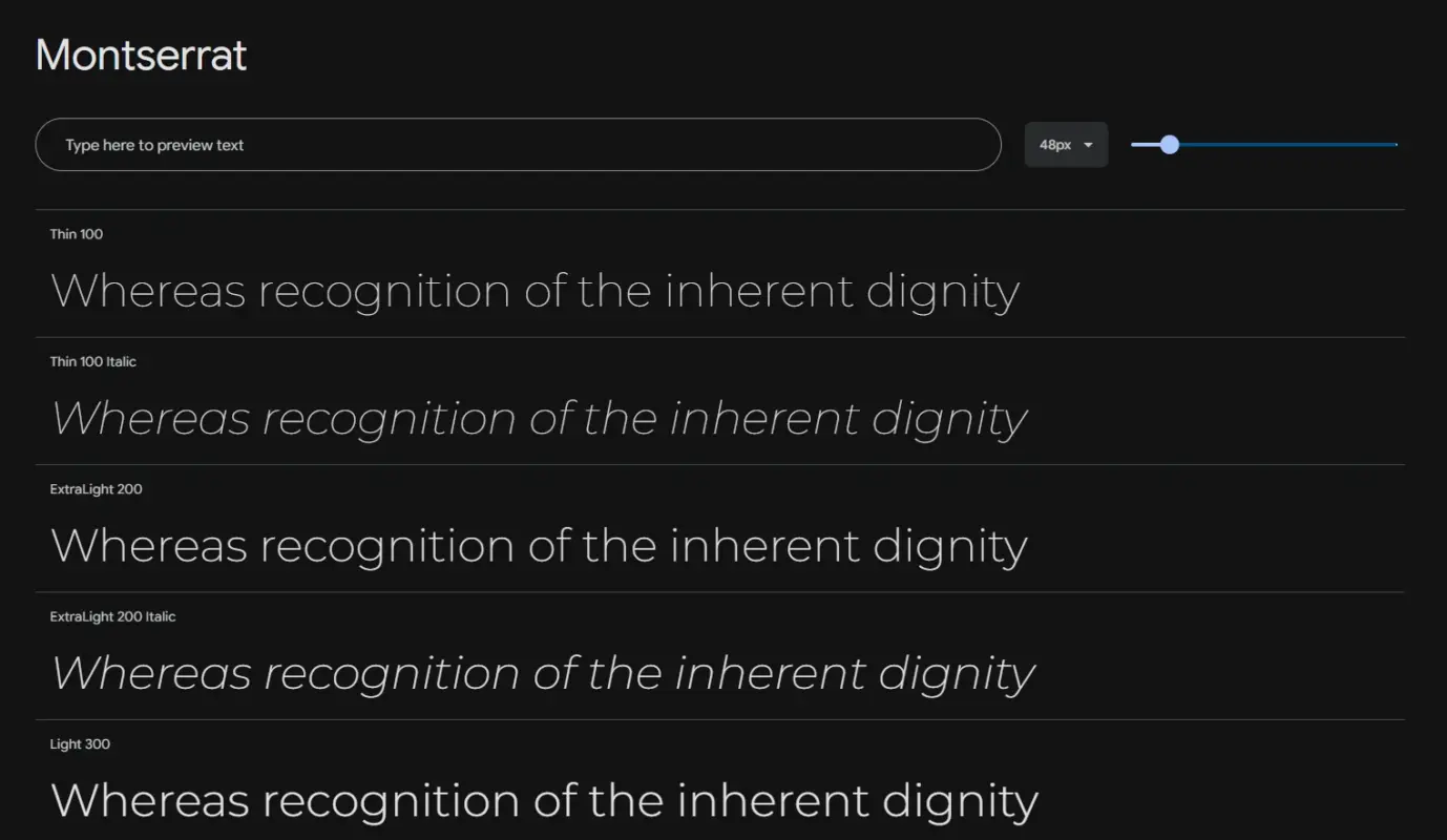
Montserrat has a geometric, poster-inspired look that makes headlines feel bold and deliberate. Inspired by early twentieth-century urban lettering in Buenos Aires, it has become one of the most recognized display sans fonts on the web. It is variable, so you can move from a light subhead to a heavy hero caption without loading extra files.
- Used in: One of the four most-used web fonts worldwide
- Font Styles: Variable, multiple weights, with italics
Best For
Bold, confident headings for brand and product pages.
6. Lato
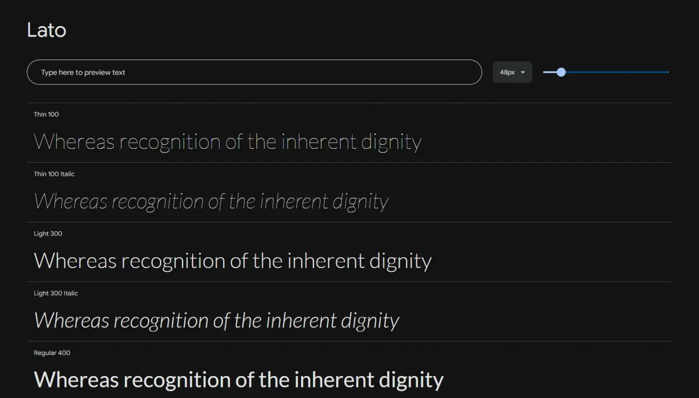
Lato is a humanist sans with a touch of warmth that keeps long paragraphs from feeling cold or corporate. Created by a Polish design team (the name means summer in Polish), it has wide language coverage that helps on international WordPress sites. It sits among the five most-used web fonts, though it remains one of the few static, non-variable options on this list.
- Used in: One of the five most-used web fonts
- Font Styles: Static font, load only the weights you use
Best For
Warm, readable body text on sites that serve multiple languages.
7. Playfair Display
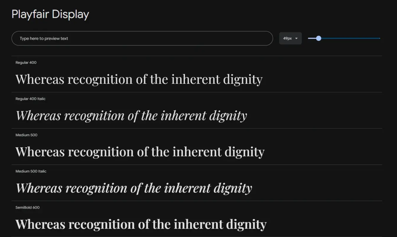
Playfair Display is a high-contrast serif built for headlines that need to feel editorial or a little luxurious. Those thick-to-thin strokes look considered at large sizes but get spindly and harder to read at paragraph size, so it belongs in headings only. It is variable now, and its classic body-text partner is a plain sans like Inter.
- Used in: A go-to display serif for editorial and personal-brand sites
- Font Styles: 6 weights, Regular to Black, each with a matching italic
Best For
High-contrast, editorial headings for luxury or personal-brand sites.
8. Merriweather
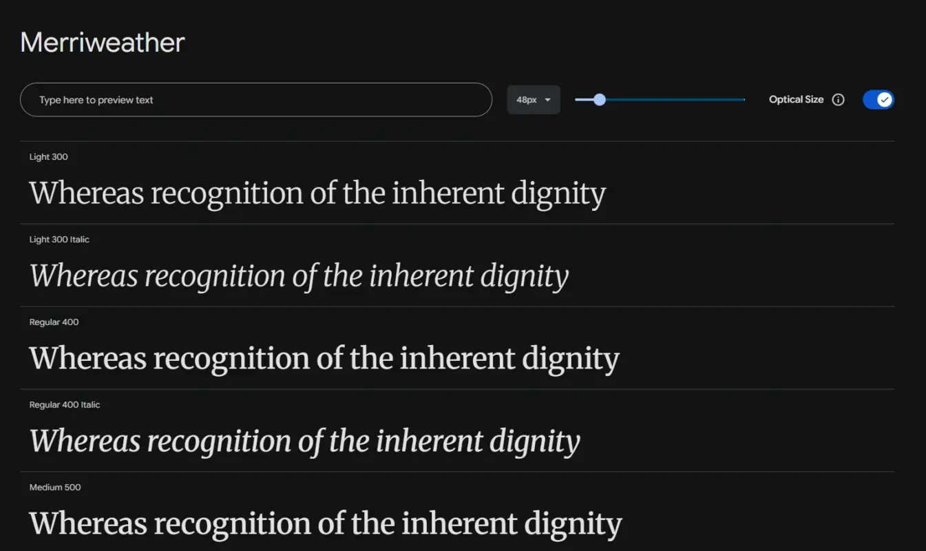
Merriweather is a serif built specifically for screen reading, with a tall x-height and sturdy strokes that survive long articles where a display serif would fall apart. It recently went variable, so the old warning about static-only files in older guides no longer applies. It works well as a full body-text serif for a blog or publication.
- Used in: A common choice for long-form editorial and publishing sites
- Font Styles: 8 styles across 4 weights, Light to Black, each with italics
Best For
Long-form serif body text that stays comfortable to read on screen.
9. Lora
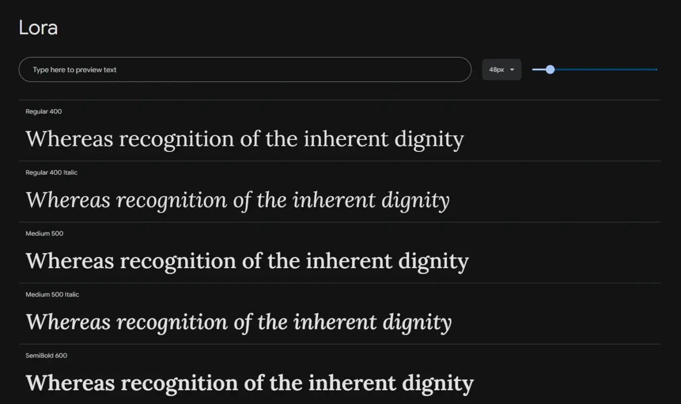
Lora is a calligraphic serif with roots in handwriting, warmer and more personal than Merriweather while staying easy to read at body length. Designed by Cyreal, an open-source type studio, it is free to use on any commercial WordPress project. It suits blogs, essays, and any site that wants to sound like a real person.
- Used in: A frequent pairing choice for blog and portfolio themes
- Font Styles: Multiple weights, Regular to Bold, each with a matching italic
Best For
A warm serif body font for personal blogs and long reads.
10. Oswald
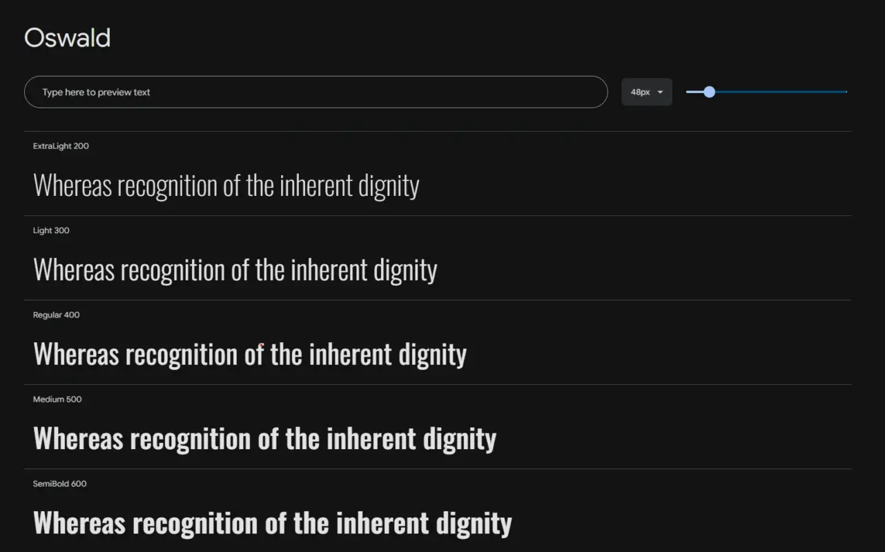
Oswald is a condensed sans built for headlines that need impact in a narrow space. Based on early twentieth-century gothic and grotesque letterforms, it packs a lot of words into a small width without looking cramped. It works well in all-caps navigation bars and short, punchy section titles.
- Used in: A common pick for magazine-style and news WordPress themes
- Font Styles: 6 weights, Light to Bold, no italics
Best For
Tight, punchy headlines and navigation, never body text.
11. Nunito
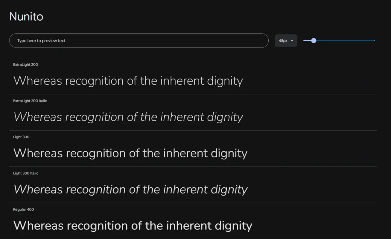
Nunito is a rounded sans with soft, friendly terminals that suit education sites, non-profits, and playful brands more than corporate ones. It reads as approachable rather than serious, so a finance or legal site should probably skip it. It works for both headings and short body copy when paired with a plainer sans.
- Used in: A frequent pick for education and non-profit WordPress sites
- Font Styles: 8 weights, Light to Black
Best For
Soft, approachable headings for education, non-profit, or kids’ brands.
12. DM Sans
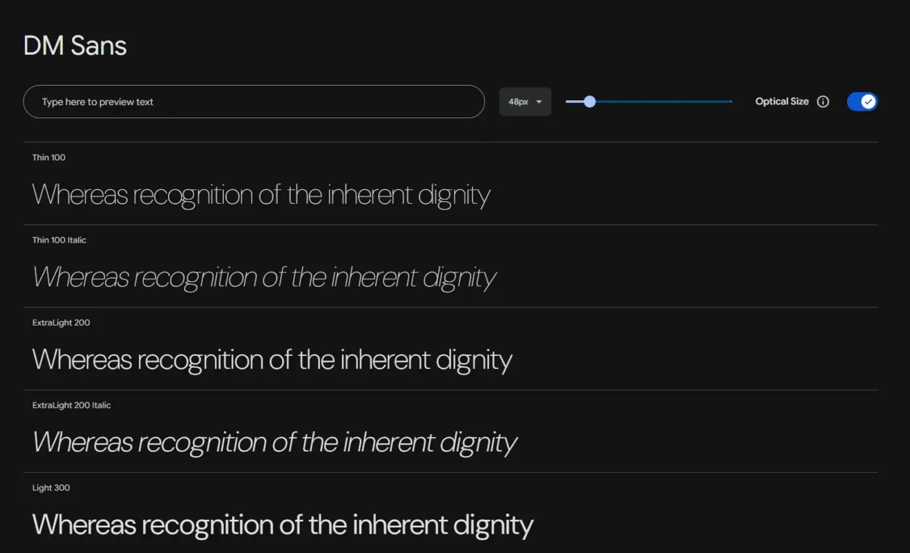
DM Sans is a low-contrast geometric sans that looks tidy in interfaces and holds up as body text on modern content sites. Its best trick is a matched superfamily partner, DM Serif Display, built to pair with it out of the box. That removes the guesswork most fonts leave you with when picking a heading partner.
- Used in: A rising pick for modern SaaS and content-led WordPress sites
- Font Styles: Regular, Medium, and Bold, each with a matching italic
Best For
Modern UI and body text, especially when paired with DM Serif Display.
Quick Comparison: 12 Best WordPress Fonts at a Glance
Scan the table below, then jump to whichever font matches your site.
| Font | Type | Best For | Pair With |
|---|---|---|---|
| Inter | Sans-serif | Body and UI text | Playfair Display |
| Roboto | Sans-serif | Neutral body text | Lora |
| Open Sans | Sans-serif | High-legibility body text | Montserrat |
| Poppins | Geometric | Bold headings | Lora |
| Montserrat | Geometric | Confident headings | Open Sans |
| Lato | Sans-serif | Warm, multilingual body text | Oswald |
| Playfair Display | Serif | Editorial headings | Inter |
| Merriweather | Serif | Long-form body text | A clean sans |
| Lora | Serif | Warm blog body text | Poppins |
| Oswald | Condensed | Punchy headlines | Lato |
| Nunito | Rounded | Friendly headings | A plain sans |
| DM Sans | Sans-serif | Modern UI and body text | DM Serif Display |
How to Pair Fonts So They Actually Work Together
Font pairing is simpler than it looks. Pick one font with personality for headings, and one plain, neutral font for body text, then stop at two families.
A few pairings from this list work every time: Playfair Display headings with Inter body text for an editorial feel, Montserrat headings with Open Sans body for something clean and corporate, and Poppins headings with Lora body for modern-meets-warm. If you also want to change your font size in WordPress to fine-tune the hierarchy, pair that with your font choice, not instead of it.
If you want a pairing you cannot get wrong, use DM Sans and DM Serif Display together. They are a matched superfamily, designed by the same team to sit side by side, so there is no guesswork involved.
Do Fonts Slow Down a WordPress Site?
Yes, if you load them carelessly. No, if you follow a few basic rules.
Serve fonts as WOFF2, the smallest modern format that every current browser supports. Always set font-display: swap so your text shows immediately in a fallback font while the real one loads, instead of leaving the page blank.
Limit yourself to two font families and two or three weights total. Every extra weight is another file the browser has to download before your text renders fully. If you want full control over exactly which files load, self-hosting through a WordPress child theme is the way to go.
Self-hosting instead of pulling fonts from Google’s servers also helps, and it sidesteps a real privacy concern. A German court fined a site in 2022 for leaking visitor IP addresses through Google-hosted fonts.
Common Font Problems and Quick Fixes
Here are the font problems beginners run into most, and the fast fix for each one.
| Problem | Solution |
|---|---|
| Font doesn’t show on the live site | Clear your caching plugin and browser cache, then reload |
| Font looks different in the editor than on the front end | Check whether your theme overrides typography in Additional CSS |
| Page feels slower after adding a custom font | Drop to one weight per font and confirm WOFF2 is being served |
| Font breaks or falls back on mobile | Test the exact weight range; some devices fail silently on missing weights |
| Plugin conflict after installing a font plugin | Deactivate other typography plugins first, then activate one at a time |
Most font issues come down to caching or a theme override, not the font itself. When in doubt, change one thing at a time so you can tell exactly what fixed it.
Conclusion
The best WordPress fonts are the ones that disappear into good reading, not the ones that shout for attention.
Start with a neutral body font like Inter, Roboto, or Lato, then add one heading font with more character, such as Playfair Display, Montserrat, or Poppins, and stop there.
Scroll back to the comparison table if you are still deciding. It is built to make that choice fast, not to send you down another rabbit hole of fifty more options.
If your site needs more than a font swap, DevDiggers offers custom WordPress development services to get the typography, speed, and design working together.
Frequently Asked Questions (FAQs)
Q1. What is the best font for a WordPress blog?
For most blogs, a neutral body font like Lato or Merriweather paired with a heading font like Playfair Display works well. Match the pairing to your topic. A recipe blog can handle more warmth than a finance blog.
Q2. Are Google Fonts free to use commercially?
Yes. Every font on this list is a free Google Font under the Open Font License, which covers personal and commercial WordPress sites without any licensing fee.
Q3. How many fonts should one WordPress site use?
Two is the safe number, one for headings and one for body text. A third is sometimes fine for a logo or small accent, but each extra font is another file the browser has to load.
Q4. Do Google Fonts cause GDPR problems?
They can, if you load them directly from Google’s servers, since that sends visitor IP addresses to Google. Self-hosting the font files on your own server removes that risk.
Q5. What is the default font in WordPress?
It depends on the theme, not WordPress itself. Most modern block themes use a system font or a Google sans-serif by default, and you can change it in the Site Editor.
Q6. Can I use a custom font that is not on Google Fonts?
Yes. You can upload any licensed font file to the built-in Font Library on a block theme, or use a font plugin on a classic theme.