
You can build buyer confidence by answering shopper questions on your product pages before anyone has to contact support. Six customer education strategies do this on a WordPress or WooCommerce store without custom code.
A shopper with a doubt often leaves quietly instead of emailing you, so you never see the lost sale. In October 2026, we opened every example page below and checked what it shows today. We also matched each tactic to tools available in WordPress 7.1.
The examples come from stores on several platforms, and each tactic has a WooCommerce version. First comes a short definition. Then six strategies with real examples, and a way to measure what works.
What Is Customer Education in Ecommerce?
Customer education in eCommerce means giving shoppers the information they need to choose and use a product with confidence. It covers quizzes, videos, comparisons, plain-language explanations, and FAQs placed on the pages where people decide. The goal is fewer unanswered questions at checkout.
Support answers a question after a shopper asks it. Education answers it earlier, on the page, so the shopper never has to write to you.
It also differs from a help center. A help center sits apart from the product page and waits for a shopper to search it. Education meets the shopper where the doubt first appears.
Most of this work happens on the product detail page. Our guide to what a PDP is in eCommerce explains that page and why it carries so much weight.
The table shows which buyer question each strategy answers and where it belongs on a WooCommerce store.
| Strategy | Buyer question it answers | Where it lives |
|---|---|---|
| Recommendation quiz | Which product is right for me? | Shop page or landing page |
| Demo video | How does this work? | Beside the buy button |
| Cost comparison | Is the price fair? | Pricing section |
| Plain-language explanation | What exactly is inside? | Own section on the product page |
| Pre-purchase FAQ | What if it does not work out? | Product page |
| Layered details | Where do I find the specs? | Tabs or accordions |
1. Use a Product Recommendation Quiz to Guide Choices
A product recommendation quiz asks shoppers three or four questions and then shows the products that fit their answers. It replaces guessing with a short guided choice, which helps stores with many similar products or variants. You can add one to WooCommerce with a free plugin.
McKinsey found that faster-growing companies get 40 percent more of their revenue from personalization than slower-growing ones, according to its 2021 personalization research. A quiz is one of the cheaper ways to personalize a store without a data team.
Quiz Builder for WooCommerce from RevenueHunt is a free plugin with more than 2,000 active installs as of October 2026. It needs a RevenueHunt account to build and serve the quiz, so check that service’s pricing before you commit.
Follow three rules for a first quiz:
- Keep it short: Start with three or four questions that mirror what a helpful sales associate would ask in person.
- Map answers to products: Link each answer to a category or tag so the result shows a short list of matching products instead of your whole catalog.
- Show the reason: Add one line under each result that says why it fits.
Review the quiz results every month. If most shoppers end on the same product, the questions are too narrow. If results scatter widely, check that each answer maps to the right category.
If your catalog has many variants, make sure the variants themselves are clear first. Our guide to creating and controlling WooCommerce variable products covers that setup.
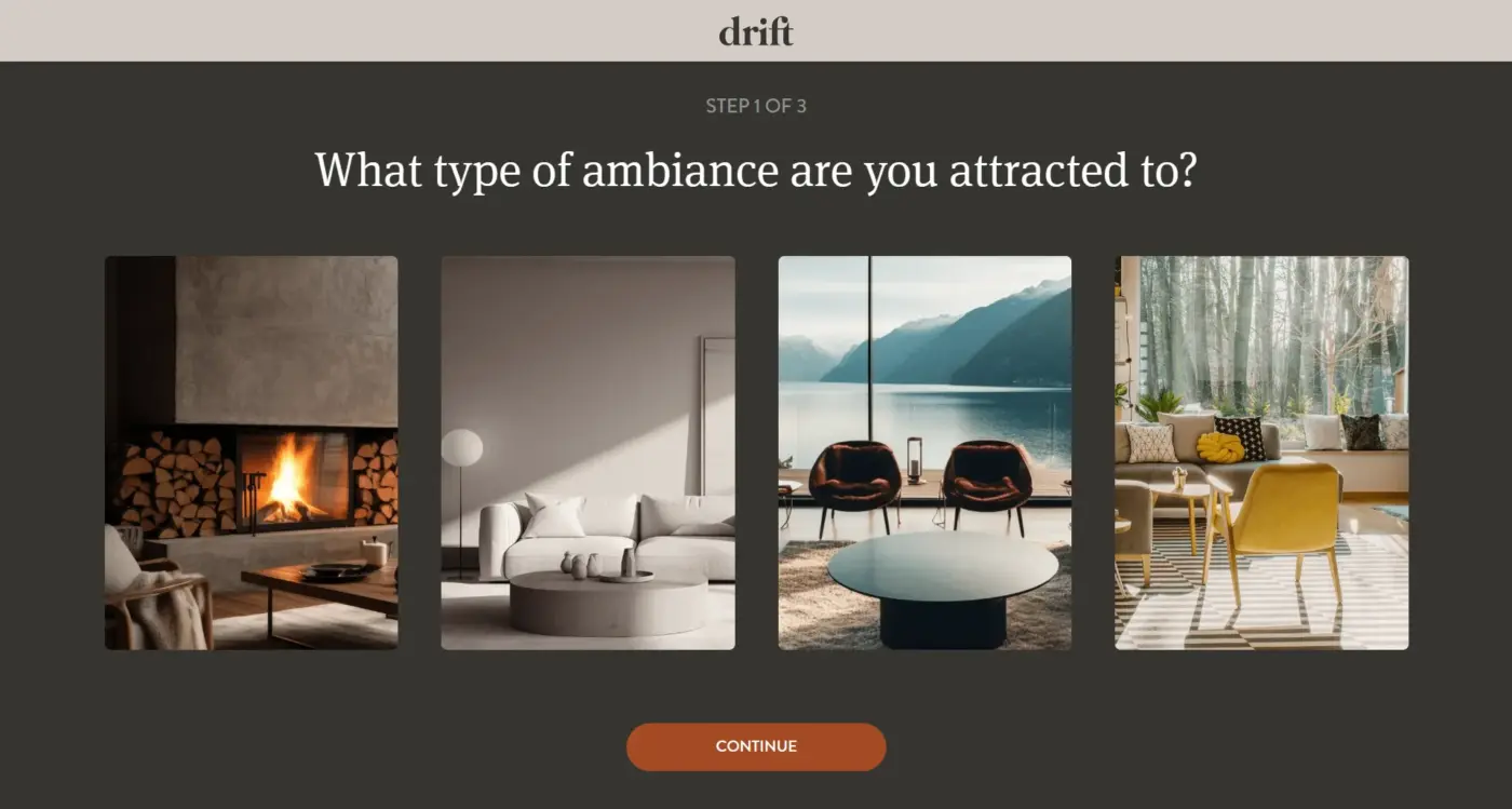
Drift, a Shopify brand that sells car and home fragrance, runs two separate quizzes, one for each product line. Its home fragrance quiz opens with Step 1 of 3 and asks which type of ambiance the shopper prefers.
Shoppers answer by choosing a photo of a room instead of reading a list of options. Three short steps keep the choice quick, and the photos let a shopper judge a mood without product jargon.
2. Add Demo and Setup Videos to Product Pages
A demo or setup video shows how a product works faster than text can describe it. Put a short clip next to the buy button so shoppers see the answer before they leave the page. Baymard’s 2019 usability testing found that 41% of test subjects watched the product videos they found.
The same Baymard research on product page videos says shoppers struggle to find a video that sits away from the main image gallery. So place the clip in the gallery with a play icon instead of hiding it in a tab.
On WooCommerce, Product Video Gallery for WooCommerce adds a video to the product gallery. The free version supports one YouTube video per product, while the premium edition adds more formats.
Our walkthrough on adding video to a WooCommerce product gallery covers both a plugin method and a custom code method.
You do not need a studio to make a useful clip:
- Record on a phone: A phone camera is enough for a setup or unboxing clip.
- Stay under two minutes: A short clip is quicker to make and easier to finish.
- Cover one task: Show the one or two steps customers ask about most often.
To see whether people watch, check how your analytics is set up. GA4 records video engagement automatically only for YouTube embeds with JS API support enabled, according to Google’s enhanced measurement documentation.
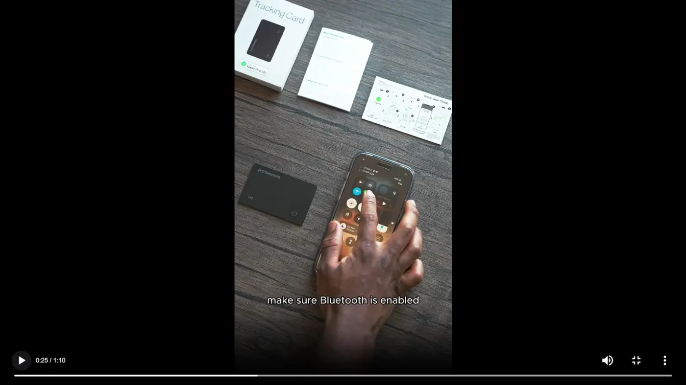
Spotminders, a Shopify brand that sells slim tracking cards for wallets and bags, puts a setup video on its tracking card page. The clip runs just over a minute and shows how to pair the card with Apple’s Find My app, including turning Bluetooth on first.
The page says most customers connect the card in under a minute. A shopper can watch the whole clip once and know what setup involves before the card arrives.
Some products also need to be seen in place, which a video cannot do. Our WooCommerce augmented reality plugin lets shoppers view a 3D model in their own room, and it starts at $59 a year.
3. Compare Costs and Value Next to Your Price
A cost comparison puts your price beside the alternatives a shopper is already weighing. Forty dollars a month looks different next to a $200 option than it does alone. Use specific numbers, and include options like doing nothing, paying for a manual process, or hiring outside help.
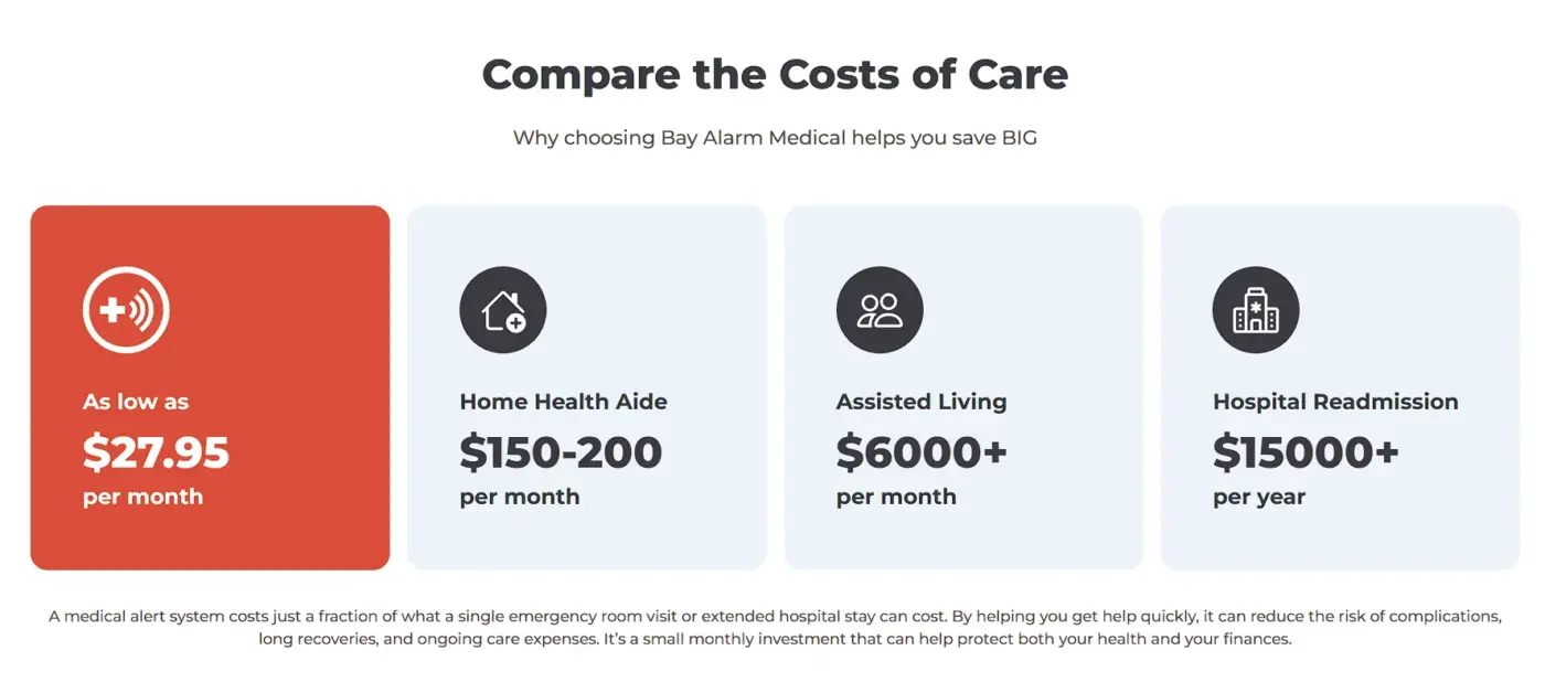
Bay Alarm Medical, a seller of medical alert systems for older adults, runs a homepage section called Compare the Costs of Care. It lists its own plan at $27.95 a month, as low as that price goes.
Beside it sit a home health aide at $150 to $200 a month and assisted living at $6,000 or more a month. Hospital readmission is listed at $15,000 or more a year, and all four are the company’s own figures, so a shopper should still check them.
On WordPress, the core Table block is enough for this. Build the table in three steps:
- List the two or three alternatives your customers consider before choosing your product.
- Add a real cost for each one, with a source for every figure.
- Place the table beside the price, on the pricing page or next to the checkout button.
Note: A comparison only builds confidence when every figure is true and current. One wrong number turns the table from proof into a reason to distrust the page.
4. Explain Ingredients and Materials in Plain Language
Explaining ingredients or materials in plain language turns unfamiliar names into reasons to buy. Name each core ingredient, say what it does in one sentence, and say why you chose it. Shoppers cannot judge quality by looking at a capsule, so your explanation has to supply the proof.
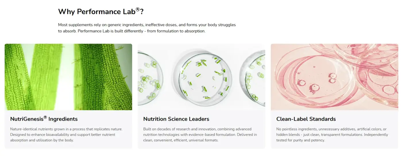
Performance Lab, a supplement brand, has a homepage section titled Why Performance Lab. It uses three short blocks: NutriGenesis ingredients, nutrition science leaders, and clean-label standards.
Each block carries a plain sentence. The page describes NutriGenesis as nutrients made to match those found in nature, grown in a process that replicates nature. It also says its formulas avoid pointless ingredients, unnecessary additives, artificial colors, and hidden blends.
The same approach works outside supplements. A furniture store can explain the wood and the finish, and a skincare store can explain what an active ingredient does and at what strength.
Treat claims like these as promises you must back up. A shopper reads independently tested as a fact, so keep the lab report ready to link.
For your own product page, give this content its own section. Our guide to designing product pages for impulse and considered purchases shows where such a section fits. Then write it like this:
- Pick the core ingredients: Start with the three or four a shopper would recognize or ask about.
- Explain each in one sentence: Say what it does in words a non-expert understands.
- State the reason: Note why you chose that form or source over a cheaper one.
5. Build FAQs Around Real Pre-Purchase Questions
A pre-purchase FAQ answers the practical worries that stop a click on Add to cart, such as fit, returns, and delivery time. Pull the questions from support tickets, chat logs, and product reviews instead of guessing. Put them on the product page itself, because that is where the doubt appears.
A generic FAQ about company history misses those worries. A good one sounds like your own customers.
Answer the awkward questions too. If a product does not suit a common use, say so on the page. A shopper who finds an honest limit trusts your other answers more, and you avoid a return later.
Use this routine to keep the list honest:
- Collect real questions: Pull them from support tickets, chat transcripts, and comment sections.
- Sort by theme: Group them into setup, compatibility, delivery, and returns.
- Answer in two or three sentences: Keep each answer plain and specific.
- Review each quarter: Add the new questions that came in since the last review.
Ultimate FAQ Accordion can show an FAQ on any page with blocks or shortcodes. Its WooCommerce product tab is part of the premium version, so check that before you plan around it.
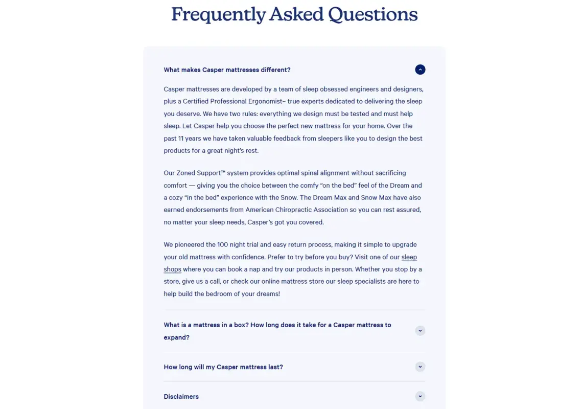
Casper, a mattress brand, ends its homepage with a Frequently Asked Questions accordion. The first answer covers the 100-night trial and the return process, and another question explains how long a mattress in a box takes to expand.
Those are the questions a buyer has about a bed they cannot test first. Each answer sits behind a question a shopper can scan, so the page stays short.
6. Make Product Information Easy to Scan
Layering product information means showing a short summary first and putting detail behind tabs or accordions. Shoppers who want depth can open it, and shoppers who do not can skip it. The page stays light on first load while every spec remains one click away.
By default, WooCommerce shows three tabs on a product page: Description, Reviews, and a third tab for product attributes. As the WooCommerce documentation on product tabs explains, developers can rename, reorder, or add tabs with the woocommerce_product_tabs filter.
Our guide to changing product page tab titles in WordPress walks through the first step. Block themes can also use the core Accordion block, which WordPress added in version 6.9 according to its field guide.
These layout tools cover most needs:
- Accordions: A shopper opens only the section they care about.
- Tabs: Specs and care instructions stay apart without forcing a long scroll.
- Descriptive headings: People scan for the exact detail they came for.
- Icons with short labels: A feature reads faster than a full paragraph.
Layering fixes the two common failures. One is a page so sparse that it raises more questions than it answers. The other is a page so dense that nobody reads past the first paragraph.
To apply it, take these steps:
- Map every piece of information your product page includes today.
- Sort the list by how often customers ask about each item.
- Show the three most requested items expanded by default.
- Move everything else into tabs or accordions so the page stays scannable.
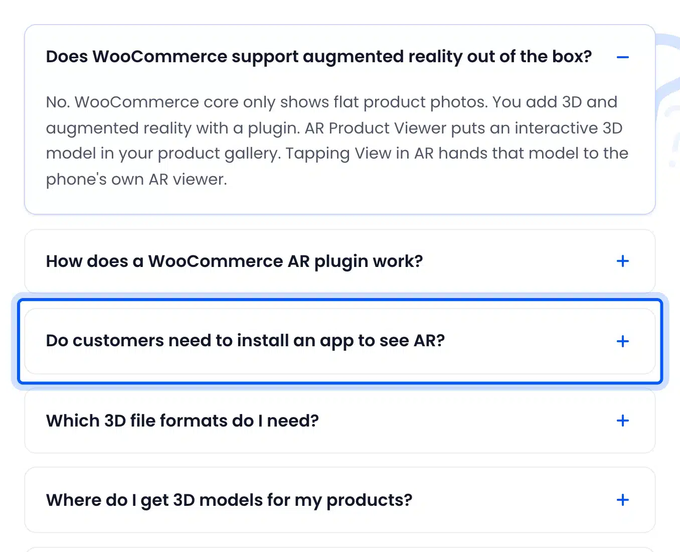
Our own WooCommerce AR plugin page includes an FAQ accordion of real pre-purchase questions. One asks whether customers need to install an app to see AR, and each answer opens on demand.
What Else Helps Build Buyer Confidence Besides Education?
Reviews, clear return policies, and visible security signals also build buyer confidence, but none of them explains the product itself. Education fills that gap by answering how it works, what it costs against alternatives, and what is inside. Use all of them together, and keep each one near the doubt it answers.
A review tells a shopper that someone else was happy. It rarely says how setup works or why a price is fair. A clear return policy lowers the risk of a wrong choice, yet it does not help the shopper make the right one.
So place reviews, your return policy, and the six strategies above on the same product page. Each one answers a different doubt, and together they cover most of what a shopper wonders before paying.
How to Tell If Your Customer Education Strategies Are Working
Customer education strategies are working when shoppers ask fewer basic questions and more of them finish checkout. Track support questions on topics you have answered, engagement on the changed pages, and conversion rate for those pages. Compare each number with the same measure from the month before you made the change.
Here is an example with round numbers. Say a product page gets 2,000 visits and 40 orders in a month, which is a 2% conversion rate. After you add a setup video and an FAQ, it gets 2,000 visits and 50 orders, which is 2.5%.
That is 10 more orders from the same traffic. It is a good sign if support emails about setup dropped at the same time.
Pick one question you have now answered on the page and count how many support emails mention it each month. If the count falls after you publish the answer, the page is doing the job that support used to do.
Keep a simple log with the date of each change and the numbers before it. Without that record, nobody remembers which edit moved which metric.
Note: One month is a small sample, and seasons or promotions can move conversion on their own. Repeat the comparison before you call a change a win.
Our guides to improving eCommerce user experience and reducing the bounce rate in eCommerce cover the wider checks.
Conclusion
Customer education strategies work because they build buyer confidence by removing the doubt that keeps a shopper from buying. A shopper without an answer will go looking for one elsewhere, and you will not see that conversation.
Pick the strategy that matches the question people ask you most, whether by email, in reviews, or in chat. Build that one first and measure it for a month before you add the next.
Frequently Asked Questions (FAQs)
Q1. How much does customer education cost a small WooCommerce store?
Most of the cost is writing time. A phone-recorded video and a comparison table in the core Table block cost nothing. An FAQ in the core Accordion block, added in WordPress 6.9, needs no paid tool either, and paid plugins only add convenience.
Q2. Which customer education strategy should I start with?
Start with the FAQ. It needs only your support emails and an hour of writing, and it answers the exact questions that stall a purchase. Add a video next if the same how-it-works question keeps coming back.
Q3. Do I need a plugin to add a product video in WooCommerce?
No, because the product description accepts an embedded video. A plugin like Product Video Gallery for WooCommerce moves the clip into the image gallery, where Baymard found shoppers look for it.
Q4. Should the FAQ go on the product page or a separate page?
Put the three or four most common questions on the product page, near the buy button. A separate FAQ page still helps with store-wide topics like shipping and returns. Link to it from the product page when an answer needs more room.
Q5. How often should I update my FAQs and product explanations?
Review them every quarter, using the newest support tickets and reviews. Update them sooner when you change a product, a price, or a return policy, because an outdated answer can mislead a buyer.
Q6. Can customer education reduce returns?
It can, because shoppers who understand fit and use before buying are less likely to order the wrong item. Compare your return reasons before and after a change to check. We have no store data that proves it, so treat it as something to test.