
Here is how to run an accessibility audit: test a sample of pages against WCAG 2.2 with scanners and check them by hand. On a store, the sample must include the product page, the cart and the whole checkout.
We ran this audit on a WooCommerce 11.2 test store in October 2026, on WordPress 7.1.3 with the Twenty Twenty-Five theme. We used Lighthouse 13.5.0 and axe-core 4.14.0. A keyboard pass, a contrast check and a checkout form test came next.
You get the seven steps, a findings table mapped to WCAG 2.2, the fixes we tested and the legal status in 2026. The default store scored 90 to 100 in Lighthouse and still had seven issues worth logging.
What Is an Accessibility Audit?
An accessibility audit is a structured check of a website against a standard, usually WCAG 2.2 at level AA. It combines automated scans with manual tests and ends in a report. Each issue in that report names the page, the WCAG success criterion it breaks and a fix.
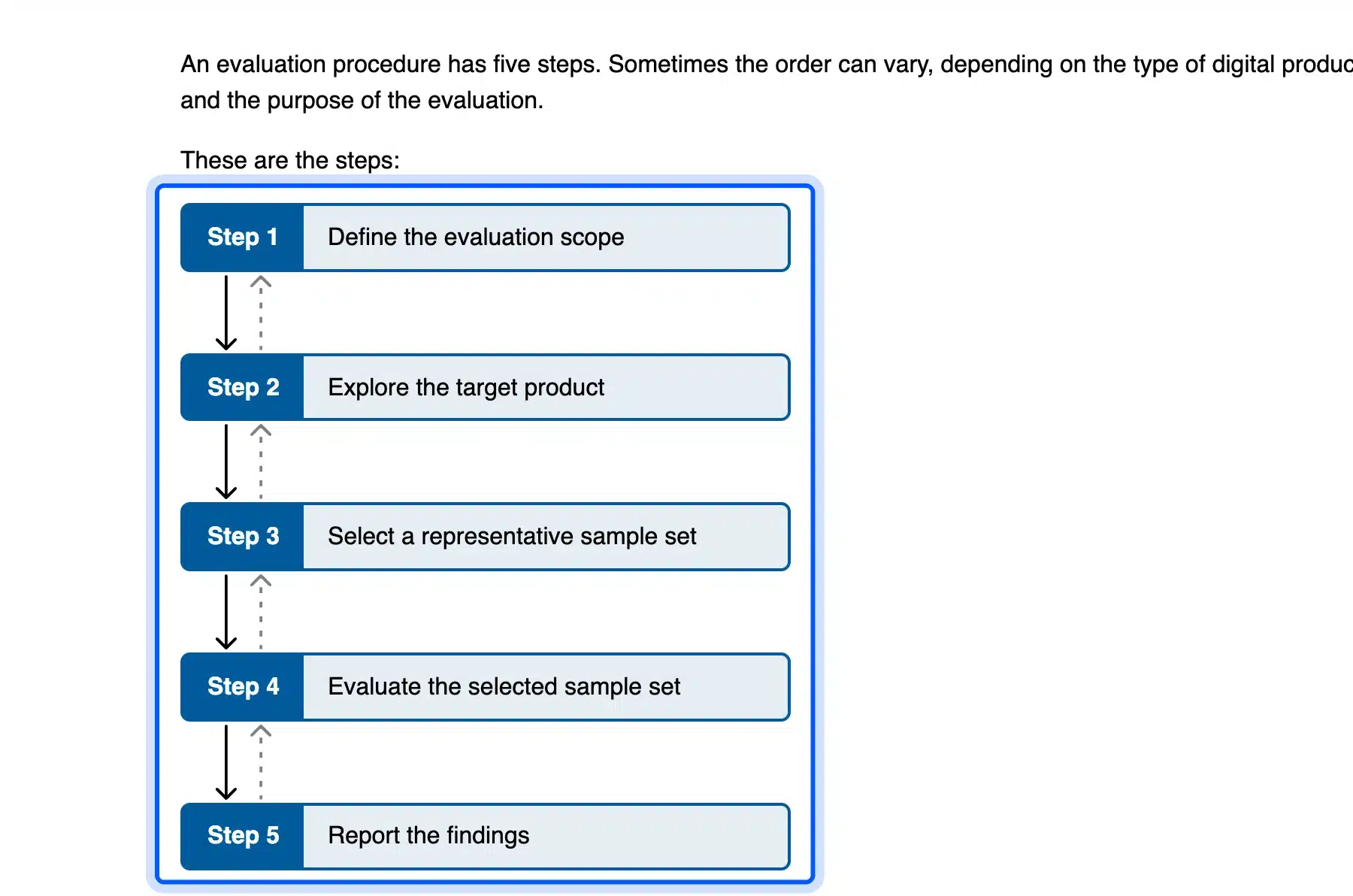
The W3C publishes the method as WCAG-EM, now a Group Note dated 23 July 2026. It has five steps: define the scope, explore the product, select a representative sample, evaluate it and report the findings.
People also call it a web accessibility audit, a WCAG audit or a digital accessibility audit. The name changes but the method does not. A scan alone is not an audit, because a tool cannot judge whether a focus order makes sense or an error message helps.
The need is real. The WebAIM Million found detected WCAG 2 failures on 95.9 percent of the top one million home pages in its 2026 report.
Those are only the failures software can detect. Real conformance is lower still.
How to Run an Accessibility Audit in 7 Steps
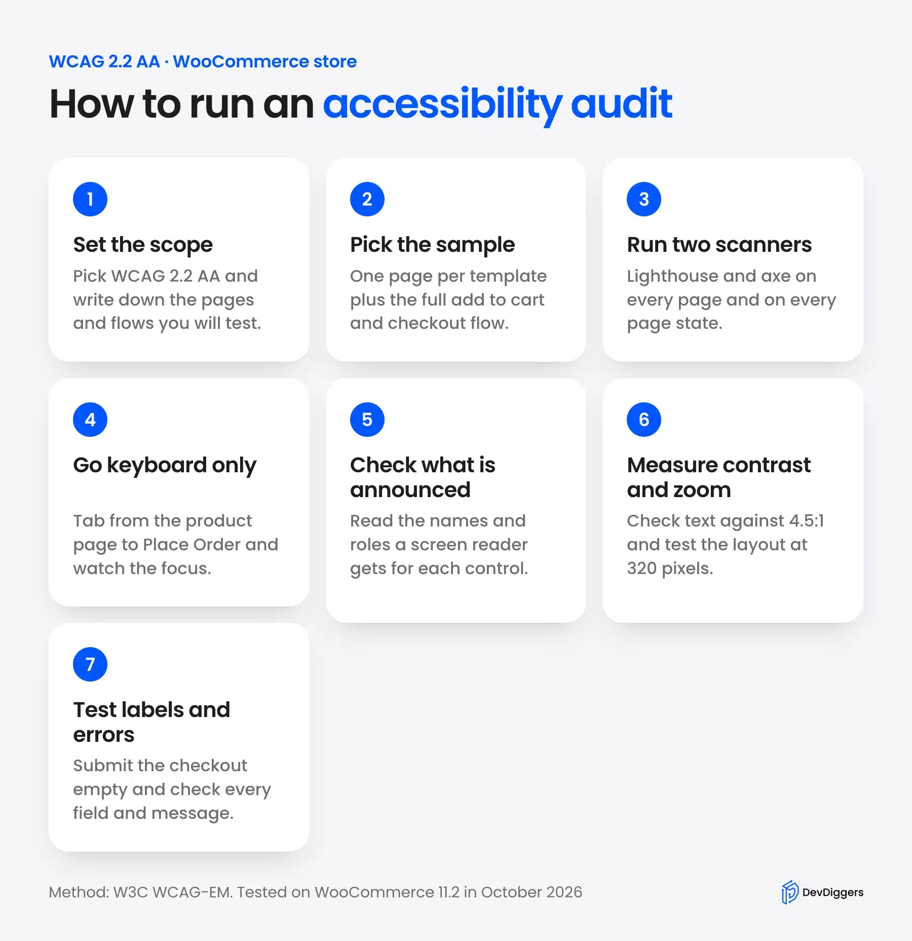
Here is how to run an accessibility audit in seven steps: set the scope, pick the sample and run two scanners on every page. Next, test the keyboard, the screen reader output, contrast and zoom. Finish with checkout labels and errors, and log each issue against WCAG 2.2.
These are the same steps you use to audit a website for accessibility of any kind. The store version adds one rule: test the buying flow as one complete process, from product page to Place Order. Accessibility is one area of a full website audit, alongside crawling, indexing, speed and security.
Step 1: Set the Scope and the WCAG Audit Target
Write down the pages, the flows and the standard before you open a tool. Pick WCAG 2.2 level AA unless a contract names another version.
Note the browsers and devices too. A second person should be able to repeat your test.
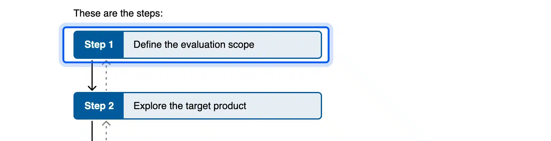
A WCAG audit that skips this step drifts. People test the home page twice and never reach the account login. WCAG-EM calls this step defining the evaluation scope, and it includes the conformance target.
Our scope was six page types on one store, WCAG 2.2 AA, Chrome on a desktop window and a 320 pixel wide window. That is small on purpose. A small scope that you finish beats a large one you abandon halfway through.
Step 2: Pick the Store Pages and the Checkout Flow
Test one page for each template, since a bug in a template repeats on every page built from it. For a WooCommerce store, that means home, shop, a product, cart, checkout and the account login. Then add the full purchase flow as one process.
WCAG-EM asks for “complete processes” in the sample. On a store, that is adding a product, opening the cart and paying. A flow can fail even when each page passes alone, for example when focus gets lost after the page updates.
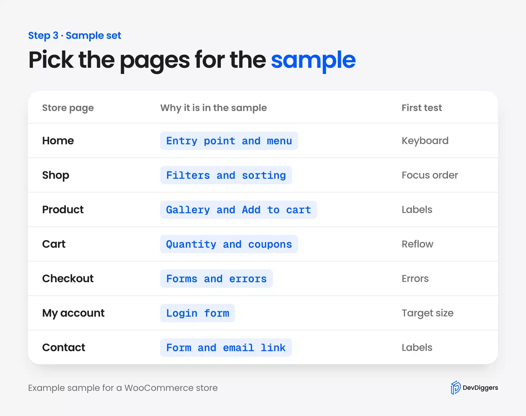
Include page states too. A product on sale, a cart with items and a checkout showing errors are different screens for a tool. Our sale badge issue only showed up on a product with a sale price.
Step 3: Run Lighthouse and axe on Every Page
Automated scans find the problems that software can detect, quickly and for free. Run at least two tools, because each one has its own rules. We used Lighthouse 13.5.0 in Chrome and axe-core 4.14.0 with the WCAG 2.2 AA rule set.
Here are the scores and failed audits before any fix:
| Page | Lighthouse score | Failed audits |
|---|---|---|
| Home | 93 | Hidden panel with focusable controls and list markup |
| Shop | 93 | The same two |
| Product | 94 | The same two |
| My account | 90 | The same two plus target size |
| Cart | 97 | List markup |
| Checkout | 100 | None |
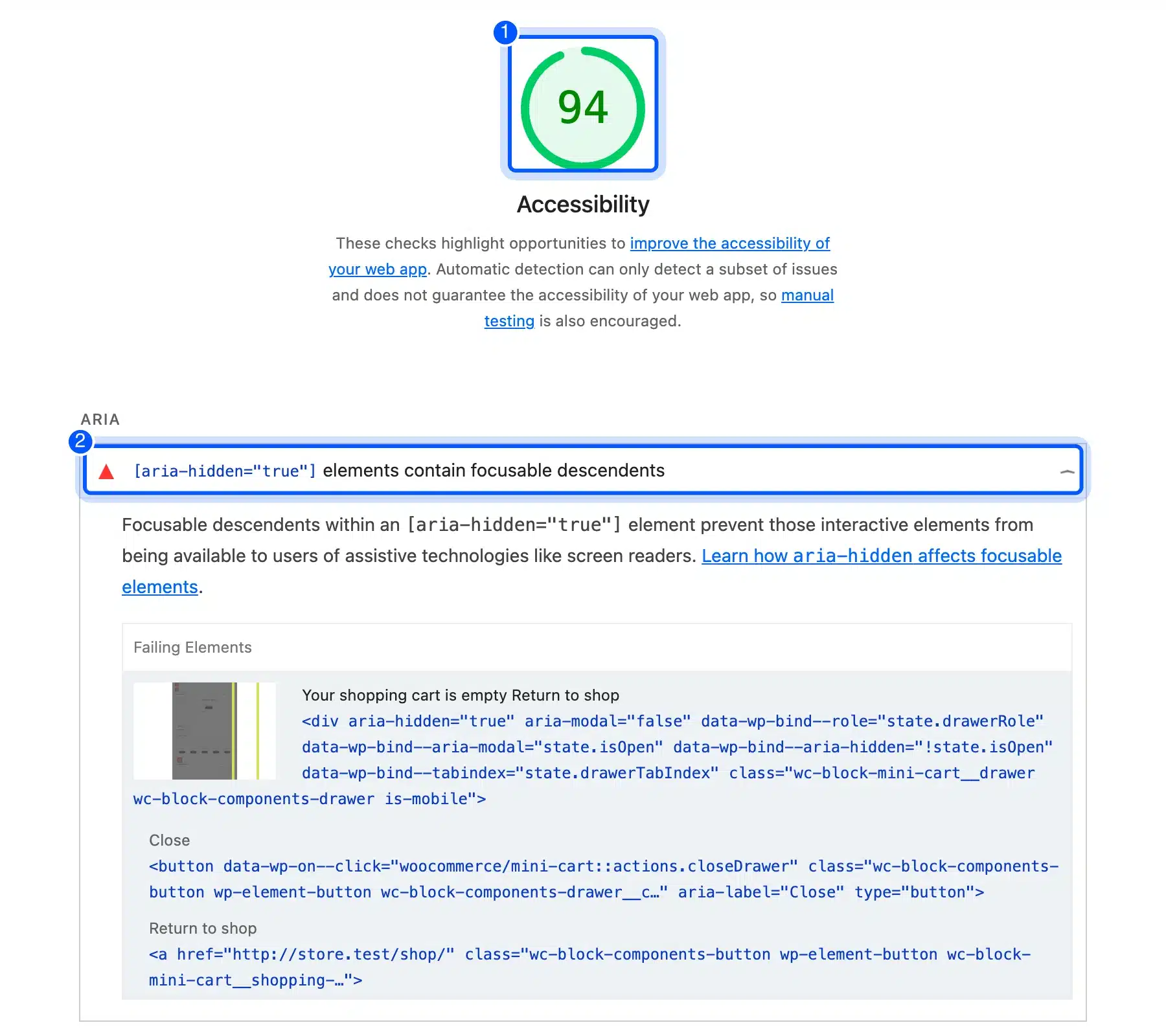
axe-core agreed with every Lighthouse failure. It also flagged two moderate best-practice items on the checkout that Lighthouse does not count. The page has no H1, and its header sits inside a second header landmark.
WAVE is the third free tool most guides name. Its online checker needs a public web address. A live store fits that better than a private staging copy.
Its browser extension covers password-protected pages, and that lets you scan a store before launch.
Tip: Scan each page in every state you can reach. A product on sale and a checkout after a failed submit each showed a problem the plain page did not.
Step 4: Do a Keyboard Pass From Product to Place Order
Put the mouse away and buy something with Tab, Shift+Tab, Enter and Space. Every control must work, the focus must stay visible and the order must make sense. WCAG 2.2 Focus Visible is a level AA rule.
On our product page, the first Tab showed a Skip to content link with a focus ring. It took 15 Tab presses to reach Add to cart. The button showed a 2 pixel gray ring.
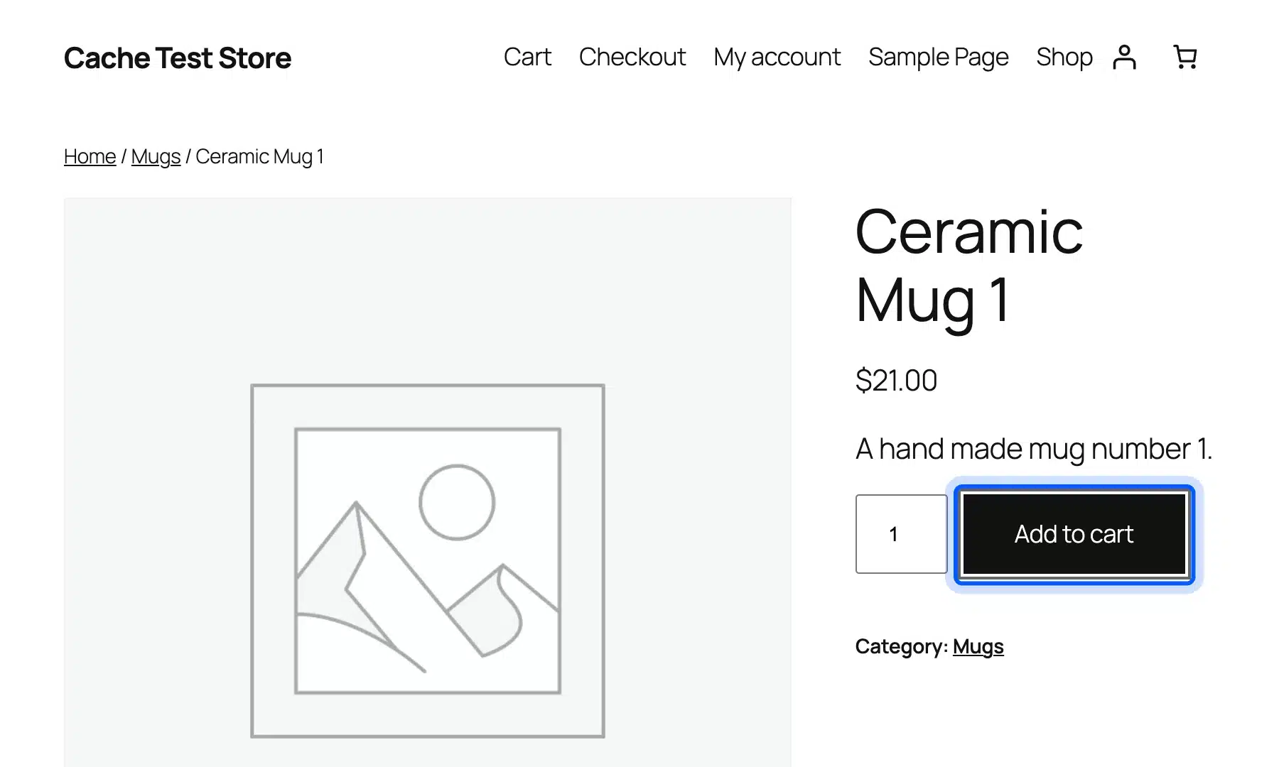
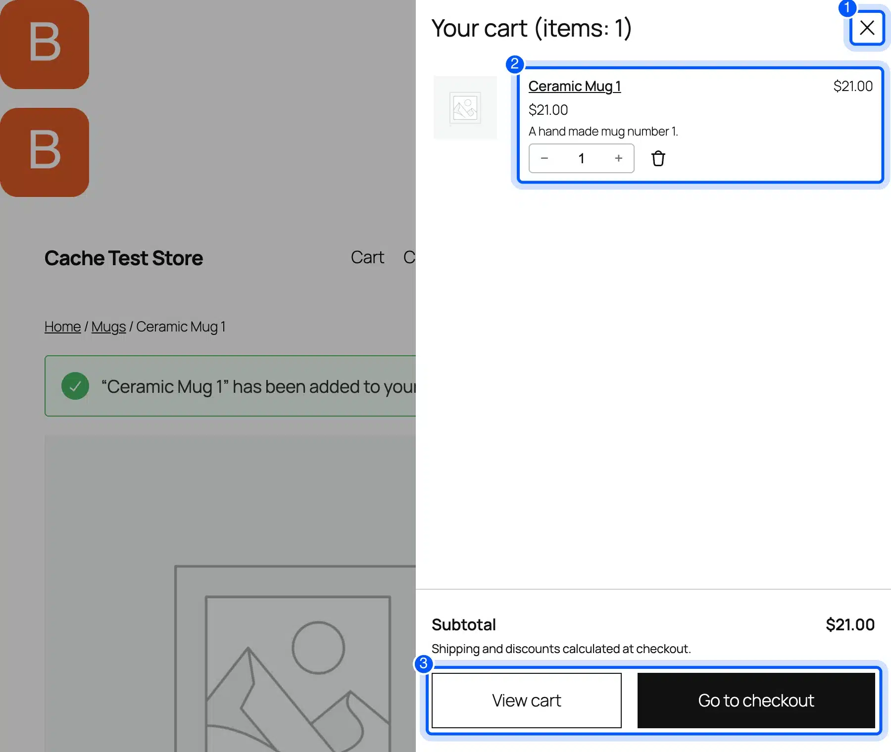
The real problem came after the item was in the cart. We kept pressing Tab, and focus landed on seven controls inside the closed mini cart drawer.
Those were Close, the product link, the quantity box, the plus and remove buttons, View cart and Go to checkout.
None of them was on screen. A keyboard user would press Tab seven times and see nothing move. This is the same panel the scanners flagged, but only the keyboard shows how bad it feels.
The cart and checkout went better. Proceed to Checkout sat at Tab 16 on the cart page.
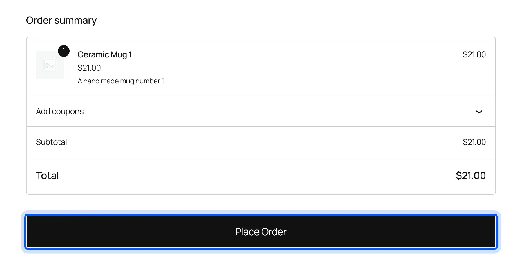
On the checkout, the fields came in visual order and Place Order was Tab 17. The two payment radios worked with the arrow keys. That is how a radio group should behave.
Step 5: Spot Check What a Screen Reader Hears
A screen reader announces each control by its name, role and state. You can check those three things without one by reading the accessibility tree in your browser’s developer tools. We read it for the product page, the cart and the checkout after a failed submit.
The names were good. The cart buttons read “Increase quantity of Ceramic Mug 1” and “Remove Ceramic Mug 1 from cart”.
The mini cart button read “Number of items in the cart: 1”. Each checkout field had a name and showed as invalid after the failed submit.
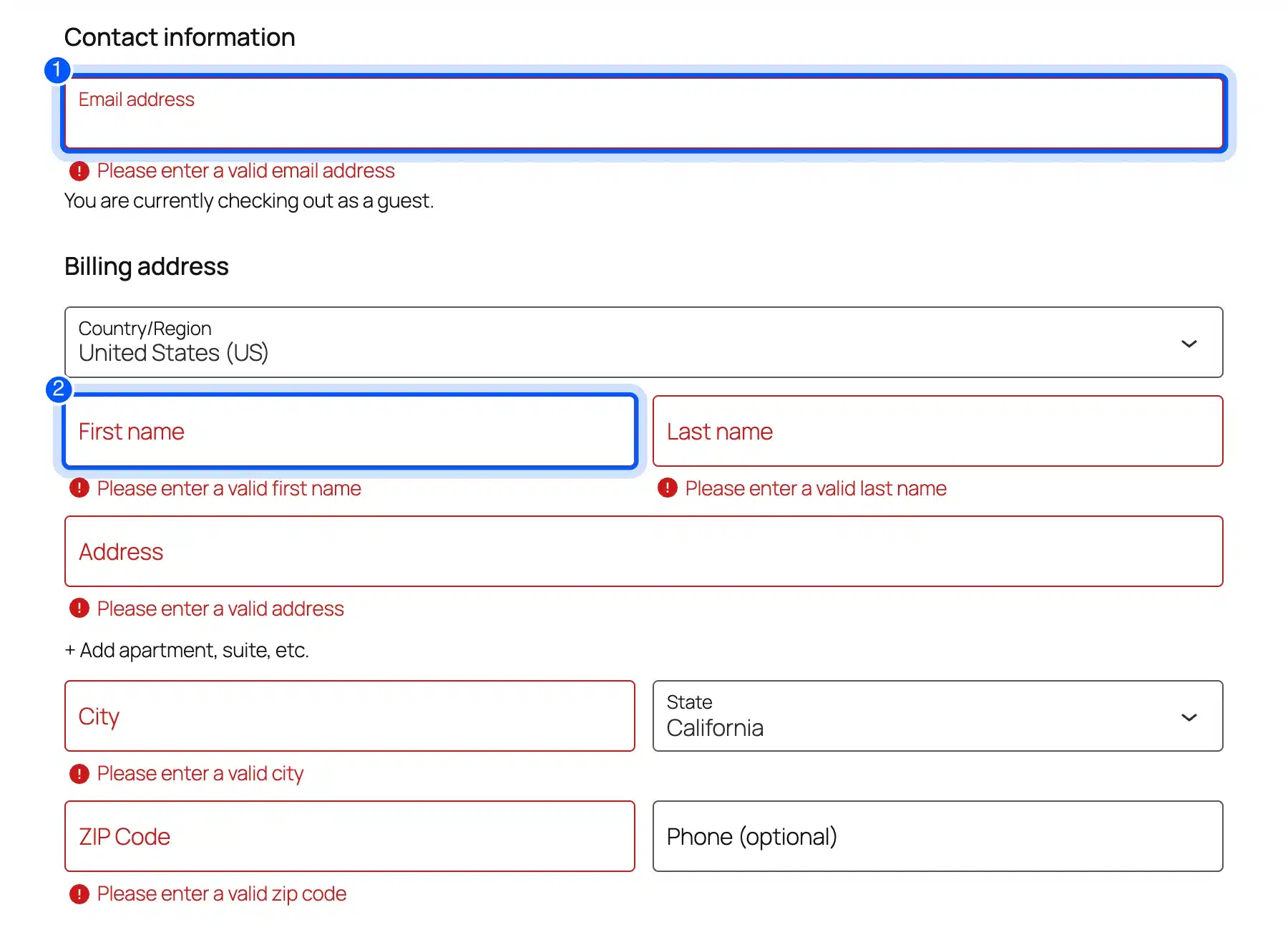
Each error message sat in an alert. A screen reader reads an alert as soon as it appears.
Focus also moved to the first invalid field, the email address. That is the behavior you want after a failed submit.
Our scope stopped at the accessibility tree. It shows what a screen reader receives. Listening to a full checkout in NVDA, JAWS or VoiceOver is the next test, and it needs a person at the device.
Step 6: Measure Color Contrast and Zoom
WCAG 2.2 asks for a contrast ratio of 4.5 to 1 for text, or 3 to 1 for large text. Low contrast text is the most common failure in the WebAIM report, on 83.9 percent of home pages. Measure every text color in your sample, including badges and states.
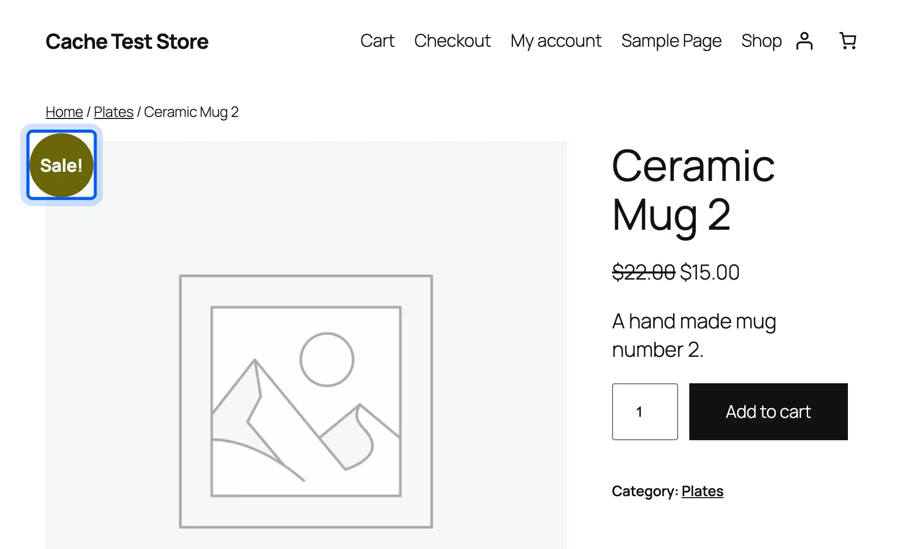
Twenty Twenty-Five passed nearly everywhere. Body text measured 18.88 to 1, and the blue focus ring measured 5.98 to 1 against white. The one failure was the “Sale!” badge: white text on an olive background at 3.41 to 1.
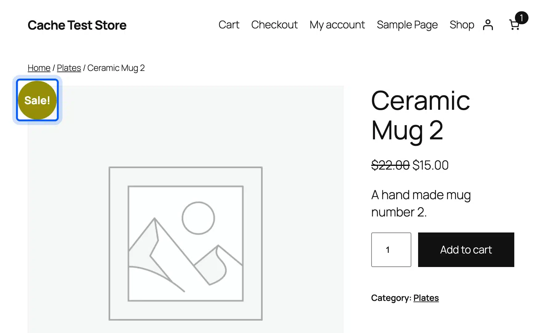
That badge is a close call. Its bold text is 18.65 CSS pixels, and WCAG 2.2 counts 14 point bold text as large text.
That line sits at about 18.67 pixels. The axe-core scan put the badge just under it and applied 4.5 to 1. We logged it anyway because a darker color fixes it for free.
Next, set the browser window to 320 CSS pixels wide. That is the width WCAG 2.2 Reflow asks for. Home, shop, product, account and checkout all fit.
The cart page grew to 345 pixels. It scrolled sideways, and the line total sat against the screen edge.
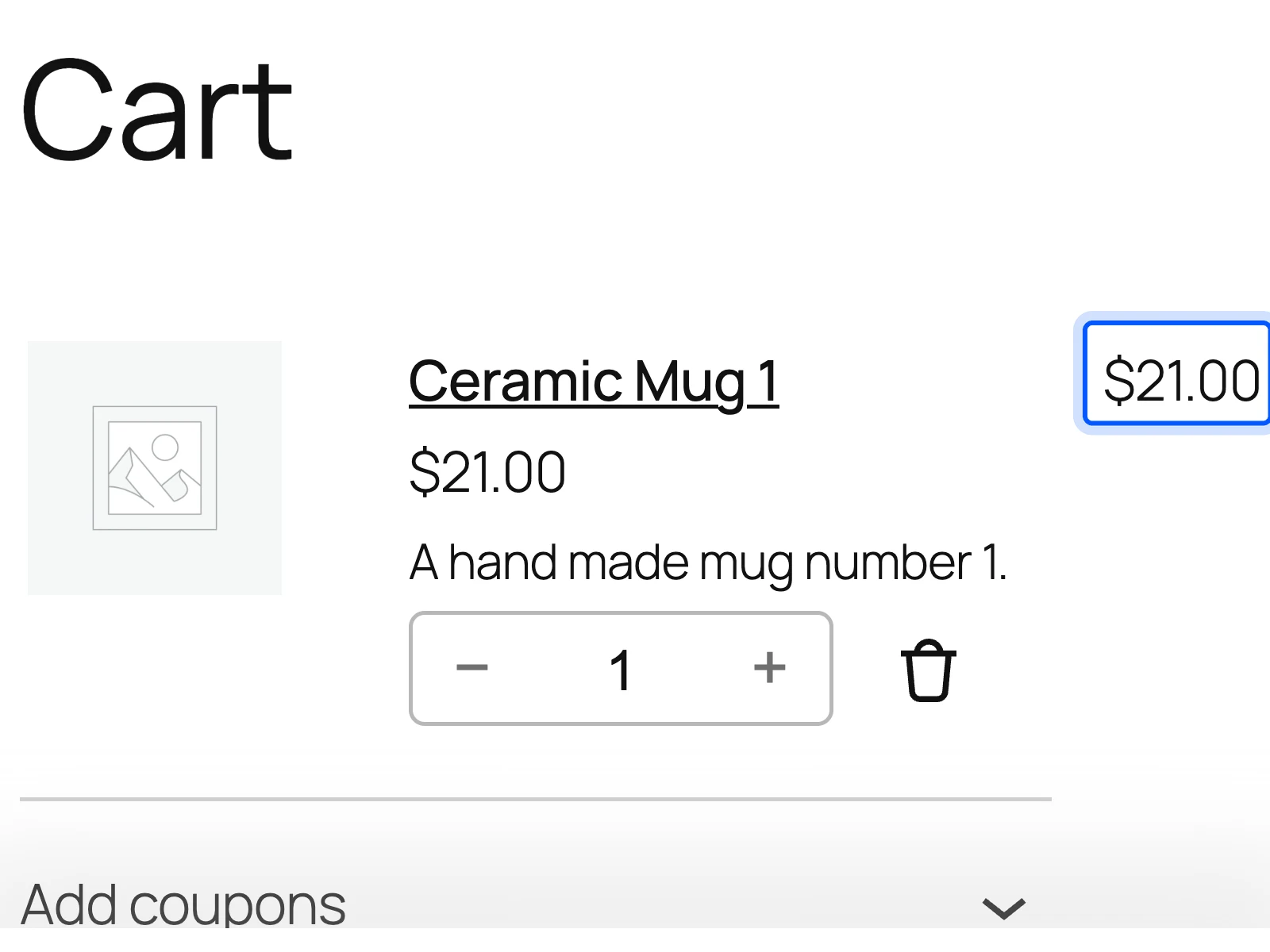
Reflow excepts data tables, and the cart items are a table. We marked it for review. Check your own link color in WordPress and your font size in WordPress during this step too.
Step 7: Test Checkout Labels and Error Messages
Every checkout field needs a label that stays visible while the shopper types. The field also needs a clear error message tied to it. Missing form labels fail on 51 percent of the home pages in the WebAIM Million.
The WooCommerce checkout block passed the label test on our store. All 13 fields had an accessible name, and every visible field showed its label.
The labels float above the text once you type. They never vanish the way placeholder text does.
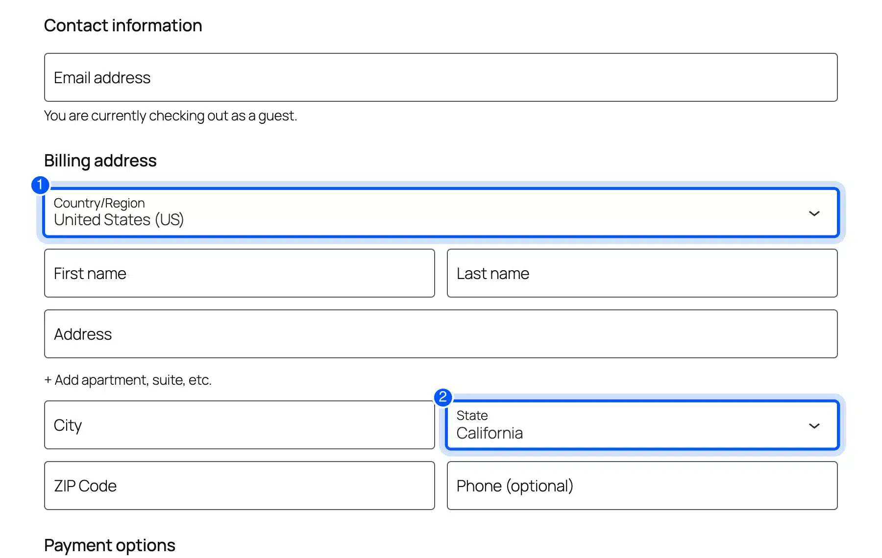
The address fields also carried autocomplete values such as “given-name” and “postal-code”. That supports WCAG 2.2 Identify Input Purpose. A browser can fill them in for a shopper who struggles to type.
The error state told another story. We submitted the checkout empty and ran axe again.
It flagged all six required fields. Each one points its error reference at a paragraph that does not announce itself, while the alert sits on the parent element.
If you add your own custom checkout fields, test them the same way. A field from a plugin can lose its label or its error link even when the core fields pass.
What Our Accessibility Audit Found
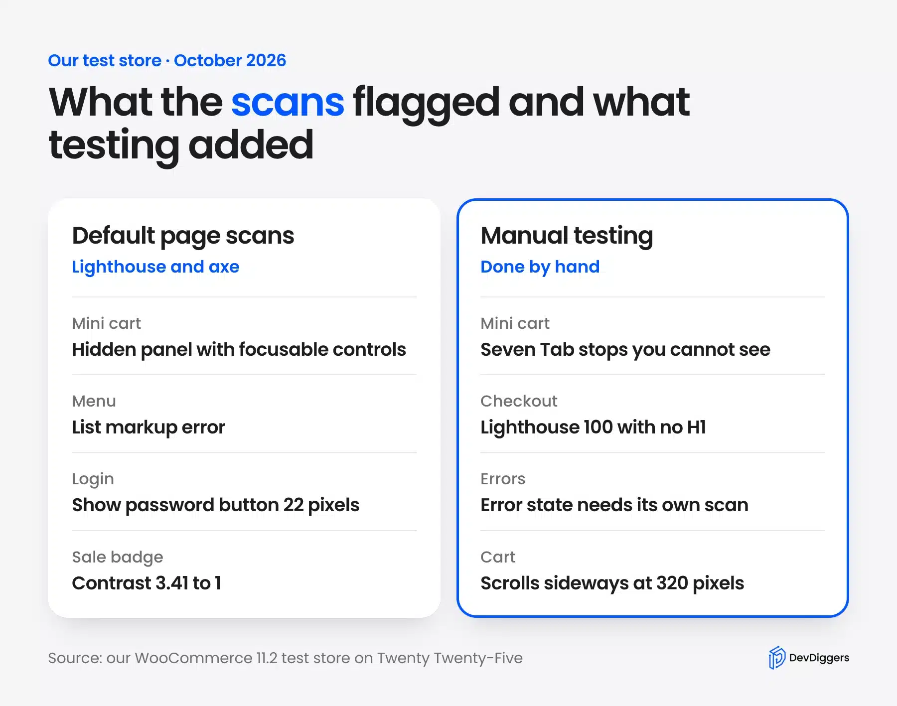
Our accessibility audit of a default WooCommerce 11.2 store found seven issues. Scanners flagged four on the plain pages, and three only showed up in testing. Severity is our call, based on how much each issue blocks a shopper on a key task.
| # | Issue | WCAG 2.2 criterion | Where | Severity | Fix |
|---|---|---|---|---|---|
| 1 | Closed drawer holds 7 focusable controls | 4.1.2 Name Role Value (A) | Mini cart on every page with a header cart | Serious | Hide the closed drawer (tested) |
| 2 | List inside a list in the menu | 1.3.1 Info and Relationships (A) | Header menu built from the Page List block | Moderate | Use page links in the menu (tested) |
| 3 | Sale badge contrast 3.41 to 1 | 1.4.3 Contrast Minimum (AA) | Product page on sale | Moderate | Darker badge color (tested) |
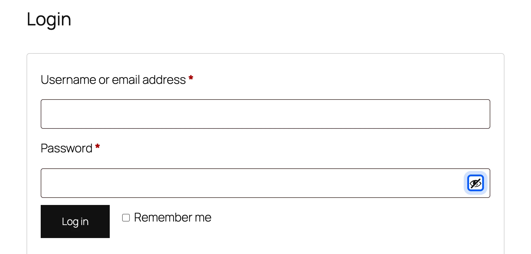
| 4 | Show password button is 22 by 22 pixels | 2.5.8 Target Size Minimum (AA) | My account login | Moderate | Make it 24 by 24 pixels (tested) |
| 5 | Error reference does not announce itself | 4.1.2 Name Role Value (A) | Checkout after a failed submit | Moderate | Report to WooCommerce and confirm with a screen reader |
| 6 | Cart scrolls sideways at 320 pixels | 1.4.10 Reflow (AA) | Cart page | Review | Stack the line total on small screens (not tested) |
| 7 | No H1 and a nested header landmark | Best practice | Checkout | Minor | Add a page heading (not tested) |
Issue 4 sits on the login form. WCAG 2.2 Target Size asks for at least 24 by 24 CSS pixels.
Spacing around a smaller target can make up for its size. Our axe-core scan measured the button at 22 by 22 pixels and found the spacing too tight.
None of this means WooCommerce ignores accessibility. Its accessibility statement says the core plugin front end is substantially conformant with WCAG 2.2 level AA. Our issues came from how the theme, the blocks and the default styles meet on one page.
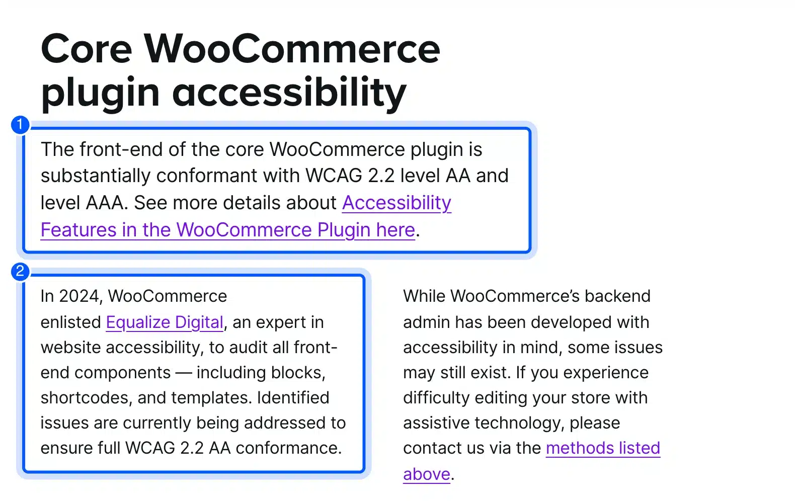
That is the case for auditing your own store. A statement covers one product, and your store is many products working together.
How We Fixed Four Issues and Retested
Four of the seven issues took one menu change and three lines of CSS, and we retested every one of them. After the fixes, Lighthouse scored 100 on all seven pages we tested. The axe-core scan found no WCAG failures on the plain pages, but the checkout error state still needs a WooCommerce fix.
We added this CSS in the Site Editor under Styles > Additional CSS:
/* Closed mini cart: keep its controls out of the Tab order */
.wc-block-mini-cart__drawer[aria-hidden="true"] { visibility: hidden; }

/* Show password button: meet the 24 by 24 pixel target */
.woocommerce form .show-password-input { width: 24px; height: 24px; }

/* Sale badge: 5.95 to 1 against white text */
body .woocommerce span.onsale { background-color: #6b6607; }
Then we checked that the fix did not break the drawer. The cart button still opened it, focus moved to Close, and Escape closed it and returned focus to the cart button. The seven hidden Tab stops were gone.
The menu fix needs no code. Open the Navigation block in the header, select the Page List and convert it to page links. The list error disappeared on every page.
The new badge color reads 5.95 to 1 against white. If your theme sets brand colors, test them the same way as changing the font color in WordPress.
Note: The drawer fix is a workaround in your theme. Report the bug to WooCommerce too. A fix in a release helps every store.
What Does a Perfect Accessibility Score Mean?
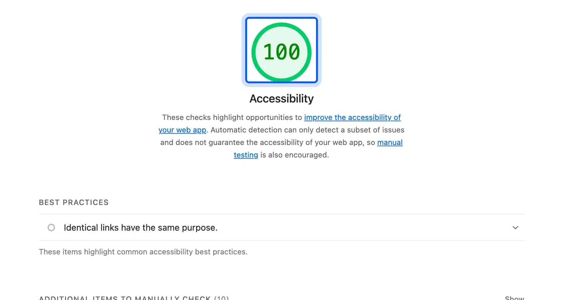
A perfect accessibility score means a page passed every automated audit the tool runs. It does not mean the page is accessible. Our checkout scored 100 in Lighthouse while it had no H1, and its error state still showed problems that only appear after a failed submit.
Chrome for Developers states that the score is “a weighted average of all accessibility audits”. It adds that manual audits and best-practice audits do not affect the score at all.
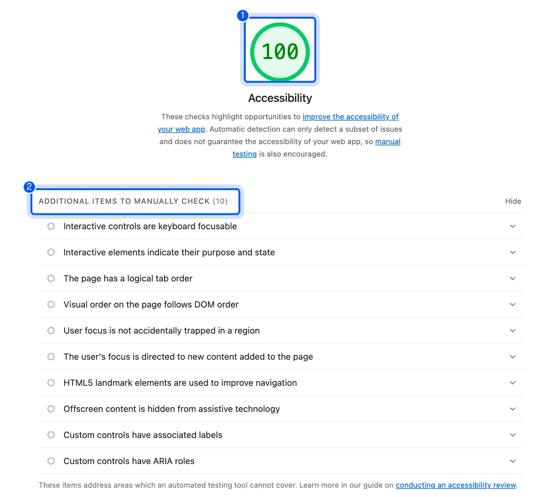
The same report lists ten checks for a person to do. They include a logical tab order, focus that is not trapped, and offscreen content hidden from assistive technology. Our mini cart failed that last one on other pages.
Use the score to track one page over time. Never use it as proof of conformance in a report.
Do the EAA and the ADA Apply to Your Store?
The European Accessibility Act has applied since June 28, 2025 to online stores selling to consumers in the EU, with a microenterprise exemption. In the US, the ADA covers businesses open to the public, but it has no detailed web rule for private stores. This is a summary and not legal advice.
Directive (EU) 2019/882 says Member States “shall apply those measures from 28 June 2025.” It defines e-commerce services as services provided at a distance through websites and mobile apps.
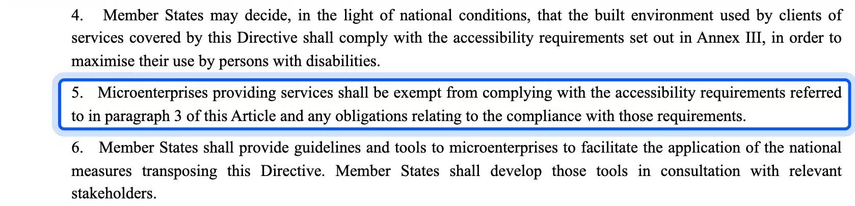
A microenterprise providing services is exempt. The Directive defines one as fewer than 10 persons, with annual turnover or a balance sheet total of no more than EUR 2 million.
National laws add detail. Check the rules in each country where you sell.
For US private businesses, the Department of Justice web guidance of March 2022 says the ADA applies to goods and services “offered on the web.” It also says the Department “does not have a regulation setting out detailed standards.”
Businesses “have flexibility in how they comply,” according to the same page. It points to existing technical standards such as WCAG as helpful guidance.
The ADA Title II web rule is different. It covers state and local governments and names WCAG 2.1 level AA. The ADA.gov first steps page lists April 26, 2027 for populations of 50,000 or more and April 26, 2028 for smaller ones.
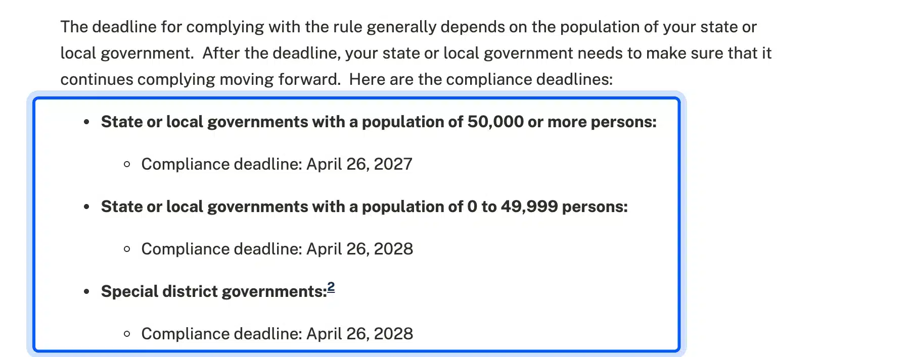
Those dates come from an interim final rule the Department published in April 2026. Private stores are outside it unless a contract with a public body brings it in.
How to Write the Accessibility Audit Report
An accessibility audit report lists every issue with its page, WCAG criterion, severity, fix and owner. Put the scope, standard, tools, versions and test date at the top. A developer who reads it should be able to repeat each finding and confirm each fix without asking you anything.
WCAG-EM makes reporting its fifth step. It asks you to document the outcome of each earlier step, and it treats a score or a formal statement as optional extras.
Use the findings table above as the template. Keep these columns in every row:
- Issue: One sentence on what fails and how a shopper meets it.
- Criterion: The WCAG 2.2 success criterion number and level.
- Where: The page, the template and the page state.
- Severity: Serious blocks a task, moderate slows it and minor is a nuisance.
- Fix and owner: The change, who makes it and the date it was retested.
Sort by severity first and by reach second. A moderate issue on the checkout costs more sales than a serious one on a page nobody visits. Note alt text problems too, and our guide to alt text in WordPress shows how to fix them.
When to Hire an Auditor
Hire an auditor when the stakes are high or the fixes are beyond your team. A customer complaint, a legal letter, a public sector contract or an EU launch are good triggers. An expert adds full screen reader passes and a signed report.
Do the first pass yourself anyway. Fix what the scans and the keyboard test find before the auditor arrives.
Ask any auditor to name the WCAG version, the sample pages and the tools, and to include a retest.
If the fixes touch theme, cart or checkout code, our WooCommerce development services can make the changes. Bring the report and the list of pages.
Conclusion
Knowing how to run an accessibility audit comes down to one habit: test the store the way a shopper uses it. Scan every page and every page state. Then buy something with the keyboard alone.
Our default store scored 90 to 100 and still had seven issues. The worst was a hidden mini cart that kept taking keyboard focus.
Four fixes and a retest brought every page to 100 in Lighthouse. A score is only the start, though.
Run the seven steps on your cart and checkout first, write down what you tested and retest after every theme or plugin update. If the cart needs layout changes, start with our guide to editing the WooCommerce cart page.
Frequently Asked Questions (FAQs)
Q1. How do you audit a website for accessibility for free?
Run Lighthouse in Chrome and axe-core on a sample of pages. Test with the keyboard and a 320 pixel window next. WAVE is free for public pages too.
A free audit still needs your time for the manual steps.
Q2. How many pages should an accessibility audit cover?
Cover one page per template plus the complete processes, as WCAG-EM describes. For a small WooCommerce store, that is about six pages plus the checkout flow. Add a random page or two to catch surprises.
Q3. Should I audit against WCAG 2.1 or WCAG 2.2?
Audit against WCAG 2.2 level AA unless a contract names 2.1. The W3C text says WCAG 2.2 is backwards compatible. Meeting it also meets 2.1, and the ADA Title II rule names WCAG 2.1 AA.
Q4. Does WooCommerce meet WCAG out of the box?
The WooCommerce accessibility statement says its core front end is substantially conformant with WCAG 2.2 AA. Our default store still had seven issues once the theme, blocks and styles met. Test your own store, because themes and plugins change the result.
Q5. Do I need a screen reader to conduct an accessibility audit?
You can start without one by reading the accessibility tree in your browser’s developer tools. A full audit should include NVDA, JAWS or VoiceOver on the checkout, though. Timing and wording problems only show up when you listen.
Q6. How often should an online store be audited?
Audit after every change to the theme, the checkout or a key plugin, and at least once a year. Updates change markup you tested before. Keep the last report so the next audit starts from known results.
Q7. What is the difference between an accessibility scan and an audit?
A scan is one automated tool run on one page. An audit is the whole method: scope, sample, scans, manual tests and a report. Our checkout passed the scan with 100 and still failed the audit.